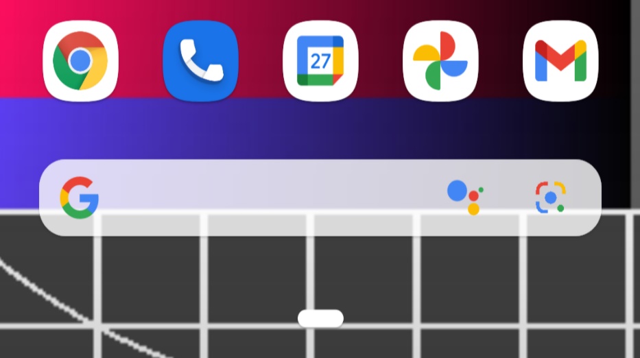
Google Lens is a handy little app these days, especially as we find ourselves moving forward in a world where we would rather not touch anything. Lens lets you point your phone’s camera at all sorts of stuff to learn more, like a restaurant’s posted menu or a QR code that could bring one up. Because we’re accessing Lens more than ever, Google is toying with the idea of making it more accessible on Pixel phones.
Some users have started noticing an extra shortcut baked into their Google Search bar at the bottom of the Pixel Launcher. That shortcut is a Google Lens shortcut sitting next to the Google Assistant button. The idea, as you can imagine, is that this puts you a single screen and tap away from opening Lens and scanning stuff.
At first, users were spotting it in Android 12, but others are seeing it in Android 11 as well. We are not seeing it yet on any device, so this could very well be a limited test from Google.
Of course, this tweaks the aesthetic balance of the non-removable search bar on the Pixel Launcher and could annoy some people. After all, if you really want quick access to Google Lens, you could just install the Lens shortcut and then slap it on a home screen. Quickly opening your camera and pointing it at objects can work in many situations as well.
And that actually brings up another point here – Google needs to give us way more control over what happens with the Pixel Launcher. Let us turn off that damn “At a Glance” widget at the top! Let us tweak the appearance of that bottom search bar, like you can do when you add the Search widget to other screens. And maybe let us decide if we want Lens and Assistant in that spot at the bottom.


Collapse Show Comments6 Comments