The Android 12 Developer Preview 3 is up and running on our in-house Pixel 5 and we’ve spent a little bit of time poking around now. Is there a lot to show you from it? Nah, most of the changes are the developer-related things we talked about earlier. But we’ve still found a couple of things! And we’ll update this post should we find more.
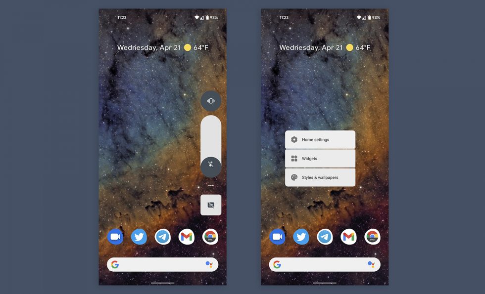
Volume slider is puffier, might have been from DP2.2. And look at this new separated menu. Cool.
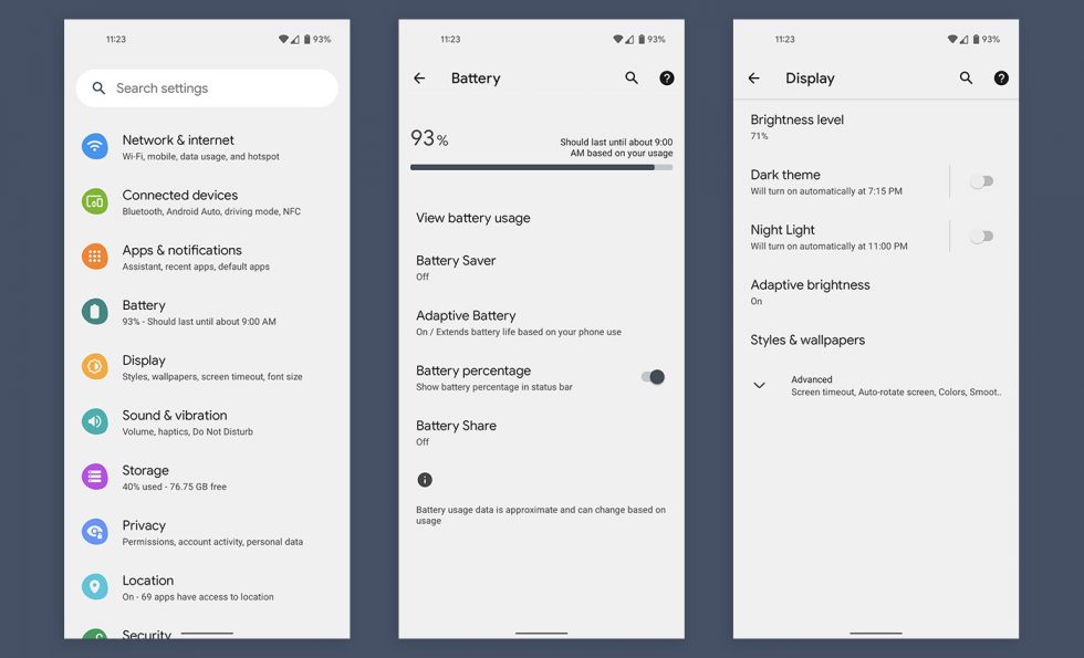
Settings area looks bigger, font-ier and more polished. It’s definitely not that Silky Home settings area we found back in the first preview, at least not yet. It may be pulling pieces from it.
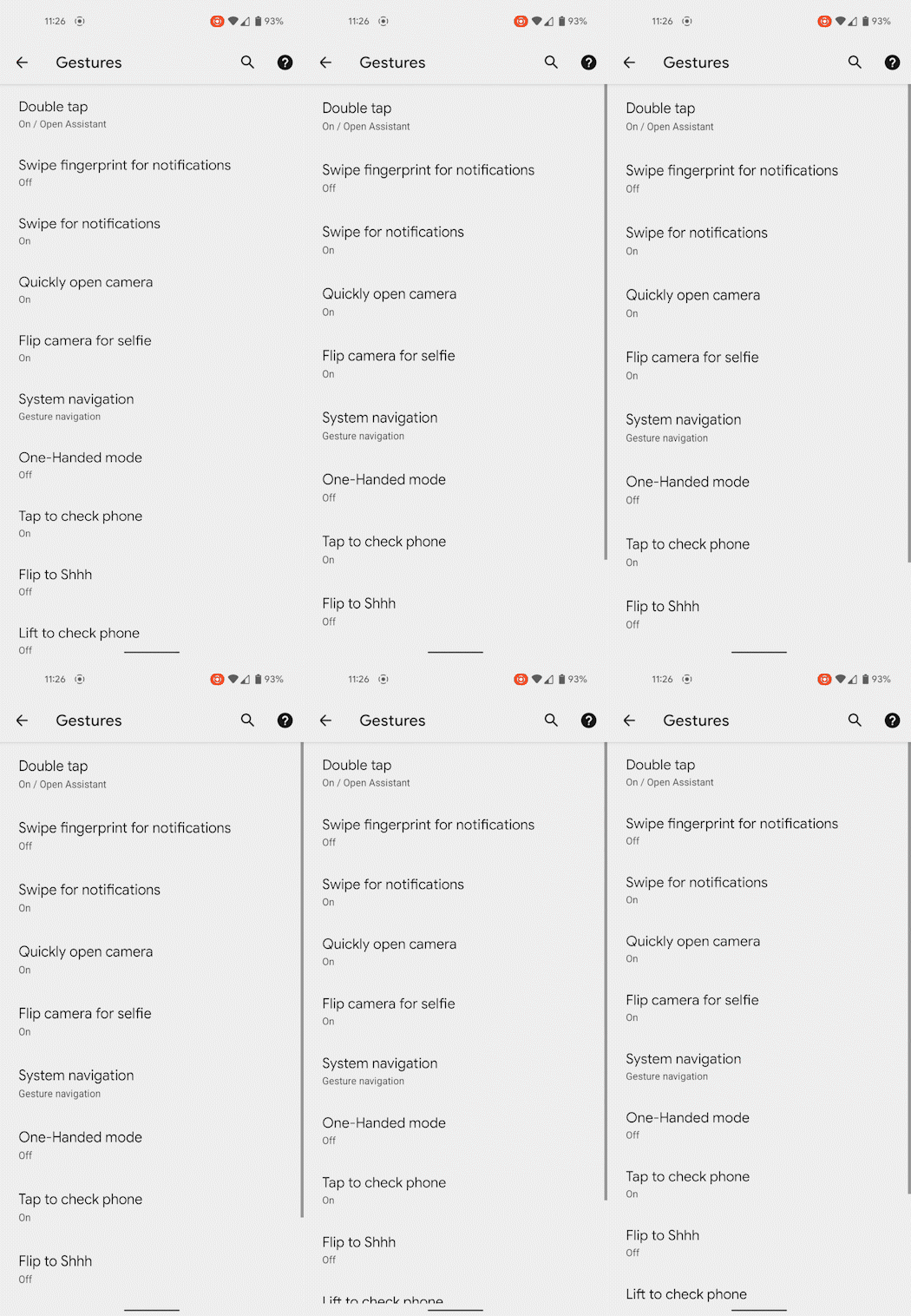
Look at this bounce.
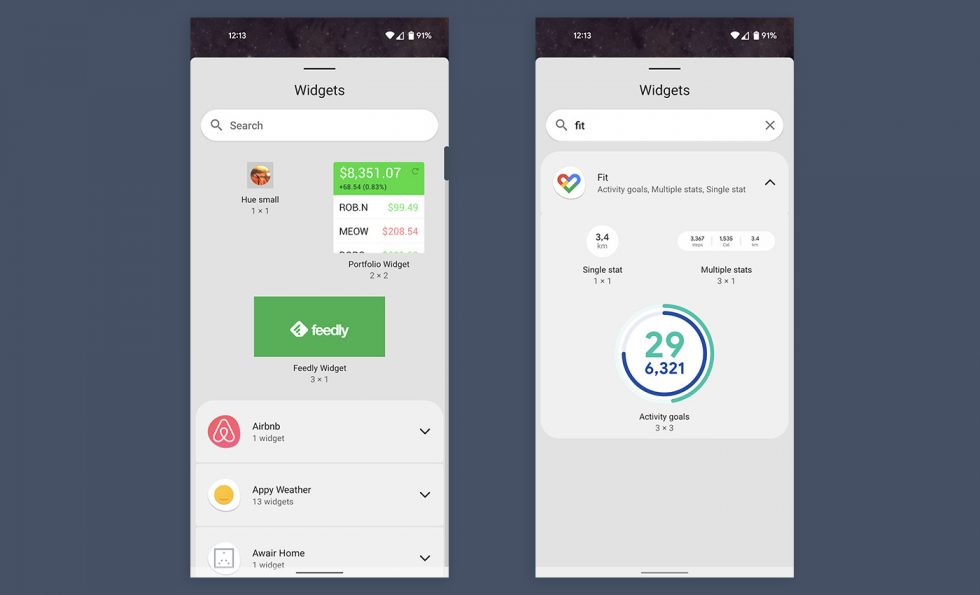
The new widget picker’s search is handy.
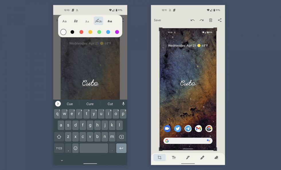
Fonts in the screenshot tool.
MORE COMING. Maybe.


Collapse Show Comments3 Comments