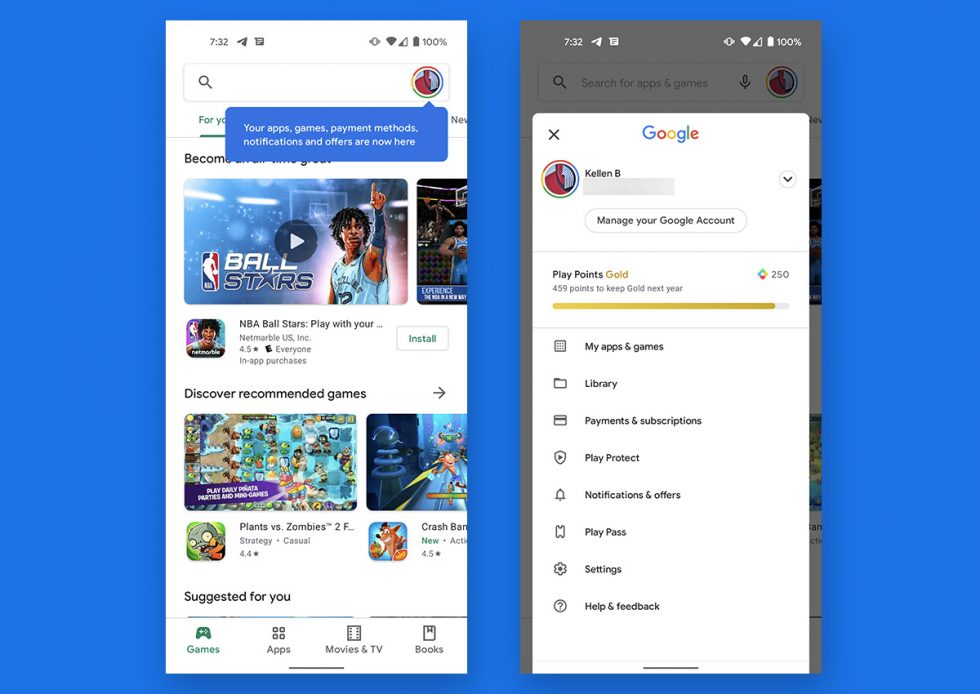
Remember back in January when we showed you a new Google Play store that ditched the hamburger menu and instead put all of its contents behind the account button in the search bar? That’s now rolling out to everyone it seems.
It’s a minor tweak to Google Play that is only shifting the location of items. Now, when you tap on your account button in the top right, a pop-up window will show you shortcuts to “My apps & games” and your Library and payments and Play Pass and Settings and all that.
If you aren’t seeing the change yet, which started rolling out widely yesterday, try killing Google Play or swiping it away in the app switcher, then re-opening. The first time it makes the change, it will white-out the menu button and then switch you over with a little blue pop-up explaining the change.
We’re almost done with hamburger menus, folks.


Collapse Show Comments19 Comments