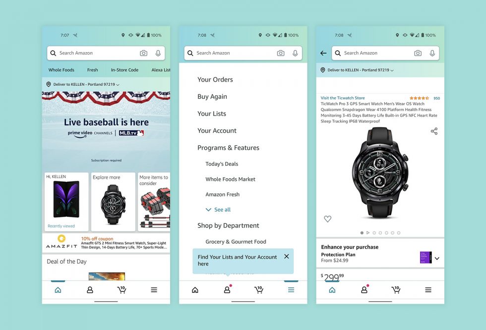
Amazon is a mega-corp with all the money in the world who not only sells everyone else’s goods, they often releases their own branded tech products with companion apps. They clearly care about design, user experiences and interfaces, and their world generally looking…nice. But for years (basically since day 1), the Amazon Android app has been bad. It’s ugly as hell, functionality always seems like it just barely worked this time and probably won’t next, and it rarely receives updates to make anything better.
That changes today! We’ve got a new update available that actually changes some stuff. We are only a couple of weeks removed from getting that new, brown icon, so hey, things are looking up!
In the new update, the big change is that you will find the side menu is now a bottom navigation bar. To get around the app, you have home, profile, cart, and menu tabs that get you into various areas. It also appears that a font change or font size change has slipped into pages (like the menu page) and the profile page isn’t the one built from 2011 anymore (there are curved buttons).
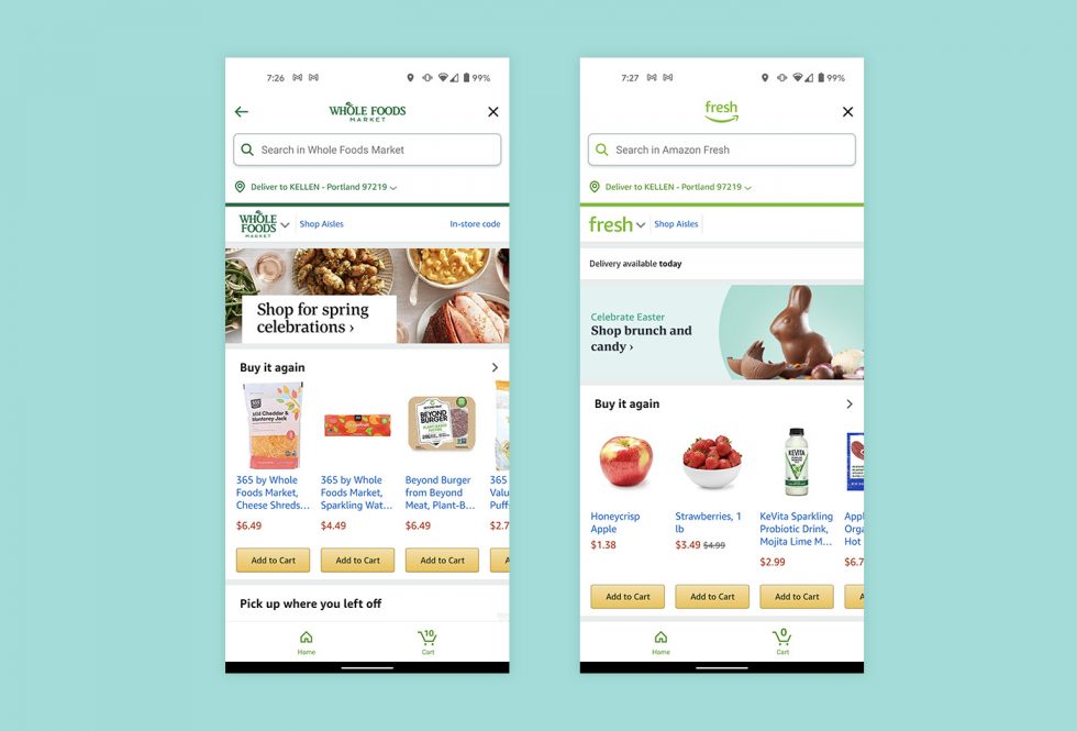
The Whole Foods and Fresh pages now offer what appears to be a somewhat custom overlay when opened. They used to open in the app as just any other Amazon page, but now they have their own branding, color scheme, etc. with search functionality that might work properly and not search throughout all of Amazon (if you know, you know what I mean).
The update should be live for all at the link below.
Google Play Link: Amazon


Collapse Show Comments30 Comments