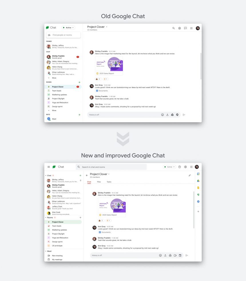
As Google Chat opens up to more people, Google is showing that it will try to improve it regularly. On March 24, for example, the web interface for Google Chat is getting visual improvements as well as several other feature tweaks.
The visual enhancements can best be seen in the image below, where within Chat rooms, you’ll now have tabs for files you’ve shared or tasks to be completed. On the right side, Google is including shortcuts to integrations you may have in Gmail as well. You can see here that there are side shortcuts for Keep, Drive, Voice, etc.
You’ll notice that the “Find people or rooms” search bar in the left navigation menu is gone and a “+” button has replaced it. Google says the “Chat” and “Rooms” sections over there are now static too. Finally, Google Meet integration is here, and I actually can’t believe it’s only arriving now.
If you are a Google Chat user through a Google Workspace (GSuite) account, you should see the new UI and features as soon as March 24. For everyone else, we have no idea when you’ll get it. Google is really bad about explaining the availability of Chat to regular Gmail users, even as they are starting to gain access.


Collapse Show Comments5 Comments