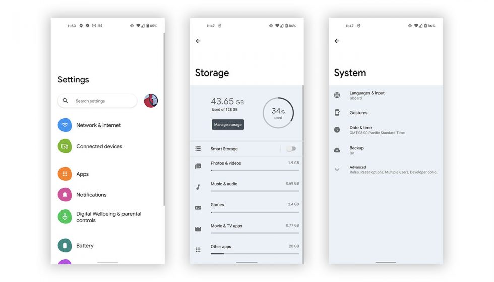
We’re putting together our list of “fun” changes that we continue to stumble on in today’s release of Android 12 Developer Preview 1, but there is one I’m sure you all want to check out. Remember the leak from a week that showed signs of a new UI, possibly called “Silk?” Parts of that new UI are indeed in Android 12 DP1, you just need to enable them.
First spotted by XDA’s Mishaal Rahman, we were able to enable the tweaked UI on our own with a simple adb command. The option to turn this off or on is apparently a feature flag that would normally be found in developer options, Google just isn’t showing it to everyone.
If you are running Android 12 DP1 and want to fire it up, here you go:
./adb shell settings put global settings_silky_home true
The new UI does not at all appear to be complete or maybe we just haven’t enabled everything yet, but by running that command, you will at least change up the settings UI to something that mostly resembles Samsung’s One UI or the latest OxygenOS skin from OnePlus.
As you can see from these screenshots, each page is pushed downward to give you easier one-handed access to touchable items, plus the font is bolder and more prominent. This is the trend of mobile user interfaces it seems.
We’ll be back with more!


Collapse Show Comments8 Comments