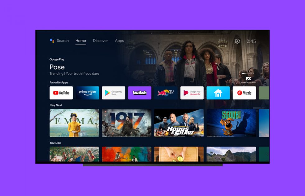
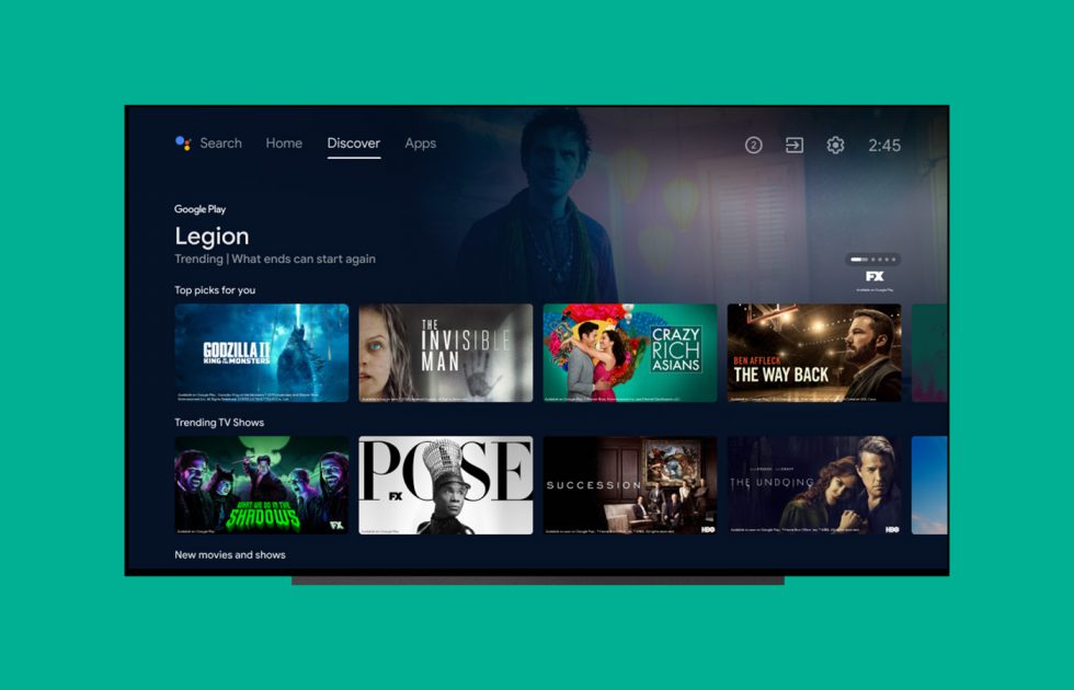
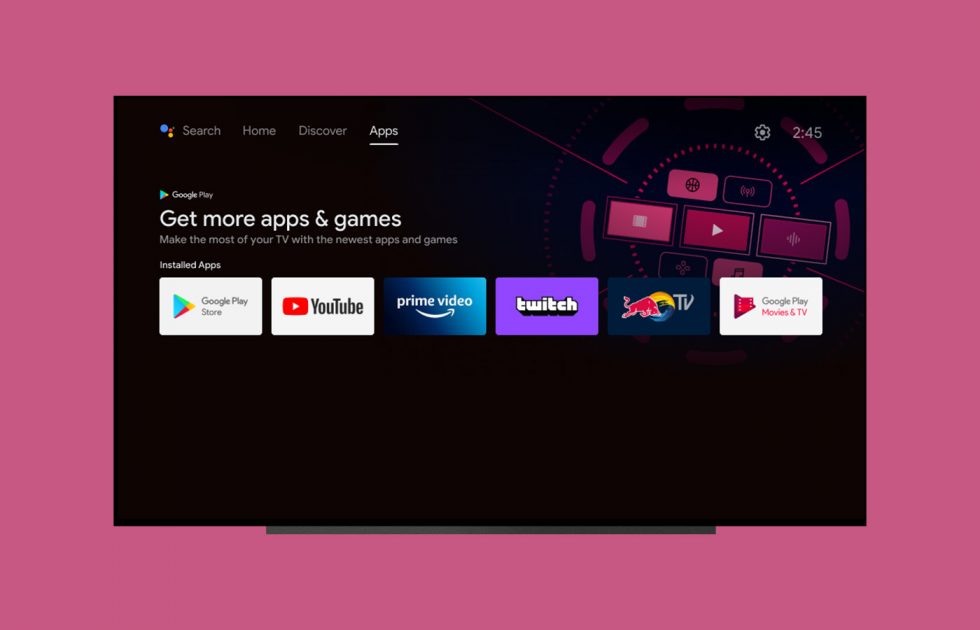
When Google introduced its new Chromecast with Google TV at the end of last year and showed off its updated home UI experience, we wondered if this setup would transition over to other Android TV devices. Google suggested at the time that it might, but instead, at least for now, Android TV is getting a similar-yet-still-unique new home screen of its own.
Starting today, Google is rolling out a new 3-tab home experience that features Home, Discover, and Apps pages.
The Home page will look similar to what you already know about Android TV, with shortcuts to apps and channels and other content. The Apps page is the spot to find all of your installed apps. The Discover page is where things get sort of fresh.
The Discover tab will showcase personalized recommendations from current trends and also based on what you watch all of the time. It should show you movie and TV options from all of the services you subscribe to, so my guess is that it’s going to pull from Google TV. If anything, it looks like a more concentrated take on the Google TV UI the gives me recommendation anxiety. It could be great.
Google says this update really is rolling out today to Android TV devices in the US, Australia, Canada, Germany, and France. Other countries will get the experience in the “coming weeks.”


Collapse Show Comments11 Comments