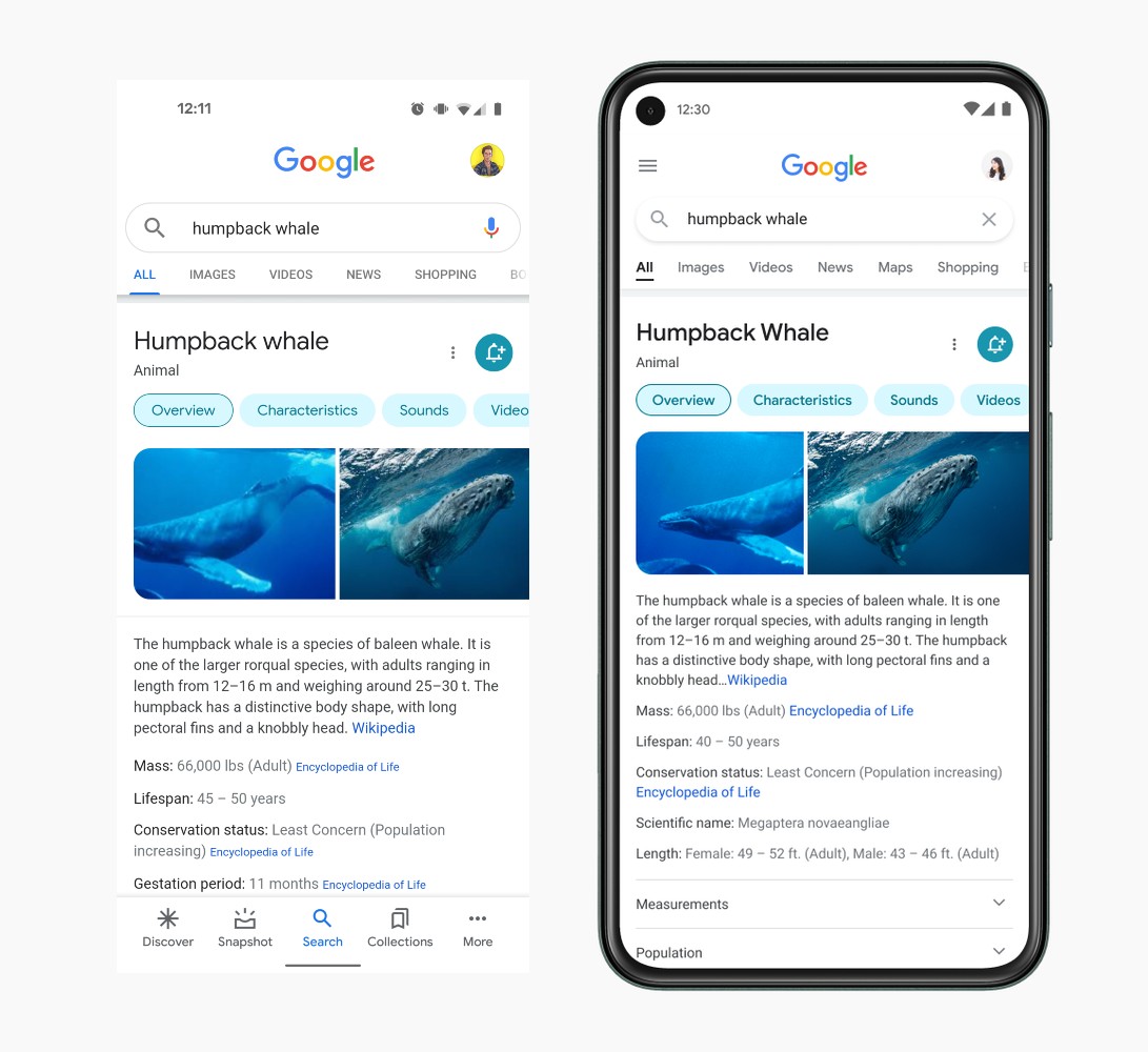
Google detailed inbound changes for Google Search on mobile devices this week, putting more focus on actual “information,” easier to read text, and more of a lean into a “Googley feeling.”
There are five key things that Google highlights when it came to defining what this change was all about. I already listed a few above, but let me lay them all out here for you — Bringing information into focus, making text easier to read, creating more breathing room, using color to highlight what’s important, and leaning into that “Googley” feeling.
I know that sounds all a bit abstract and vague, but the key takeaway is that Google intends to provide more visual space for viewing search results, using colors to bring attention to important aspects of the search results, and making things appear more “bubbly” and “bouncy” to go along with the current gist of Google’s design language.
“Old Search UI” vs. New
As you can see from the above photo, it looks like all that’s happening, at least for the humpback whale page, is the removal of the bottom bar and return to the hamburger menu on the side. I suppose that’s confusing because we spent all this time ridding ourselves of the hamburger menu, but now it’s returning in this limited capacity? Don’t ask me, I don’t understand anything these days. It’s also possible Google already has me on the updated UI and I don’t even know it.
Be on the lookout for these changes to hit your mobile device in the coming days!


Collapse Show Comments14 Comments