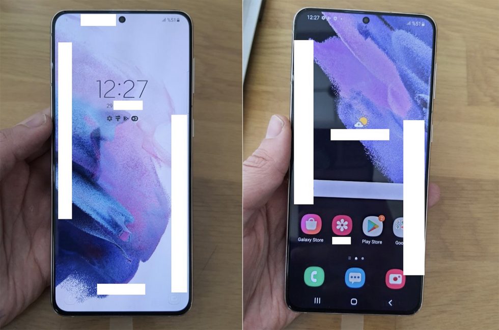
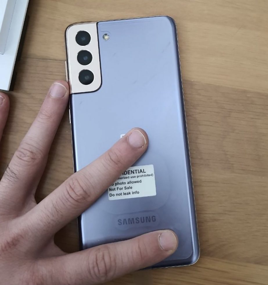
After seeing the Galaxy S21 line-up in countless images, my thoughts on its design haven’t necessarily changed much – I’ve always admitted that its unique backside was tastefully done. But after seeing fresh real-world pictures this week, I’m back to thinking this is one of the most elegantly designed phones in some time. What a pretty phone the Galaxy S21 is.
You may be tempted to point out that the design isn’t actually that much different from this year’s Galaxy S20 and you would not be incorrect. We still have the all-display front with centered hole punch front camera. The backside appears to be a lot of glass with a large camera housing. The rest of the design bits are negligible.
For whatever reason, the camera housing is pushing this over the top. It’s like a waterfall edge on a pool. It looks dangerous, so you can’t take your eyes off it. It’s a risky design whose payoff is clear, because nothing else matches its uniqueness. By cutting out a chunk of the corner of the phone, Samsung is both separating the camera to remind you it’s there, while still blending it into the entire phone’s body. It’s quite magical.
And that’s really all that ties this together as being special. The front, while it might have even smaller bezels than the S20’s, isn’t that remarkable. Less bezel might actually hurt its usability. But that backside will let the S21 standout against a sea of recent phones that all settled into the exact same design.
I can’t wait to get this beauty in my hands.
// @MauriQHD


Collapse Show Comments36 Comments