Google just dropped the Android 11 Beta 2 on Pixel phones and we are already diving in to see what’s new. As a mostly-stable build under the Platform Stability milestone, we might not see anything huge, but Google often continues to tweak UI elements up until the final release.
In this post, we’ll do our best to track those changes. We can’t promise that the list will be long or that exciting, although we are already finding some changes that make a lot of sense.
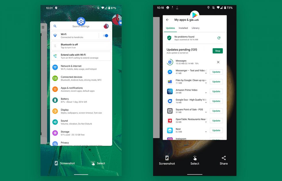
App Overview changes
Beta 2 vs. Beta 1
This isn’t a huge change here, but the app switcher in Android 11 Beta 2 has been cleaned up. In the previous preview and beta builds, Google was including 3 options to screenshot, select text, or share. Having all three made so little sense, and Google appears to have realized that. In the new Android 11 Beta 2, they’ve reduced that down to just screenshot and select, with a new icon for text selection.
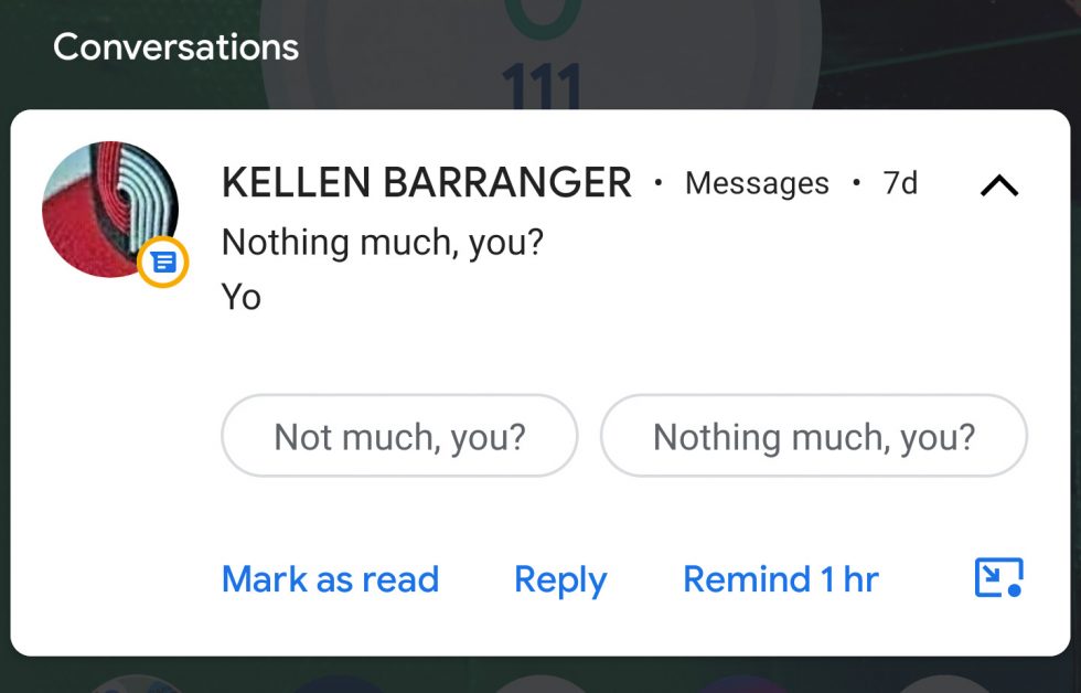
Bubbles icon makes more sense
This is a minor change, but inside of a notification that allows you to open into a Bubbles conversation, Google tweaked the icon some to make more sense. In the bottom right corner above, see how the Bubbles icon now has an arrow suggesting the button does something outside of the notification? That wasn’t there before. Previously, it was just this weird circle with a dot in it and no indication about what it might do.
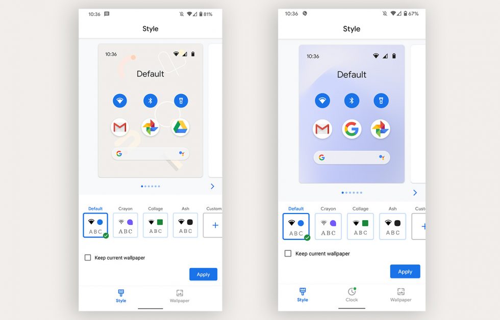
Clock option removed from Style section
Beta 2 vs. Beta 1
In previous preview and beta builds, Google included a Clock section within the Styles & Wallpapers area, but that has been removed on my Pixel 4 XL in Beta 2. We assumed that area was going to allow for customizations of the lockscreen and always-on display clocks, so to see that now removed is a bit weird. Maybe Google is saving it for a Pixel feature drop?
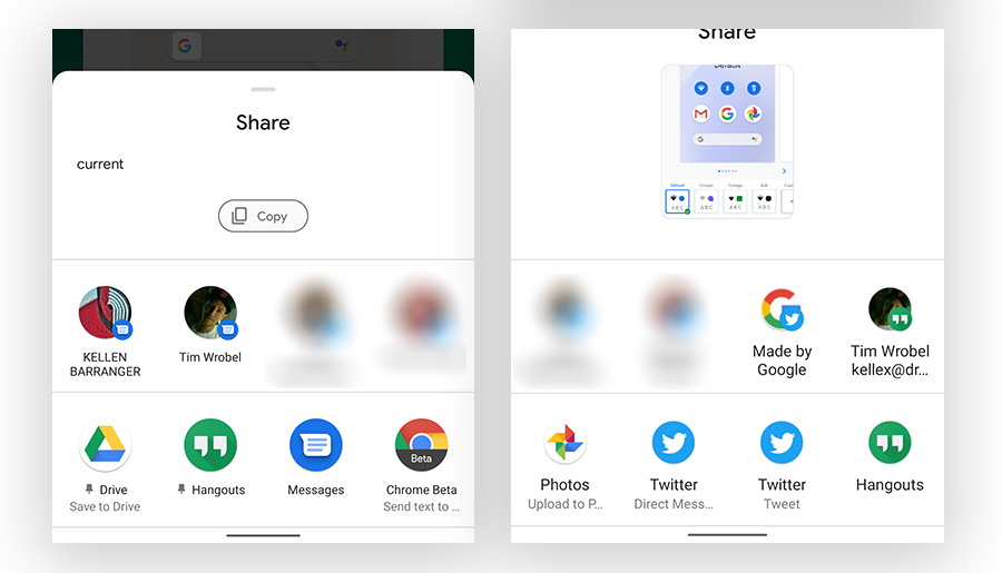
Share menu tells you when you pin an app
Beta 2 vs. Beta 1
This is another UI clean-up or improvement thing, but the app pinning you can do in the Android 11 share menu now shows a pin icon next to the apps you have pinned. I like it.
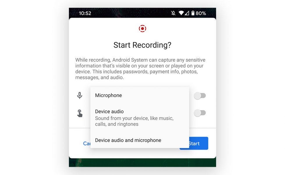
Screen recording can record device audio
Screen recording in the new Android 11 Beta 2 added a couple of new audio options. Instead of only recording from the microphone, you can customize the audio experience further to record only device audio or both device and microphone audio. It looks like the screen record feature got a new icon too.
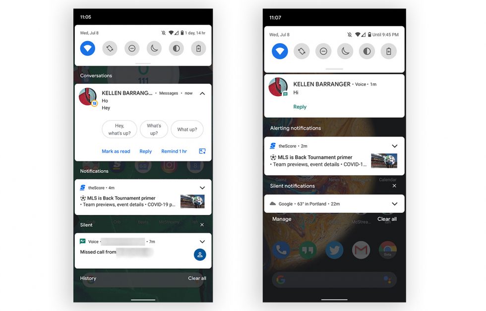
Notifications sections no longer have such weird names
Beta 2 vs. Beta 1
Remember how silly it was from the early previews that Google was writing out confusing and absurdly long names next to each section in the notifications area of Android 11? They were using “Alerting Notifications” and “Silent Notifications” to help us understand that some notifications would alert us while others were silent. In Beta 2, those are now gone and the sections now just say “Notifications” and “Silent.” Thank you, Google!
The new media controls in quick settings are here, for some
The new media player in Quick Settings design is now enabled by default. pic.twitter.com/urpJZICr8p
— Mishaal Rahman (@MishaalRahman) July 8, 2020
In Beta 1, Google showed off new system-level media controls that would now be housed within the quick settings area, rather than as an always-showing notification. The implementation in Beta 1 wasn’t complete, required you to enable them through a developer option, and didn’t look like what Google had teased, but we are now seeing the finished product in Beta 2. Well, some people are. The new look is showing up for some, just not all…like us. 😑
Picture-in-picture gets simple resizing
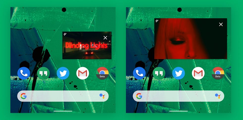
My Pixel 4 XL running the Android 11 Beta 2 just grabbed an update to YouTube and it brings with it a better way to resize picture-in-picture windows. In previous builds, there was a barely working pinch-to-zoom action that would sometimes resize these windows, but Google has now baked in real support.
In the shots above, you can see the floating window has an icon in the top left corner with two white bars that indicates you can make something happen by touching there. With a swipe out or back in on that spot, you will resize the picture-in-picture. Take that, Apple!
We’ll keep updating this post.


Collapse Show Comments39 Comments