Motorola re-joined the flagship-level phone race at what is arguably the worst time possible. After a few year absence, Moto threw it all into the Motorola Edge+ just as the world and its economy have been hammered by a global pandemic. Seriously, sending out a $1,000 phone when budgets are tighter than ever is going to be a hard sell.
That said, I’ve been testing the Motorola Edge+ for the past week or so, hammered on the battery, played with its insanely curved display, and shot some pictures. I think I’m ready to talk about it and whether or not this is a phone you should consider, assuming you are on Verizon because…yeah it’s exclusive there.
This is our Motorola Edge+ review.
What do I like?
Generally speaking, there is a lot to like about the Motorola Edge+. It’s a phone that stands-up nicely against the OnePlus 8 Pro and Galaxy S20 series. In fact, I’m not sure it’s far behind either of those in any substantial way. The phone’s performance is incredible, the battery life is on another level, and the software package is one of our favorites.
That doesn’t mean I don’t have my gripes, but before we get to those, let’s talk about what it is that I like about the Motorola Edge+.
Battery life
I am absolutely blown away at the Edge+’s battery life. We’re talking potential 2-day battery life here, and that’s not a joke or exaggeration. The 5000mAh battery coupled with a 1080p display at 90Hz instead of 120Hz has created the new champ in my eyes.
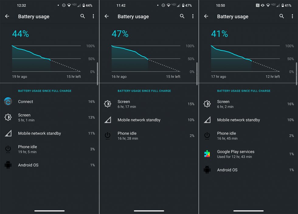
Since I’m sitting at home with little to do because of stay-at-home orders, it appears my phone usage has increased substantially since I got the Edge+. On multiple days over the past week, the screen on time from the battery page showed I had hit the 6-hour mark, which is not typical for me. I’m wondering if I have hit that number because I have zero worry about this phone dying.
As you have now seen above, with 6 hours of screen on time in a day, there were times where I still had almost 50% battery remaining just as I was putting the Edge+ down for bed. Like, what in the hell?
I thought the OnePlus 8 Pro had decent battery life, but this is just on a completely other planet. I have not come close to killing this phone on a single charge and can’t imagine I ever will in a single day. There is a good chance that I could have run this phone for almost two full days, which is absolutely insane for a phone with this big of a screen. Actually, I’ll correct that – with my typical usage (3-4 hours of use), this phone would have easily gone two days.
On a charging note, by no means is the Motorola Edge+ a champ compared to others. It only does 18W wired charging and decently-fast 15W wireless charging. I’m not sure that matters much knowing how long this phone lasts, but it’s a correct criticism. With batteries only growing, others are doing 25W and 45W charging at this point. And Motorola sells a phone that does 45W charging, so I’m not sure why they left that out here.
Still, the Motorola Edge+ is the battery champ of 2020.
Specs
Strictly talking specs, I’m not sure the Edge+ is missing anything. It has a big beautiful 6.7″ full HD OLED display with a high 90Hz refresh rate. It has the Snapdragon 865 and 5G. It has 256GB UFS 3.0 storage with 12GB LPDDR5 RAM. It has the triple camera with 108MP main sensor along with ultra-wide and telephoto lenses. It has a huge 5000mAh battery with fast wired and wireless charging and power sharing. It has dual stereo speakers, an in-display fingerprint reader, and WiFi 6. It even has a headphone jack.
To criticize what Motorola has put out here, you have to get a bit nit-picky. You could point to the 1080p display resolution and 90Hz, while Samsung is doing 120Hz at the same resolution. OnePlus is going as far as 120Hz at quad HD. There’s no real water resistance, which is fair to point out. The fast charging isn’t as fast as some. And, well, that’s pretty much it.
Motorola included almost all of the specs that matter in a 2020 flagship phone that costs $1,000. They might not have maxed out every single spec, but they sure came close. I don’t think anyone could look at the specs list here and say with a straight face that Motorola’s package is worth less than what Samsung or OnePlus just put out.
Performance
When I compare phones during the review process, OnePlus’ latest devices always stand out to me as being the quickest or the benchmark that every other maker should try and reach. After using this new Motorola phone, it might be the new reference device. Thanks to 12GB LPDD5 RAM, 256GB UFS 3.0 storage, and Motorola’s ability over the years to fine-tune the speed of Android on their phones, the Edge+ is blazing fast.
With phones on this level, with these specs, and at this price point, it’s the little things you look to that help you realize how optimized the phone is. For the Edge+, it’s something as simple as dragging your finger back and forth over a swipe spot to see how well the screen or menu keeps up. It’s watching the smoothness of the animation as an app shrinks back down to its icon upon exiting. It’s that subtle snapping that happens as you open an app or motion into the app switcher.
This phone, friends, is so, so quick. I haven’t seen touch responsiveness like this, maybe ever in an Android phone. I cannot tell you how satisfying it is to switch apps or use the bottom gesture bar to move around the UI on the Edge+. Obviously, scrolling in anything looks good because of the 90Hz, but it’s the way screens motion from one to the next that is something you would need to see in person to fully understand. Unbelievable job here from Motorola.
Software
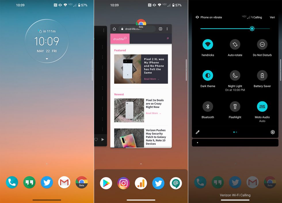
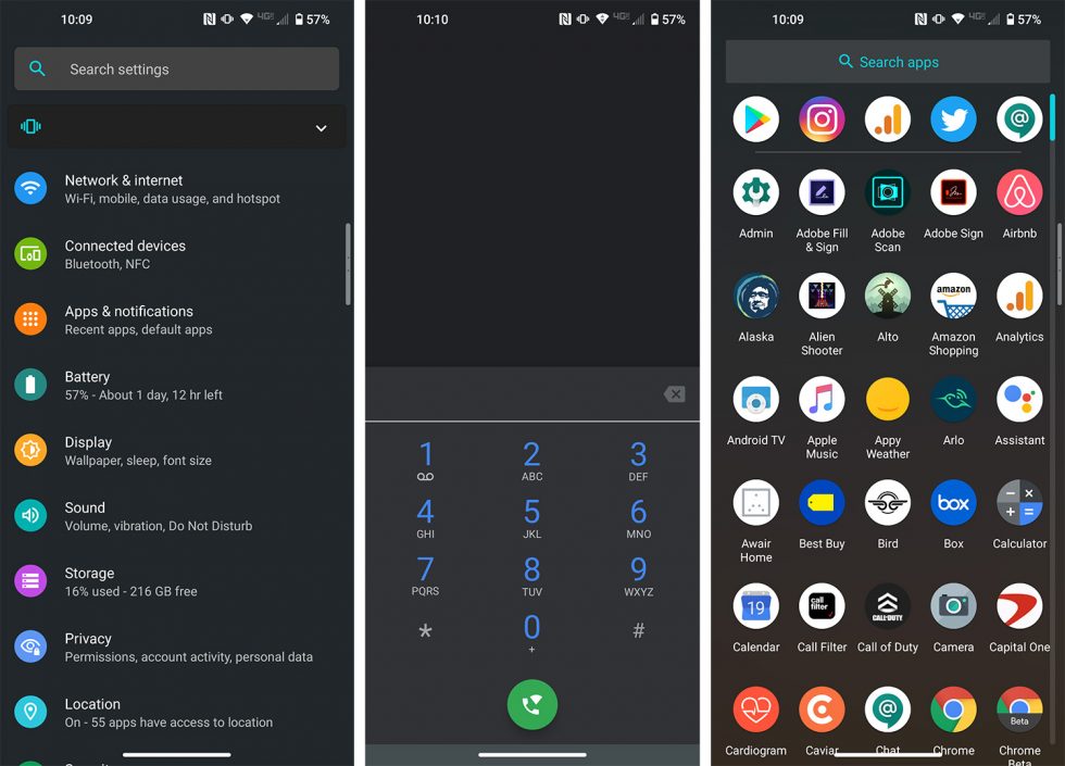
Motorola was one of the first companies to ditch their bloated Android skin and switch back to a close-to-stock experience that they enhance with their own suite of features. They did this when Google owned the company, but have stuck to it since. Because of the clean UI with useful add-ons, Motorola’s flavor of Android is one of the best.
On the Motorola Edge+, you get Android 10 that looks quite similar to what you might see on Google’s Pixel phones. The launcher is almost identical (with access to Google Discover), as are the notification, quick settings, and system settings menu areas. Where Motorola changes it up is in their Moto suite.
That’s where this phone is elevated, because you still have Moto Display, which isn’t an always-on experience, but it’s close. A quick motion of your hand toward the Edge+ will wake its display to show you time, notifications, battery, that sort of thing. You still get the actions too, like twisting to launch the camera, chopping to activate the flashlight, or picking up your phone to silence incoming calls.
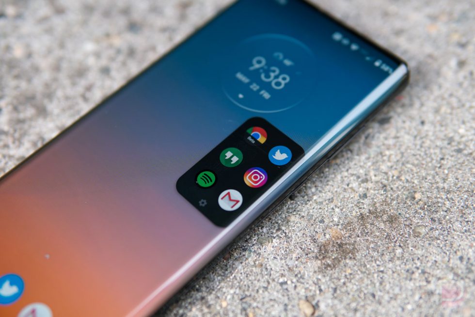
Where you find new stuff is through the phone’s edge display, where some clever software tricks allow you to use the edge rather than just look at it (more on that below). Motorola added more customizations to the UI, with power over icon shapes, theme colors, grid layouts, and fingerprint animations. They also added a game mode that gives you L/R top buttons placed within the edge. That’s pretty clever, right?
On the flip side of good software you have today, we need to talk about Motorola and how well they distribute software updates. When this phone was first announced, they would only commit to a single Android version update, which would have meant an update to Android 11 and not to Android 12. That created quite a bit of a storm for Motorola, where the phone was never going to be taken seriously. Paying $1,000 for a phone and getting a single major update is absolutely a dealbreaker.
But after the backlash and just prior to launch, Motorola realized their phone was dead in the water and flipped. They are now committing to “at least” two Android OS version updates. Assuming they don’t backtrack from that commitment, you should see Android 11 and Android 12, with the possibility of a third. We’ll obviously monitor the situation over the coming years as Motorola has a lot to prove in the update department. Their current track record is one fo the worst in the industry.
So look, the software on the Edge+ is very good and Motorola is at least saying the right things for now about future updates.
Design
The overall design of the Motorola Edge+ is quite nice. We’ll talk about the edge display of it in a minute, but the way Motorola put this package together, it is without a doubt a looker.
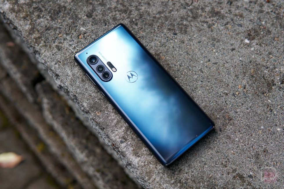
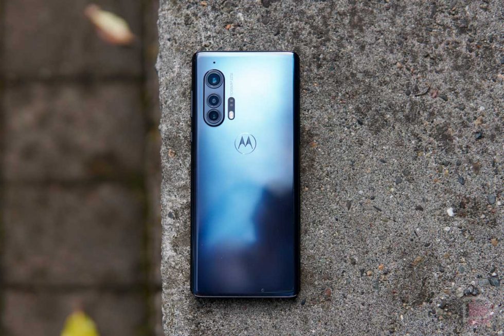
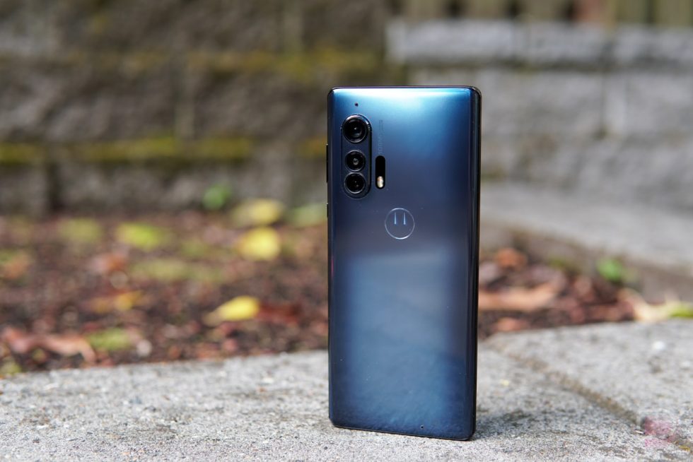
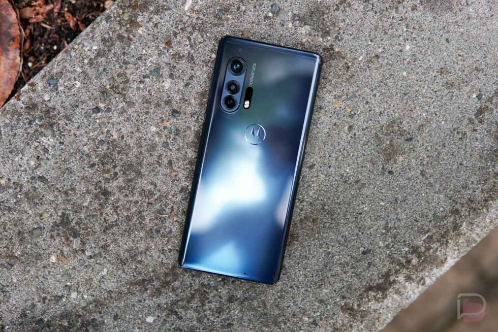
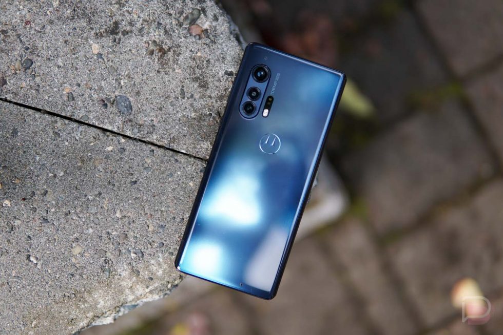
I’ve been testing the Thunder Grey version and love the color. On the back, depending on the angle of light, the name “thunder” is so fitting because it almost looks like there is a smoky or cloudy storm brewing within it. It also reflects light sources in the coolest way, where they streak from odd, off-centered angles that you might not expect.
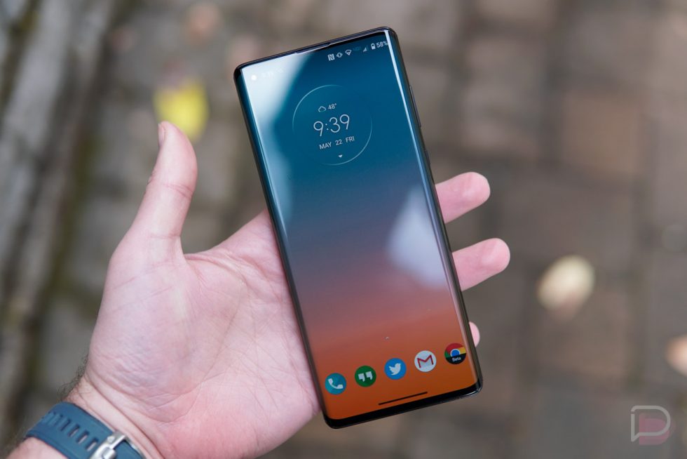
The Moto Edge+ is a really nice width too, where you can easily hold it in one hand and get quite a bit of use out of it without needing two at all times. While heavy, the phone is one of the easier-to-handle I’ve used outside of the smallest Galaxy S20.
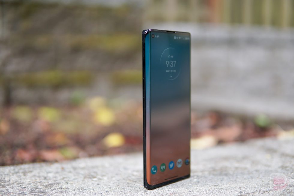
Want to know something else cool? This phone can stand-up on its own without a prop. That’s right, the bottom (and top) is flat with a slightly inward curve that allows it to stand by itself. I’m not sure I know of another phone in recent years that can do this.
It’s not a perfect design, though. Like I said, it is a really heavy phone that will weigh down pockets and make longer usage periods tiresome. It’s incredibly tall, so you’ll really have to get used to the edge display shortcuts for accessing the notification panel. And the backside, with that rounded camera hump, is a nightmare for use when the phone is lying on a table. It’s almost impossible to use like that and you’ll likely just pick your phone up when you need it.
You could find issue with the sides of the phone too, where it curves around and meets the front display. There is a noticeable edge there that could be used for better grip, or you could argue that it’s a design flaw where Motorola couldn’t quite polish off the design as they should have.
I think for the most part, the Motorola Edge+ is a pretty phone that feels great in the hand. It has a few issues and is by no means perfect, but I’ve had a better time holding and using this phone than I did the OnePlus 8 Pro and its extra-wide body.
Camera
The camera setup for the Motorola Edge+ is a 108MP main shooter at f/1.8 (with OIS) that uses Quad Pixel Technology to bin the photos down to 27MP photos. It’s paired with 16MP ultra-wide (117° FOV, f/2.2) and 8MP telephoto lenses (3x optical zoom, f/2.4). It can shoot video in 6K, has portrait and night modes, lets you utilize manual controls, and will give you full 108MP stills if you want to go nuts.
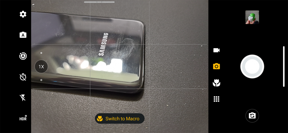
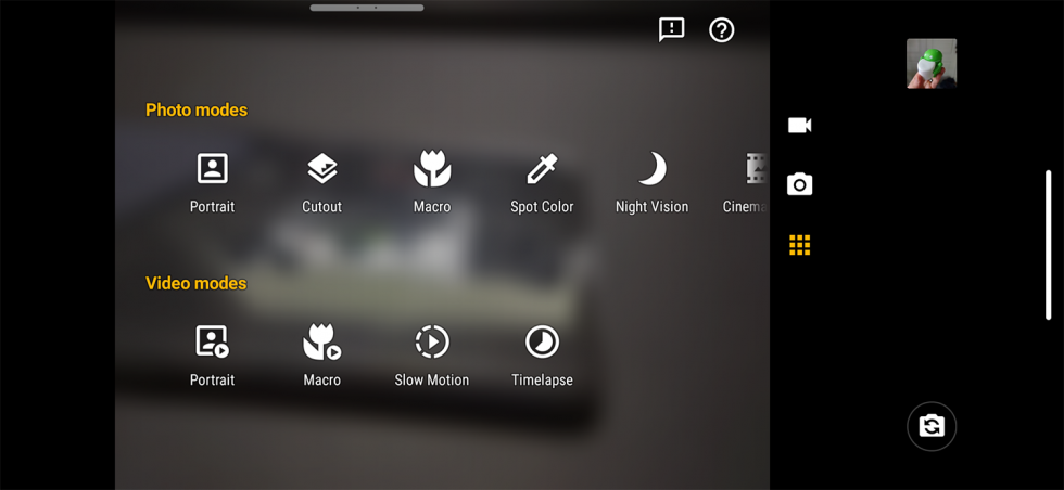
The software powering all of that is Motorola’s constantly-improving camera app. You can launch it with the twist of a wrist, all of the controls are where you’d expect them to be, there’s a quick menu to access additional modes, and there’s even a Google Lens shortcut. You can add a grid and leveler, let it auto-optimize shots, and shoot UHD video as H.265/HEVC. It’s all there, as you would hope from a $1,000 phone.
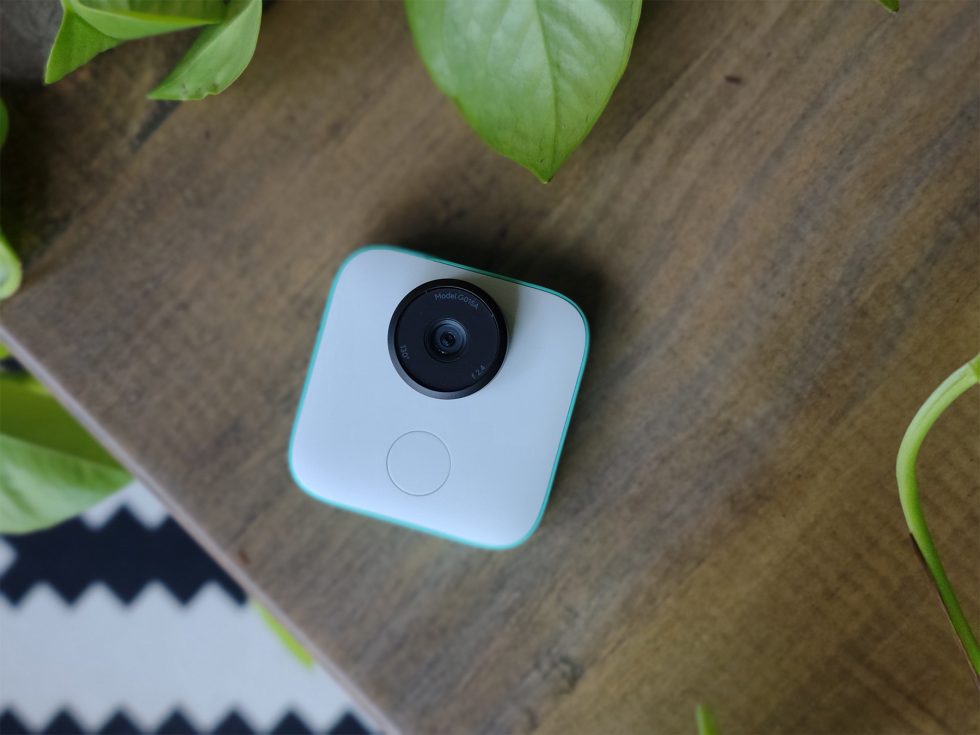
Is it a good camera? I think so, at least the 108MP shooter is. Again, as I’ve noted in the past review or two, we’re stuck at home for the most part, so getting out and really pushing phone cameras is not as easy as it typically is. Still, I’m happy with the photos I’ve taken using the Edge+ from the main sensor.
The camera is excellent at showcasing depth, it creates beautiful bokeh balls and holds its own in night scenes. If there is an issue I noticed when comparing against the Galaxy S20, it’s a color reproduction thing. Edge+ photos aren’t quite as vibrant, but they might produce more life-like shots. Like most phones, that’s a your-eye-test thing. I will point out that the telephoto and ultra-wide cameras lack optical image stabilization, so they struggle at times to produce clean shots, particularly with the ultra-wide trying to shoot macros.
In the end, when reviewing a camera, I tend to ask myself, “Could I trust this camera if it was the only camera with me?” For the Edge+, yeah, I think I could.
What’s bugging me?
Display
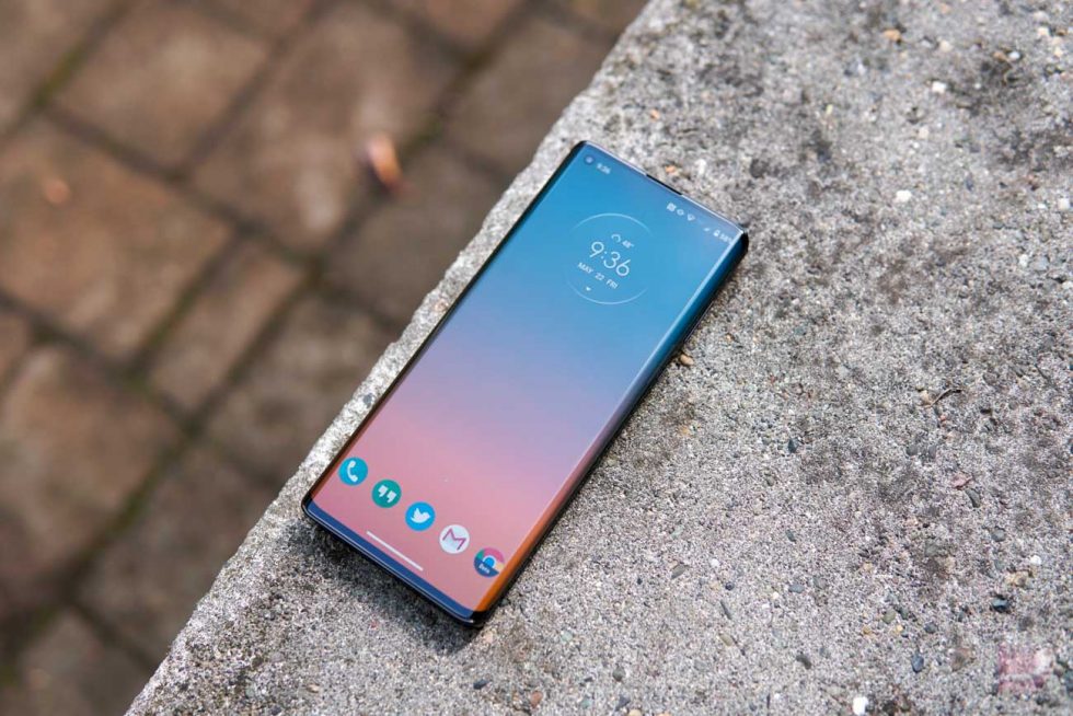
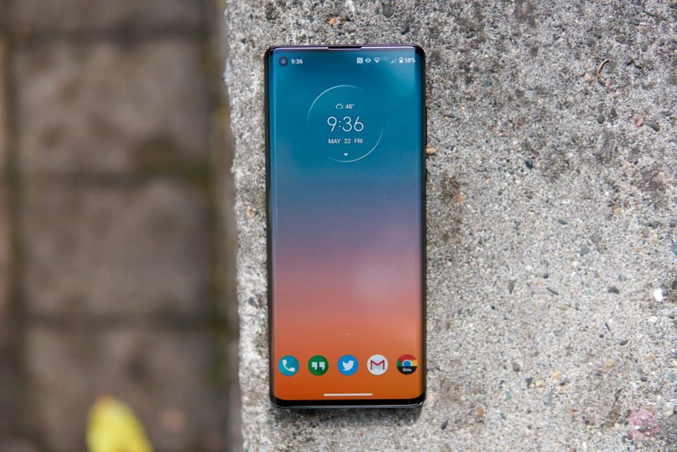
In what is going to be the least surprising part of the this review, I’m sure you figured before my fingertips ever touched the Motorola Edge+ that I would not be a fan of the display. Not because the display looks bad, the OLED isn’t as good as others, or because it’s not responsive or big/small enough. You probably assumed I’d hate it because of the awful curve or edge that Motorola included. You would be right, but I also am not convinced this is a great overall display if you ignore the curve.
As a display that shows you images or video or websites or apps, it’s just OK. It leans a little cooler in temperature, which I actually prefer over a warmer, yellower picture. The thing is, if you want to adjust a setting like that, there isn’t a way. You have color profiles of Natural, Boosted, and Saturated, but no other controls beyond what those presets give you. I hope you like how Moto tuned it out of the box.
The display doesn’t have a wide enough brightness range either. It doesn’t get dim enough in dark situations and can’t match the S20 or OnePlus 8 Pro in peak brightness, at least to my eye. I also don’t think its Night Light blue light filter gets amber enough and barely changes the color of the display when you most need it to.
At off-centered angles, the display presents a slight color shift that I don’t find on other phones, sort of in a way that everyone complained about the Pixel 2 XL years ago and its blue shift. While this phone doesn’t get blue, the darkness or refresh rate or something makes it look off as your angle increases. I can’t quite pinpoint what the issue is, but something doesn’t look right.
All of that aside, yes the insanely steep curve that Motorola included on right and left sides is as bad as you imagined. While companies like Samsung are realizing that the curved display thing was a dumb trend that we are all ready to move away from, Motorola is diving in as extremely as I’ve seen.
With the Edge+’s edge display on full display, you get distortions over the content that shows on the screen, you get the nasty glare that all edge phones show, and there are steady streams of palm touches. Does it look sort of cool? Sure, I guess. Is it the most impractical nuisance of a phone feature? Yes, and it always will be.
Now, Motorola did try to make its edge useful by allowing you to swipe up and down it to grab the notification pulldown or jump into the app switcher. They included a special area you can double tap to turn the edge display off or swipe out to access a set of favorite apps. They use the edge as an incoming notification light and also to show charging status. They tried to make it useful, unfortunately, it’s just not that fun to use like all edge displays.
During my time with the Edge+, I force-turned off the edge in as many apps as I could to try and show content on the top, flat portion of the display. This certainly helped with the experience, but it also messes with some apps. For example, if you look at Instagram with the edge turned on, all of the photos you see curve over the edge and looked distorted and bad. But if you turn the edge off, Instagram doesn’t quite resize properly and some comments are cutoff and buttons can be weird to touch. I ran into issues with Chrome websites sizing properly too. I sort of feel like Motorola has work to do at the system level to better help apps realize what they are doing with such a steeply curved display panel.
Basically, my worst thoughts came true here and while the display looks OK while in use, the curve has its issues that I’m not sure will ever go away.
5G
I really dislike the fact that this phone (and almost all phones on Verizon right now) has 5G. Verizon’s 5G is so non-existent, that most people are paying a 5G premium for something they will never use or connect to.
Like, I get it Verizon and Qualcomm and Motorola, you are proud of the early 5G work you have done and are having a blast telling people how fast this phone’s theoretical speeds are. But holy shit, no one will get those because Verizon’s 5G network is no where. Not sure what I mean? Look at this story, where two different testing outfits found Verizon’s 5G to be available to all of 0.5% of 5G users in a lowly 35 cities.
By all means, this phone costs $1,000 because it has 5G. If Qualcomm wasn’t forcing 5G on everyone who wants the Snapdragon 865, you might have paid $800 or less for it. 5G sucks.
Price & availability
Speaking of price, I don’t necessarily disagree with the overall pricing here if you look at all other similar phones. This is apparently the price you are paying for Snapdragon 865 phones in 2020 no matter who is making them. It’s just a really hard time to recommend $1,000 phones to people. And I’m just not sure that the Edge+ is delivering a better experience than Samsung’s Galaxy S20, a phone priced right next to it.
As far as availability goes, yeah, Motorola is dumb to continue to sell exclusives through Verizon only in the US. You can’t buy the Edge+ anywhere outside of Big Red, not even as an unlocked model directly from Motorola, as they have done in the past. This is not a winning strategy and no one is going to switch to Verizon just for this phone.
Other notes
- Headphone jack: Yep, this phone has a headphone jack. Is it any good? I couldn’t tell you as a man who has gone fully wireless. I did slap in a 3.5mm cord one time just to make sure it works and to see if my Jabra Elite 85h headphones sounded better than they would over Bluetooth. I came away thinking, cool, the headphone jack works. It’s there if you still need it.
- Stereo speakers: When Motorola unveiled the Edge+, they were really excited to talk about the phone’s stereo speakers. They said they could produce the “loudest, most powerful output from a smartphone.” Umm, yeah the speakers are decent, but the Galaxy S20’s speakers are better, produce richer sound, and get louder.
- Fingerprint reader: Motorola included an in-display fingerprint reader in the Edge+ and it’s like all in-display fingerprint readers, which is me saying that it kind of sucks. It’s slow, no doubt, but I did find it reading and unlocking my phone better than the reader in the Galaxy S20, so there’s something. I just wish the “M” logo on the back was an old school fingerprint reader.
Video
Unboxing and Tour
The Verdict
Motorola has without a doubt created one of 2020’s best phones with the Edge+. It’s unfortunate that Motorola tied itself to Verizon and waited too long to commit to software updates, because I think most have already written this phone off. If you are on Verizon, I don’t think you should do that.
This Edge+ has battery life and performance that I’m still amazed by after a week of testing, the hardware is very nice, there are stereo speakers and wireless charging and a headphone jack and excellent software and so much more. While I tend to find edge displays to be a nuisance, you may like Motorola’s ultra-curved implementation, especially with the added software tricks.
At $1,000, you will need to decide if this phone is better than Samsung’s Galaxy S20 or the OnePlus 8 Pro, which fall in at similar price points. What I can tell you is that giving Motorola’s Edge+ some thought before pulling the trigger is going to be worth your time.
- Buy Motorola Edge+: Motorola | Verizon
- DEAL: Save $12 off 15W wireless and 27W TurboPower charger bundle



Collapse Show Comments6 Comments