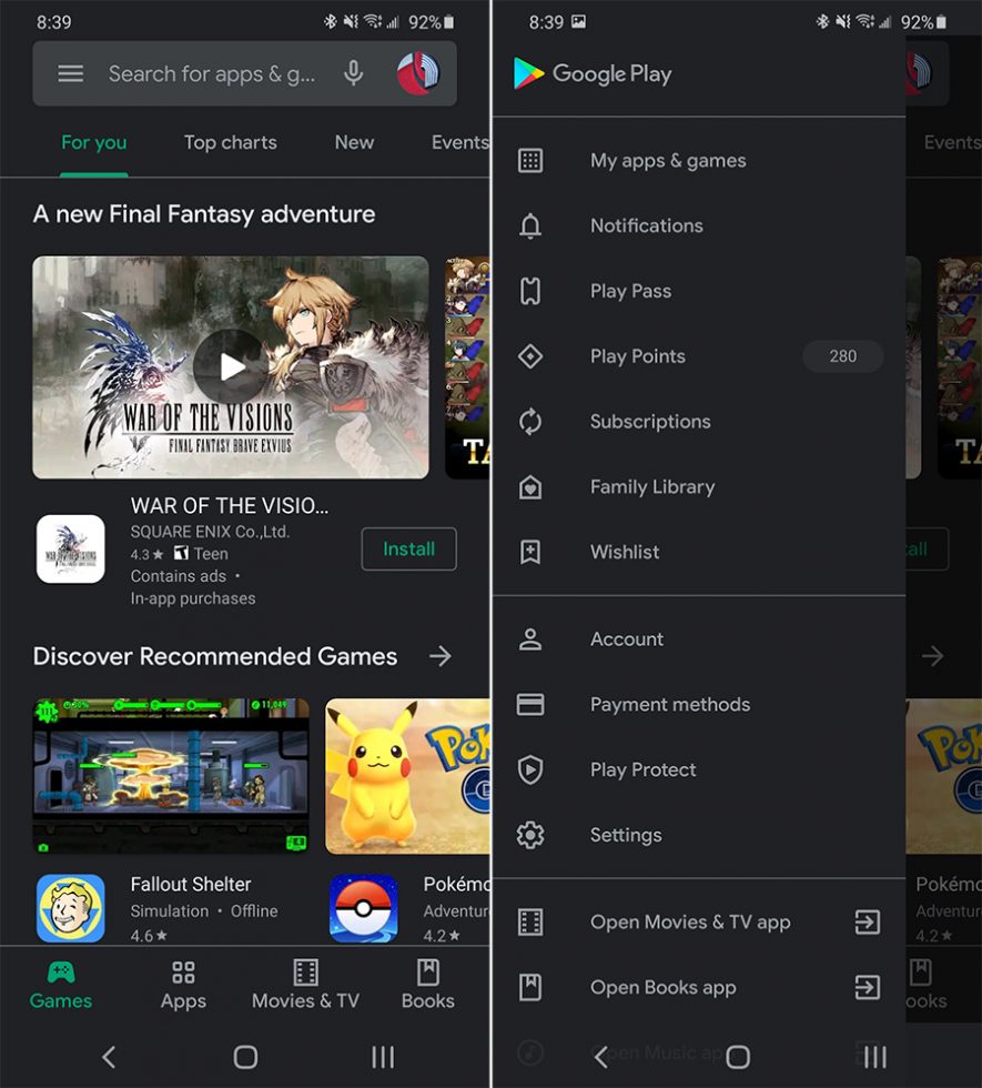
A Google Play change/update began widely rolling out yesterday that brings the app store in line with other Google app designs from the past year. The subtle change should make it easier to switch accounts for those of us with multiple Google accounts on a phone.
The move is a pretty minor one that simply relocates the account switcher out of the side menu and puts it in the top right corner, within the search bar. You’ve seen this look on Gmail, Google Keep, Drive, Google Photos, Maps, Google Voice, and more.
Oh, you’ve had this change for some time now? That’s not surprising, since Google started testing this change on devices in recent months. In fact, of all the devices I own, I received this change on a Pixel 3a at least a month or more ago and could never get it to show up elsewhere. Google even teased it two weeks ago in a dark theme announcement. So yeah, it’s not necessarily super new, but is now available to all from what we can tell.
What I really love about this design tweak is the fast account switching. If you happen to have multiple Google accounts on your device, don’t forget that you can swipe up or down on your account image to switch to another account. This trick works in a bunch of other Google apps too.
If you aren’t seeing the change, try closing your Google Play store from running tasks and then re-open.


Collapse Show Comments