Samsung One UI 2 Gets an Official Reveal With Smarter Dark Mode
We may earn a commission when you click links to retailers and purchase goods. More info.
Samsung’s One UI 2 was given an official reveal yesterday at Samsung’s Developer Conference. During that reveal, Samsung told us what’s new and whether or not there are new goods to get excited about. For the most part it’ll be a familiar One UI experience, but there are certainly new items to talk about.
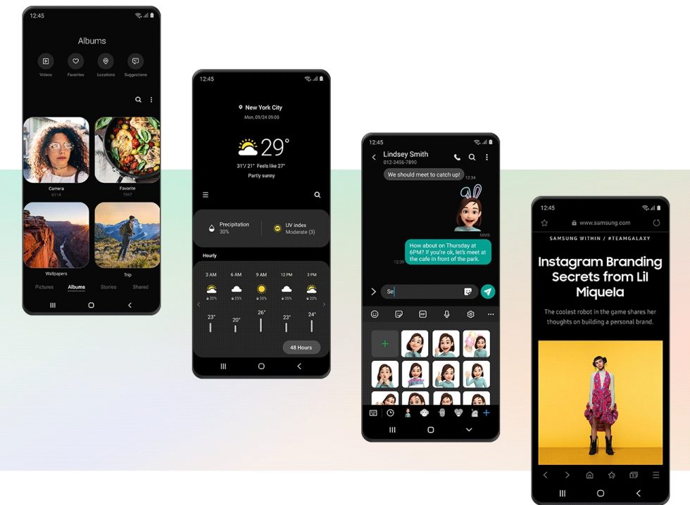
With One UI 2, Samsung tried to clean up UI elements from last year by tightening things up, like in notifications, where they take up less space overall. Even incoming call pop-ups or volume sliders are smaller and without text, so that interruptions are less hostile. The roundness to everything in the UI has been improved too.
Additionally, Dark Mode is now smarter, Samsung says. They didn’t exactly say what that means, only that there is an “enhanced” Dark Mode that softens the display and makes sure your eyes are comfortable at all times. I think what they mean is that they darkened more apps.
Some other things of note:
- There are now “vivid moving icons” for your apps. Think animated app icons, depending on the app, but probably mostly just for Samsung system apps.
- There are more digital wellbeing or digital wellness settings to show your usage, help you manage screen time, etc.
- And that’s mostly it…
Did anyone get in the beta? We tried and failed.
// Samsung

Collapse Show Comments