
For me, I enjoy having a device with all of the premium specs along with the large ultra high resolution display, so I went with the Galaxy Note 10+ for review purposes. Kellen, on the other hand, appreciates smaller devices so he went with the Galaxy Note 10. He’ll have a review for that device coming soon.
I’ve reviewed or at least used every Note device Samsung has released since the Galaxy Note 2. It’s crazy to think how far we’ve come since then, and if you’re curious how this phone stacks up against other phones on the market right now or if you should think about upgrading, that’s what this review is for. Let’s get to it!
This is our Galaxy Note 10+ review.
The Good
Specs
In the specs department, the Note 10+ is the pinnacle of what Note devices should be — large, overpowered beasts with no concern for your pocket size or wallet. The phone features a 6.8″ QHD AMOLED display (3040 x 1440, 498ppi), Snapdragon 855 processor, 12GB RAM, 256GB storage, 4,300mAh battery, triple rear camera setup + one TOF camera, single selfie camera, ultrasonic fingerprint reader, stereo speaker setup, S Pen, the ability to “Superfast Charge” and wireless charge, IP68 rating, as well as Android Pie with Samsung’s One UI on top.
- Official: Galaxy Note 10+ Specs
Note phones should represent the best of what’s available in the world of Android and the Note 10+ does that easily. Besides the missing headphone jack, which I’m not concerned about whatsoever but do admit there’s plenty of room for one, I can’t think of anything this phone lacks.
Display
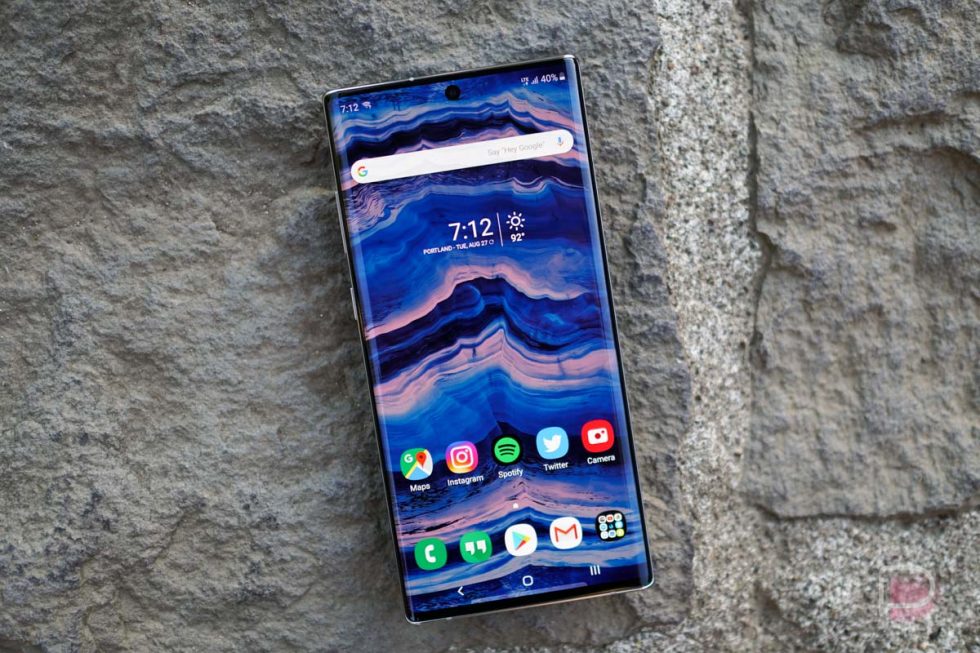
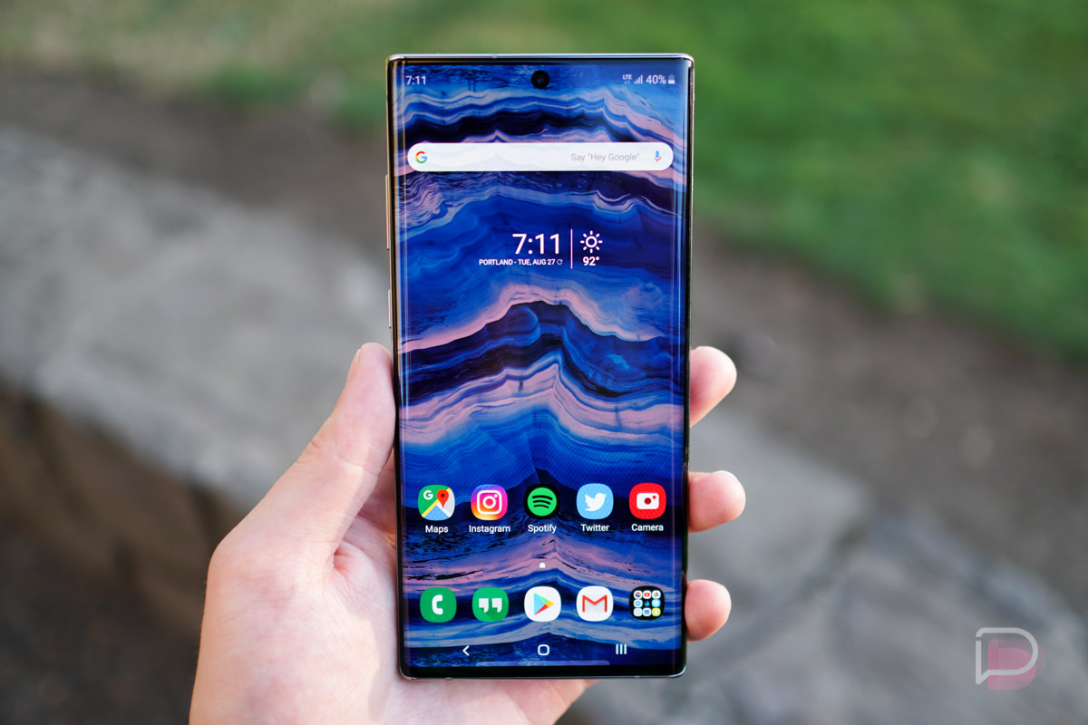
If you take what DisplayMate says as information you can trust, which we do, then you’ll already know that according to them, this is the best smartphone display on the market. But besides data points and a bunch of words that don’t really relate to real-world usage, I can vouch that at least compared to other phones I’ve used, this 6.8″ QHD display is absolutely incredible to look at.
The colors are punchy and well saturated, while contrast levels are just right. I feared that coming from a OnePlus 7 Pro with its 90Hz refresh rate that I’d be begging to get off this display’s 60Hz, but really, I can’t tell a difference throughout my usual days of usage.
I also feared that 6.8″ was going to be tough to get my hand around, (Tim’s inner monologue note: I hate to say this next part!) but thanks to the curve of the display and the hardware itself, consuming media and playing games while out on the town or while just sitting on the couch is really enjoyable and easy to do on this large panel.
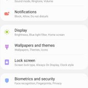
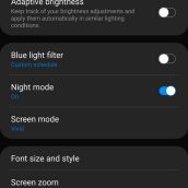
As for settings on the display, Samsung offers its usual list of customization options. Under Screen Mode, I opt for Vivid, but users can choose a more Natural appearance. Under Advanced settings, you can also swipe through individual RGB values to tune the display however looks best to you. The display also includes a blue light filter for the bedtime usage, ability to choose screen resolution (HD+, FHD+, and WQHD+), and there’s also a toggle for increased touch screen sensitivity.
Camera
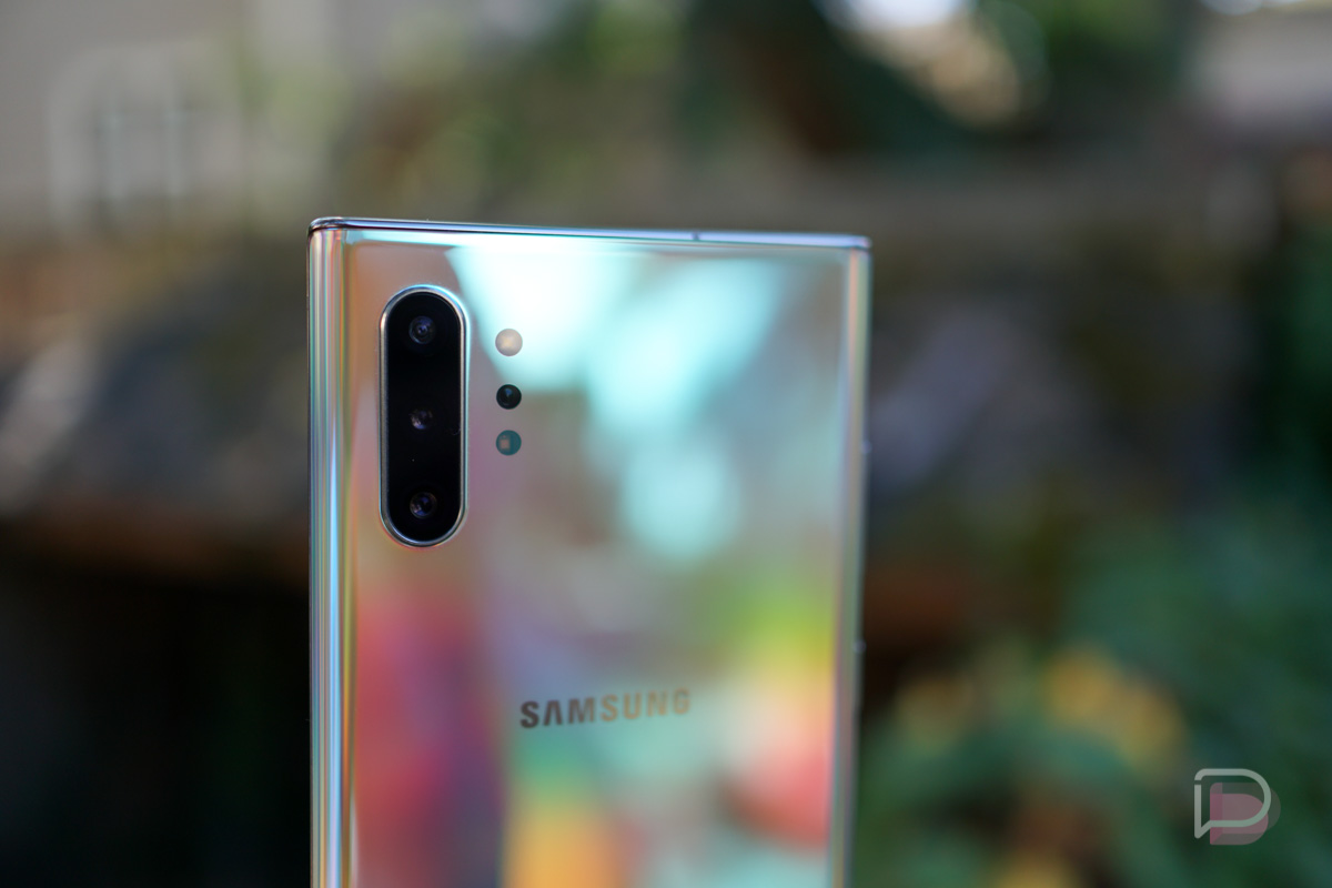
On the back of the Galaxy Note 10+, there are four cameras in total. There’s a 16MP Ultra Wide, 12MP Wide Angle, 12MP Telephoto, plus the DepthVision Time of Flight (ToF) camera. In terms of raw picture shooting, the Galaxy Note 10+ excels in most categories that I attempted to shoot in during my review period. I do wish I was able to capture a few more night shots and darker environments in general, but didn’t have many good opportunities.
For performance, the cameras are fast to focus on subjects and the initial shutter speed is fast. However, I did notice that when shooting shots at a rapid pace that the phone can have troubles keeping up with my finger. There aren’t many cases where I need to take a ton of shots in a short period of time, but it can be problematic in certain instances.
As for modes, there is no shortage of them. There’s Live Focus, Pro, a dedicated Night shooting mode, Panorama, Slow-mo, Super Slow-mo, Hyperlapse, Food, and Instagram mode. I used about 4 of these, and if you’re an average camera phone picture taker, you probably won’t dive too deep into these either. However, that Pro mode can be insanely clutch with controls for shutter speed, as well as individual controls for color temp, tint, saturation, highlights, and shadows. The Pro mode is very comprehensive for those who take time with their shots.
One mode Samsung is really pushing for the Note 10 lineup is the revamped video shooting modes and video editing software. Besides the ability to enable a Super Steady mode inside of videos, which is limited in terms of aspect ratio and filter support, the Live Focus Video mode is pretty sweet. In this mode, you can control bokeh strength and also apply a few fun filters while shooting. Lastly, at least for the mode talk, there’s a 3D scanner app available for “+” models of the Note 10. Thanks to that ToF camera on back, you can scan things with your phone, then actually interact with the scanned models via the camera app. It’s cute, but not something I’ll ever use.
Back to my impressions, my favorite thing to shoot with Samsung phones are flowers and landscapes, mostly because I love seeing the uber-rich colors the display can produce. Everything seems hyper detailed and borderline exaggerated, which I don’t mind at all. If you’re capturing photos for memories, there’s nothing wrong with a bit of exaggeration.
Here are some camera samples. No edits have been made except for resizing and the compression of uploading to this site.
Lens Comparison: Wide angle, Standard, Telephoto
Hardware
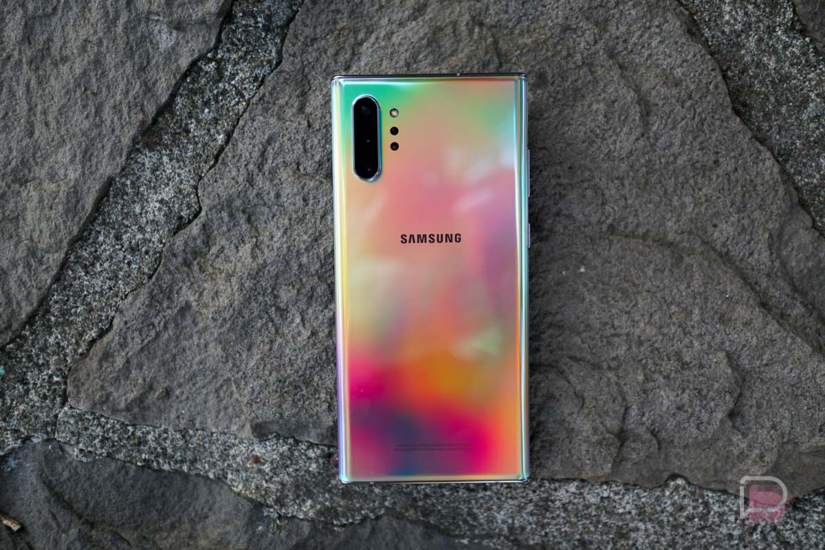
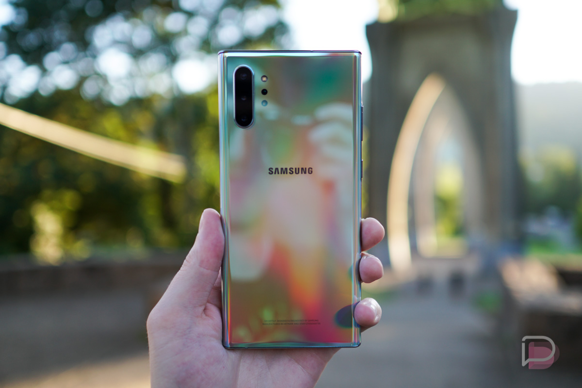
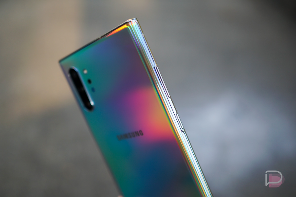
Besides the display, the hardware of this device is probably my favorite aspect of it. I have the Aura Glow colorway, and seriously, this phone is fire to look at. In-hand, it’s very Samsung in terms of the glass and metal usage, but with the minimization of bezels and severe curve of the display, using and looking at this phone is unlike any other. You’d imagine that a 6.8-inch display-packing device would be difficult to wield, but Samsung has worked its magic and made the phone very comfortable to use with one hand. As someone who uses their phone with one hand constantly, this is appreciated.
Samsung advertises this phone as being impossibly thin, but if you’re looking for a decent comparison, I’d look at the Galaxy S10+. That phone is measured at 7.8mm thin, while the Note 10+ is measured at 7.9mm. If you can’t find a place to get this phone in-hand for comparison’s sake, its height is nearly unmatched by most phones on the market. It stands at 6.4″ tall (rounding up from its exact 6.39″ measurement). Other phones near that height are the Pixel 3 XL at 6.22″, the OnePlus 7 Pro at exactly 6.4″, and the LG V50 ThinQ at 6.27″. But again, I find this phone more usable than all three of those, simply because the curved body and display, along with how thin it is. I know we preach about disliking curved displays, but on phones of this size, it’s a must to be curved for usability.
For weight, you might be surprised the first time you lift this phone off a table or out of your pocket. It’s surprisingly lightweight. It weighs in at 196 grams. For comparison, the Pixel 3 XL weighs 184g, the OnePlus 7 Pro weighs 206g, and the V50 ThinQ weighs 183g.
One hardware aspect that has me a bit disappointed is the rear camera hump. I understand that these lenses and sensors need that depth to be good and all, but dang, can’t we get them flush yet? LG is actually teaching Samsung a lesson in this category right now, but I imagine in the future flush rear cameras will be very common.
Battery
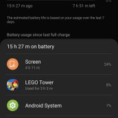
I’ve used the Note 10+ for exactly one week and have zero issues with the 4,300mAh battery. I’ve actually been rather impressed. I’ve had the display cranked to the highest resolution the entire week and I’ve used the phone for a ton of gaming and YouTube viewing. My typical usage in any given day is off the charger at 7AM-ish and then plugging it back in at night around 11PM-ish. Every night this past week, I was going to bed with 20-30% battery left, sometimes more. If you wanted to stretch that battery life, that’s completely doable. First thing I’d do is crank that screen resolution down to either 720p or 1080p. Then, throw on Night Mode for the day and see how far that gets you. Of course, you can always start enabling the phone’s built-in power saver settings that are designed to make the phone last a very long time away from a charger.
This phone is capable of Samsung’s 45w Superfast Charge, but of course, that’s an added $50 accessory you have to purchase. I’m not a fan of that, and besides, the in-box charger works just fine for my usage. If you need more juice in a shorter period of time, it’s something to consider. 15w wireless charging is also built-in.
Software
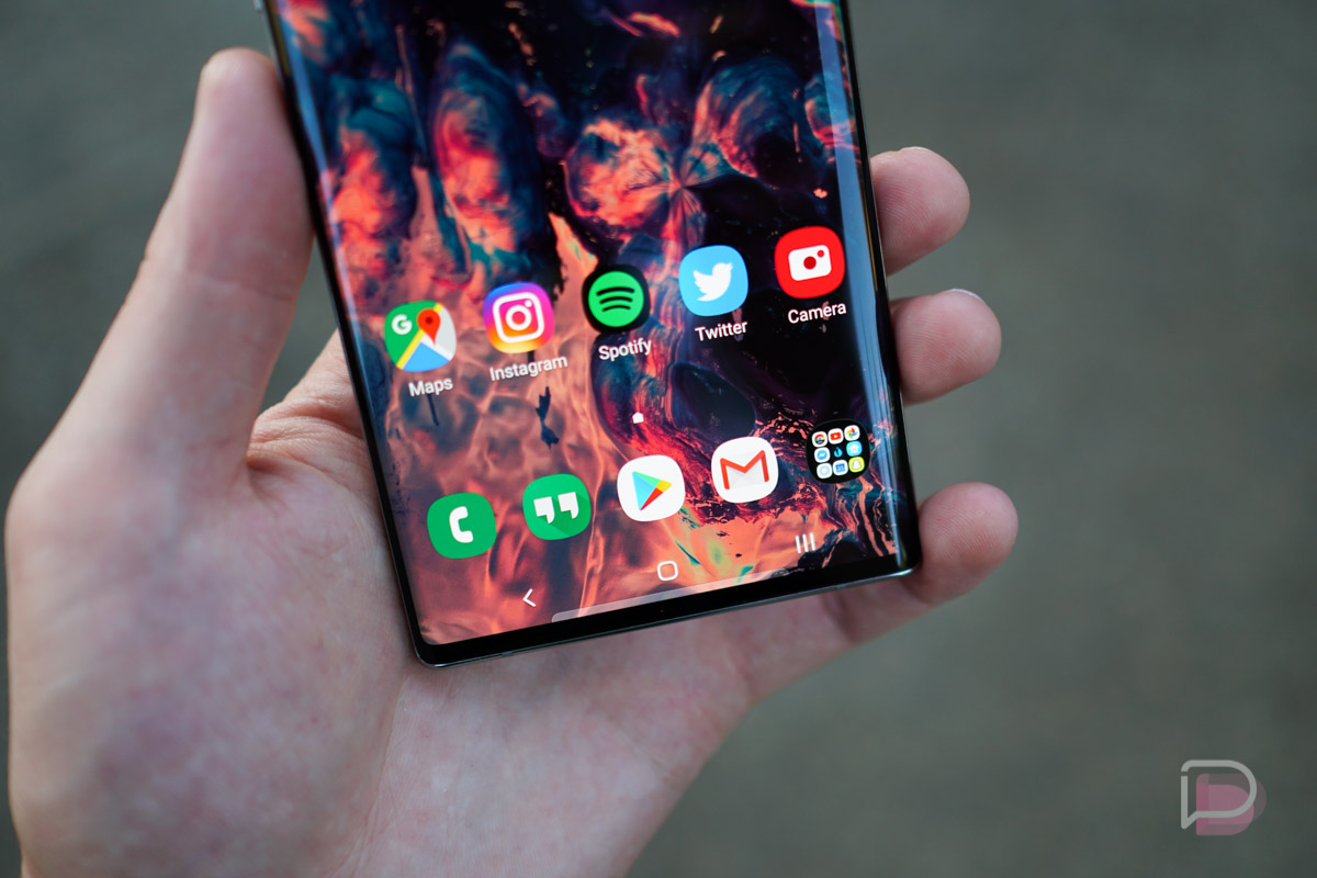
Coming from past Samsung devices, One UI has grown on me so much. Samsung did an excellent job designing it and you can tell that one-handed usage was thought of greatly in its development. I know some folks still aren’t convinced, but back in the day once I was done with Samsung phone reviews, the first to go was the launcher. On One UI, once my review is complete, I don’t change anything. Besides swapping out Samsung’s keyboard app for Gboard, I hardly change anything on the software side.
Coupled with the high-end specs, this UI flies and the only real thing I miss is the pill navigation option that’s available on Pixel and OnePlus devices. Samsung’s gesture navigation is not ideal, but once Android 10 arrives on this phone, I assume Google’s gesture navigation will be available and I would probably use that. For now, I’ll rock the classic 3-button option.
Highlights on the software side include a Dark Mode that I don’t mind looking at, unlike Android 10’s (it’s a little too blacked out for me), Smart pop-up view (not new, but I like it) that lets messaging apps have pop-up bubbles when a message comes in, and the built-in screen recorder feature is also clutch for gaming sessions.
There are literally too many software highlights to list, but others worth mentioning include the built-in theme manager for changing up the system’s look and adding custom icons to the interface, the new Link to Windows option for connecting your device to your computer for instant access to texts and incoming notifications, plus Edge Panels are still baked in for a whole tray of useful side widgets that include app and contact shortcuts, weather, reminders, and Live Messages.
The thing that has always been certain for Note phones and Samsung phones in general, is that there is no shortage of software features. In past years, Samsung’s software made most of this feel like bloatware, but on One UI, they all feel like added features that you can simply choose to enable or disable. It’s not a major hassle like it used to be.
S Pen
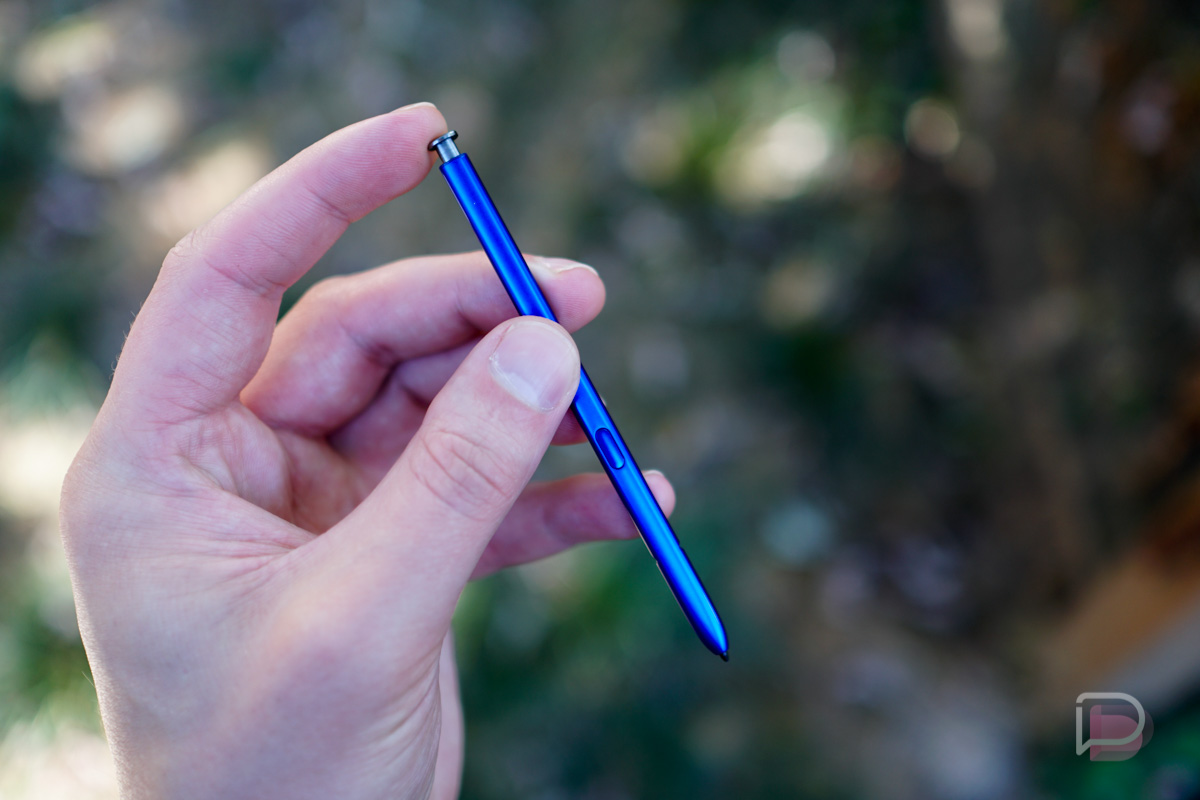
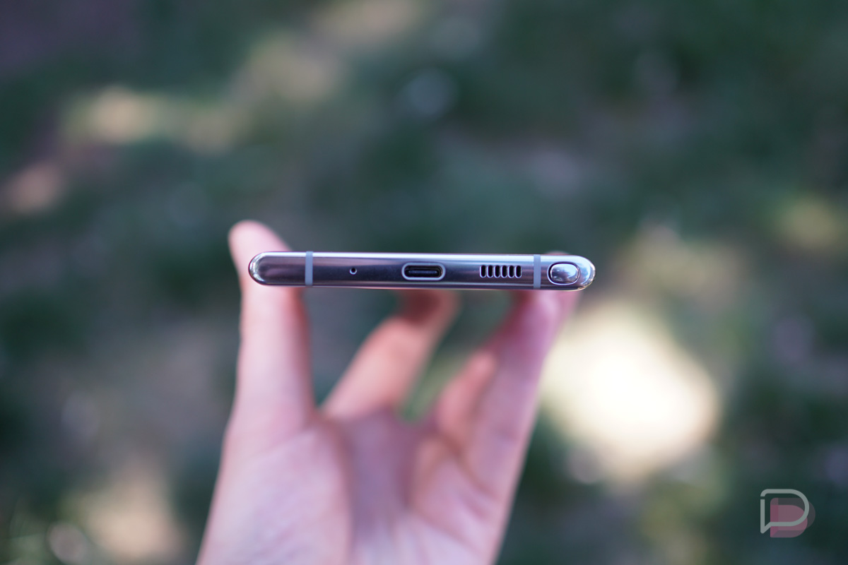
The one part about Note phones I always have to force myself to use is the S Pen. I actually forget the S Pen exists most of the time, but that’s Samsung’s fault for making it blend into the bottom of the device so well. However, for my review, I used the S Pen. It’s cool and I’m sure S Pen fans will love the improved usability it has, thanks to a suite of redone sensors for the stylus.
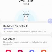
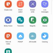
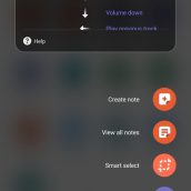
There are, of course, tons of different things to do with the pen. You can create notes, draw doodles, write on top of a screen, translate text, and plenty more. The S Pen is also getting more melded together with Samsung’s apps. For example, when inside of the camera app, you can snap pictures and videos with the S Pen, as well as use gestures with the S Pen to switch cameras and scroll through modes.
As for using Samsung’s new Air Gestures, it’s not a great experience. Allow me to break it down. When the S Pen is removed, there are gestures you can perform with the pen within different apps. For example, you have Spotify playing some music. A single click on the pen’s button will play and pause music. A double click with skip the track. That works fine.
Where things get wonky is when you attempt to perform the gestures for volume up, down, play previous track, and play next track (even though there’s a dedicated double press action for that function). To do the Air Gesture, you have to press the button, then drag your pen in a particular direction. This has to be done just right or the pen will take that button press as you trying to pause playback. If you hold the button too long, it’ll open up the camera, but that action can be customized to whatever you want. There were plenty of occasions where I’d press the button and drag the S Pen up in an attempt to turn the volume up, but no, instead it’d either pause playback or bring up the Air actions for Media help menu. Very frustrating experience and then I’m reminded why I never take this thing out of the device. I’ll just use my finger, thanks.
From my own experience, albeit limited, I can tell that anyone who has enjoyed past S Pen iterations will be very happy with the new one. If you love Note phones but don’t ever use S Pen, this one won’t change that feeling, believe me.
Sound
The Note 10 lineup features no headphone jack, but if you weren’t aware, there are plenty of other ways to listen to tunes and enjoy media. For example, there is Bluetooth. There is also USB-C. The phone also has stereo speakers that get exceptionally loud. Besides the no headphone jack, this thing is a media consuming behemoth in terms of audio.
Like on the Galaxy S10 lineup, Samsung has included a bunch of different software tweaks for audio lovers. If you dive into the Sound settings menu, you’ll find a dedicated section for sound quality and effects. Personally, I run with Dolby Atmos enabled plus the equalizer set to Rock. There is also a Custom setting that can be enabled, granting access to a nine band EQ for fine tuning things. The Atmos setting can also be applied with different presets, such as Movie, Music, and Voice.
When using the stereo speakers, this phone reminds me very much of the LG G8. You see, the phone’s upper internals features a reverberation chamber (iFixit teardown details this) for channeled waves of sound through the earpiece. This chamber adds a sense of depth and bass to audio, which as a music lover, is very pleasing. When turned up, you will feel this phone vibrate quite a bit via that chamber, making it feel like the LG G8’s Crystal Sound OLED display.
Somewhere in the Middle
Fingerprint Reader
Like on the Galaxy S10 and S10+, Samsung has included an ultrasonic fingerprint reader on the Note 10 lineup. When it works, it works very well, but unfortunately, there are times where I’ll get the dreaded “No Match” text on the lockscreen after having placed my finger on the display. It’s a pretty common occurrence, something that didn’t happen as often when we used fingerprint readers that weren’t infused into our screens. Those were simpler times, apparently.
Power Button Location aka “Side Key”
One thing about this phone, and this aligns with my Software section as well, Bixby doesn’t seem packed down your throat on this device. However, Samsung has removed the usual Power button on the right side of the phone, and instead, kept the Side Key that sits below the volume rocker on the left side. This is where the dedicated Bixby button used to be.
Now, I could probably tell you that Samsung has a psychologist on the hardware design payroll, because why would you ditch a Power button before you ditch a Bixby button? If you really want folks to start using that Bixby button, you don’t remove it from where it was, you change its role, but you also allow users to determine what the button does. That’s what Samsung is doing here and I dislike it very much.
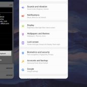
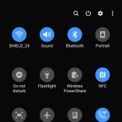
In the Settings, there are two actions to perform with the Side Key, a double press and a press and hold. With a double, you can quick launch the camera, open Bixby, or open an app of your choosing. For press and hold, you can either wake Bixby or access the power off menu. Because you can have that Side Key not act as a power off menu, Samsung went ahead and baked those options into the notification pulldown, right next to the Settings gear button.
Now, because this button doesn’t need to be used for Bixby, I’m totally fine with it. This move doesn’t bother me at all. I simply feel that it’s a little strange Samsung would ditch where the power button has been located for years, just so they can potentially get a few more Bixby clicks.
Other Notes
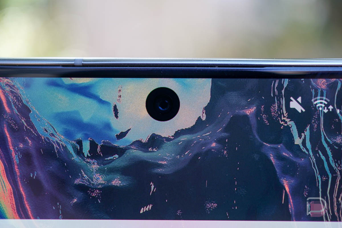
- Girlfriend Impressions: “The phone is pleasantly light, considering its size. I love the screen. The punch hole camera is pretty cool. It’s a beautiful phone, but the backside feels like plastic. I’m not the biggest fan of the curved screen, but overall it’s a pretty cool phone.”
- Samsung Pay: I love you, Samsung Pay. It’s easy to use and super convenient.
Price and Availability
The Galaxy Note 10+ starts at $1099 with 256GB storage, while the 512GB option is $1199. Being a Samsung flagship, the device is available at most retailers and all major US carriers.
It seems like a safe bet to assume that the 1TB Galaxy S10+ option didn’t sell well, since it’s not available for the Note 10 lineup. It was crazy expensive anyway. Also to note, Samsung’s trade-in program continues to be pretty darn good at the time of this writing, saving folks up to $600 off the purchase. That’s not bad at all!
Shop Galaxy Note 10, Note 10+
Videos
Unboxing
First 10 Thing to Do
Gallery
The Verdict
If you’re a Galaxy fan, whether that be Galaxy S or Galaxy Note, buy this phone. It’s incredibly good, even if you’re upgrading from a Galaxy S9 or Galaxy S10 model. Even if it’s just for that Aura Glow color, it’s worth it. However, if you’re using a OnePlus device or Pixel phone, I don’t know if switching over to this device is the right move. While it certainly has everything you’ll need, the software is a pretty major difference, and the speed at which you’ll receive software upgrades probably won’t impress you like they would on phones from those other companies.
Speaking solely on Galaxy Note phones, this is Samsung’s best ever. That, to me, is undeniable. No, I won’t knock it for lacking a headphone jack or something silly like that. This is essentially the perfect Android phone, capable of doing hard work, having fun and everything in between.










Collapse Show Comments