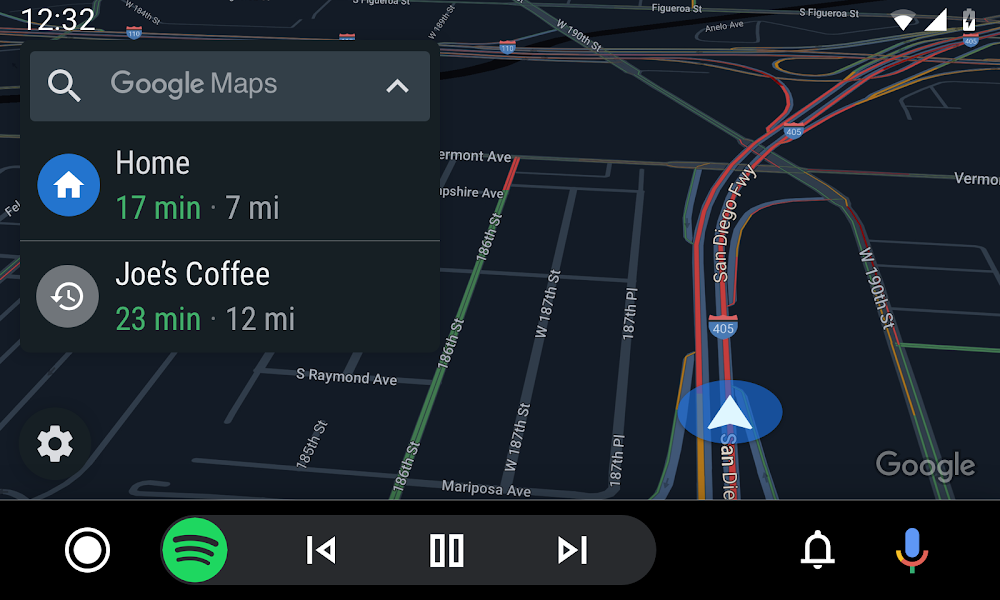
Back in May, Google announced a refreshed look for Android Auto, and this week, it’s rolling out.
There are a few major changes to take note of. The big change is a dedicated app drawer, which will lay out all of your Android Auto compatible apps for easy access. On some icons, you’ll notice a Google Assistant button. Pressing on it will have Assistant read out certain details, such as upcoming events should you tap on the Calendar icon.
Multitasking is also a major part of this update. For example, while inside of Google Maps and navigating where you need to go, music controls will be embedded directly onto the bottom of the UI, allowing you to control playback while still having your maps up. This was always a major frustration of previous interfaces.
There is also a dedicated section for notifications. In the bottom right you’ll see a bell, which is where users can access incoming messages and calls, with Assistant able to read out the messages and send replies on your behalf.
Google says all users should have the new interface within the next few weeks.


Collapse Show Comments