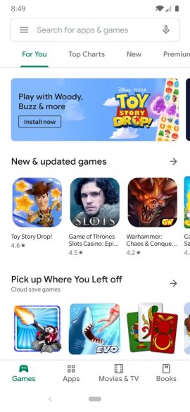
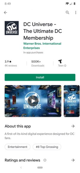
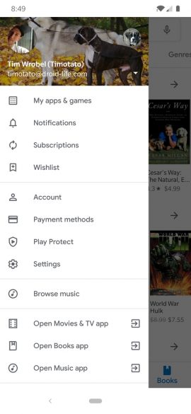
The latest redesign for Google Play is now hitting user devices, spotted by the fantastic folks over on reddit.
The major change is the addition of a bottom bar for navigation. There are dedicated sections for Games, Apps, Movies, and Books. Previously, these sections were at the top of the app, and honestly, it was a pretty funky UI to navigate. This seems much better.
Of course, you’ll also notice that essentially the entire UI has been whitened. We assume this move, like the other Google apps to receive this treatment, is in anticipation for Android Q’s dark mode that is currently in beta testing.
If you have yet to receive this redesign, you can either be patient or follow the link below to be taken to a download page.


Collapse Show Comments