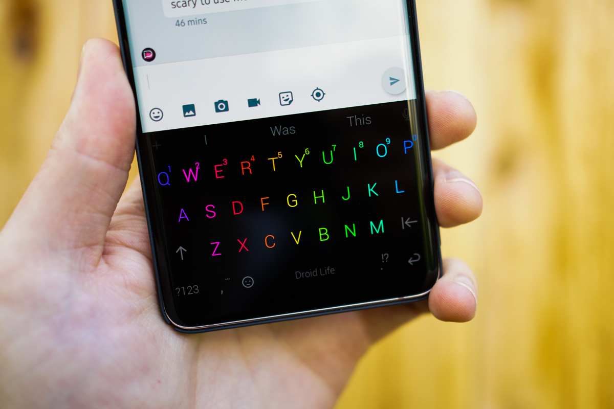
I was recently scrolling through Instagram and saw an ad for Chrooma Keyboard. This is funny because I’ve known about Chrooma since it was a fledgling beta of an app in January, 2016. Since then, the keyboard has seen a lot of development, and what struck me the most about the advertisement I saw on Instagram was a new theme it showcased. Chrooma calls it the RGB theme, but basically, it’s like having Razer’s Chroma lights powering your phone’s keyboard theme, which is pretty hot.
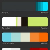
The RGB theme is part of Chrooma’s “premium” offering, which is priced as an in-app purchase at $4.99. This unlocks the RGB theme itself, as well as other premium themes and features.
What doesn’t translate well via a photo is the motion the RGB theme performs when enabled. If you’ve ever seen the wave of color that is projected from a Chroma PC keyboard, then that’s what you can expect from the theme. It’s trippy and mildly distracting at first, but now that I’ve been using it for a few days, I really enjoy looking at it while I swipe my messages out.
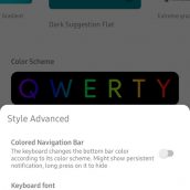
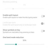
Looking over what’s been added to Chrooma over the years, it’s a lot like Gboard still, but with more features. Not only are there greater theme options than what Google’s own keyboard offers, but Chrooma also delivers a dedicated GIF search function (required to have in 2019), emoji suggestion, automatically changing navigation bar according to the app you’re in, plus the same gesture control and multi-language support keyboard users need. Again, a lot of Gboard, but there’s more emphasis placed on personalization.
It was when Gboard came to be that I stopped using Chrooma, but now that I’ve rediscovered it, along with this RGB theme, I think I’ll be sticking with Chrooma for a while.
Check it out and let me know what you think.


Collapse Show Comments