
As the smaller and less expensive of the three Galaxy S10 phones, I know this won’t be the phone for everyone, but there are some choices that Samsung made here that drew me in. And boy, did they deliver those choices, as well as the rest of the typical Galaxy S package in a way that has won me over. Shall we talk about it?
This is our Galaxy S10e review!
-
ALSO READ: Galaxy S10+ review!
The Good
Size and Design
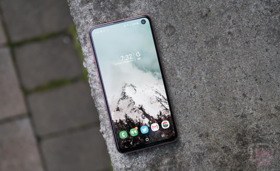
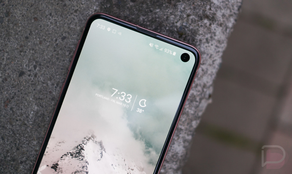
Prior to Samsung announcing the Galaxy S10 family, I wrote a piece about how I needed Samsung to ditch their awful-to-use curved screens and I’d probably be ready to give their phones a serious shot in 2019. That was an unpopular opinion, but since Samsung loves me (they actually don’t – they won’t even talk to me or return my emails) they gave me just what I asked for in the S10e. It has a flat display! Not only that, but it’s also not obnoxiously large like all other Android phones not named the Pixel 3. I’d argue that the Galaxy S10e may be the perfect size for a smartphone.
So what you’ve got with the Galaxy S10e is a phone that’s slightly shorter than the Pixel 3, yet a tad wider and with a larger display (5.8″ in the S10e vs. 5.5″ in the Pixel 3). They were able to create a footprint like that thanks to the full-screen experience, with minimal bezel and a hole-punch for the front camera. I thought the Pixel 3 was a great size, but with the Galaxy S10e, you have a phone that tricks reality some. That display taking up almost every inch of the front comes off as large to your eyes, yet my average-sized hands have no issues getting to all corners at all times.
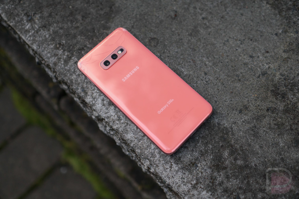
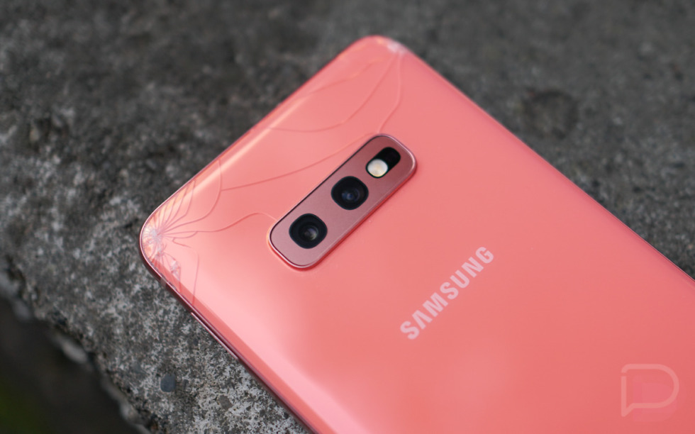
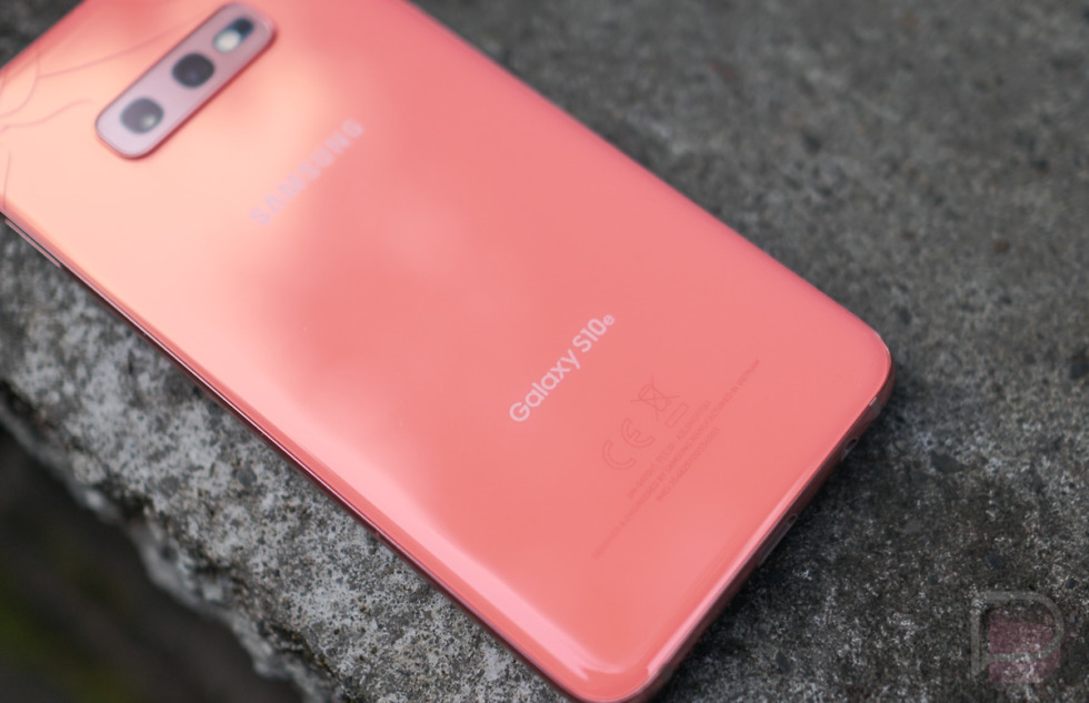
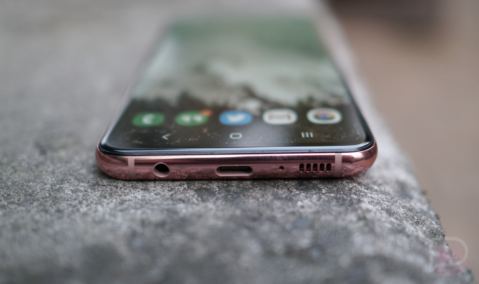
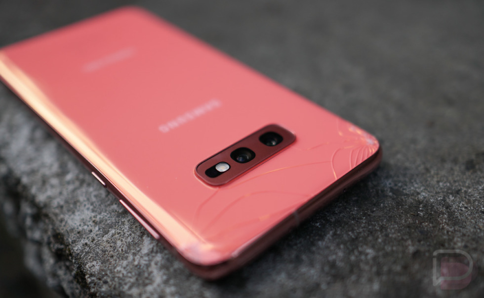
And of course Samsung tossed in the materials that the industry would call premium (not me) that feel nice in the hand. There is glass (which I broke on day 4) and metal everywhere, subtle curves at the edges, and the best colors Samsung has ever used in a set of phones (The S10e gets an extra color blend in the camera housing too, something the other S10s don’t have.). The S10e looks like a phone you’d want in your hand and pocket, yet with a slightly understated vibe compared to the other S10 family members. Maybe that’s why I like it, because it’s different and probably won’t be the phone your friends have unless they too are different.
I do have one complaint (outside of the back glass), though, and that’s with the power button. Samsung is using its power button on the S10e to double as a fingerprint reader. I have no problem with that move. What I do have a problem with is the placement of the button. It’s way too high up the right side, so high that it’s frustrating to try and reach it, even with a smaller phone like this. I actually feel bad for Galaxy S10 and S10+ users, because Samsung did the same thing with those phones’ power buttons and those phones are even larger. Come on, Samsung, this was a bad idea.
Specs
What’s up with the specs on the Galaxy S10e, they are super sh*tty or something, right? No, not really. They aren’t as good as the S10 and S10+, though! Are they good enough? Probably, for most, especially if you thought the Pixel 3 was fine in the specs department.
The S10e has a pretty similar setup, it’s just that Samsung left out a couple things, likely to keep the price lower. It has the Snapdragon 855 processor, IP68 rating, NFC and MST, 802.11ax WiFi, wide and ultra-wide cameras (12MP Dual Pixel + 16MP), fast wired and wireless charging, and Android Pie under Samsung’s One UI.
The differences are in battery size, display resolution and size, lack of a third rear and secondary front camera, and in-display ultrasonic fingerprint reader. The S10e has the smallest battery of the three phones at 3100mAh, no telephoto lens on the back, a single 10MP selfie camera, and a 1080p display instead of QHD. It’s RAM configurations only start at 6GB too (S10 and S10+ start at 8GB).
But look, it’s specs destroy the Pixel 3 and it costs $50 less. So again, not too much to complain about here.
Display
The 5.8″ 1080P D-AMOLED HDR+ Infinity-O display used in the Galaxy S10e is a good one, but that should surprise no one who knows Samsung phones. While not a QHD resolution, I don’t think I’ve been one to stress over that in recent years as I believe 1080p is enough pixels for a small-screen smartphone experience.
The S10e’s display has an amazing range in its brightness that allows it to get incredibly dark in darker situations, while having the ability to get super bright when out in the daylight or sun. It might be the most versatile display I’ve used to date. You have available Vivid or Natural color profiles for those who either like to live life juicily or for those who eat vegan. Viewing angles are excellent and touch sensitivity is where you’ll want it as you browse around.
Samsung included a blue light filter and night mode as well, so you can truly relieve your eyes at night. Adaptive brightness is here to learn your usage patterns too. It’s all here, is what I’m getting at.
I do think the display shines a bit warm for my taste, particularly at night is when I notice it. I’m not sure if the adaptive brightness is to blame or if Samsung has a background process that is purposely warming the display in later hours. I don’t like it, though. If I want a warmer display tone, I’ll turn on the blue light filter. When that’s off, I prefer a cooler display and that seems to be lacking here at times. The Vivid mode lets you choose a cooler display temperature, but it doesn’t seem to do much at night. Something is up.
Camera
Alright, let’s talk camera. The Galaxy S10e features a dual rear camera setup comprised of a 12MP Dual Pixel wide angle (77°) camera with dual aperture at f/1.5 and f/2.4 next to an ultra-wide (123°) 16MP camera at f/2.2. The S10e is missing the third telephoto 12MP f/2.4 camera that you’ll find on the S10 and S10+. On the frontside, you have a single 10MP Dual Pixel f/1.9 camera, the same as is on the S10. It doesn’t include the second 8MP RGB selfie depth sensor from the S10+.
For software, Samsung’s camera experience is a bit bloated, but that just means they included every single modern camera feature you can find in a smartphone. You have auto and Pro modes, Live Focus (portrait) mode, video, super slow-mo, slow motion, panorama, and hyperlapse modes too. There’s even Food and Instagram modes.
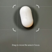
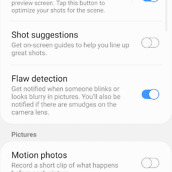
The video camera can shoot in 4K at 60fps if you want it to. It has auto-HDR, does Motion photos, stabilizes your video, and will attempt to optimize the scene you are shooting in to get you the best shot.
As far as the layout of the camera app goes, it’s pretty straight forward. Your shutter button is easily accessible, there are toggles to flip between the wide and ultra-wide camera, and gestures to get you between modes or to the selfie camera. It’s a semi-complex app, unless you just shoot in auto – then you’ll be fine.
How are the results? I think the Galaxy S10e takes solid photos.
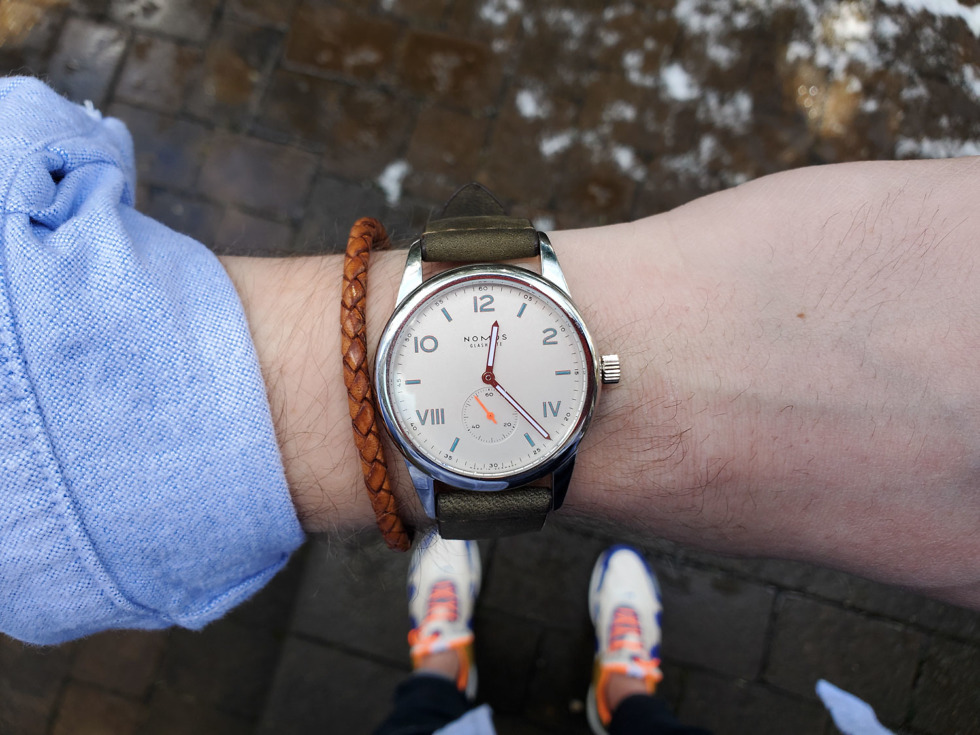
From indoors to outdoors, looking at the shots now, I think the S10e delivers. It’s flexible because of its ability to switch between wide angle and ultra-wide angle, it’s super fast to load and focus, and it gives you any control you could need depending on the situation. I typically shoot in auto for reviews and I like the majority of the photos you are seeing above.
At times, the S10e’s camera can be inconsistent in deciding if it should ramp up colors and contrast or stay natural. And if you crop in on a photo, you’ll probably notice whacky processing around edges. Those are areas Samsung can address down the road via software update. That said, it’s awesome at capturing depth even without the telephoto lens. In the various drinking establishments I visited during this review period, the S10e dominated when rooms were well and poorly lit. It’s a great food and beer camera, a good kid camera, and certainly one I always felt I could rely on.
Software and Performance
For years, I’ve made it clear that I don’t like the way Samsung does software. That’s now changed with the implementation of their One UI on top of Android Pie. One UI is a great Android skin because it is in many ways a punchier version of what Google releases, but with a bunch of features built into it that Google probably won’t implement for another five years.
Sure, I still hate their horizontal app drawer and Bixby, but those are things I can change or disable. What I do like is the clean UI with conveniently placed touch points, countless controls over the display setup, a dedicated night mode, more lock screen customizations than anyone could ask for, the addition of Google’s Digital Wellbeing software, more controls over sounds and vibrations, a set of “advanced” features that I find useful, and super speedy performance. I’d tell you more about all of those individual features, but you should just hit up that video section below for tips and tricks, First 10 Things to Do, etc. to find out what this little guy is capable of. There is a good hour worth of software tours down there that elaborate on everything I just mentioned above.
All you need to know is that Samsung finally created a really enjoyable software experience that I’m not even feeling the need to complain about. That’s saying something!
On the flip side of that, Samsung is never going to update their phones as quickly as Google does. The S10 family does run Android Pie and picks up most monthly security patches, but Google has begun testing Android Q already. Once Q is released (probably in August), you shouldn’t expect Samsung phones to get it for months.
As for performance, the Snapdragon 855 and 6GB RAM on the model I’ve been testing have been a fun combo. This phone doesn’t slow down. It holds enough apps in memory, unlike the Pixel 3, the UI is quick to move around, whether that’s from the app switcher or launching directly, and the stutters we see on other phones aren’t there. Again, I’m using the base model S10e for this review (128GB storage + 6GB RAM) and there hasn’t been a hiccup to tell you about.
Price and Availability
The Galaxy S10e is a reasonably priced phone for what Samsung is delivering. I noted above that its specs blow the Pixel 3 away even with a starting price that’s $50 lower. You get so much more in the S10e than Google’s smaller phone, including a bigger and better display, more RAM and storage (+ SD slot), more cameras, newer processor, a bigger battery, faster WiFi, headphone jack, and non-proprietary fast charging. With a starting price of $749 that maxes at $849, you could argue that the price is a deal on most days.
Since this is Samsung, you can get the Galaxy S10e everywhere. All of the major US carriers sell it, plus it comes in an unlocked model too. There are four colors to choose from and two RAM and storage options. Unlike Google’s phones, Samsung doesn’t do many exclusives these days, especially not with its flagship line. They want customers from all walks of life to buy them, not just those stuck on Verizon.
Somewhere-in-the-Middle
Battery Life
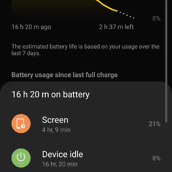
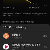
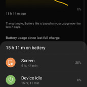
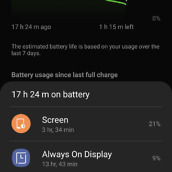
The only real complaint I have with the Galaxy S10e is in the battery life department. It’s just average at best. I initially tested the international model on T-Mobile and battery life was pretty disappointing. I then switched for the past week to the US unlocked unit (still on T-Mobile) and have seem a good amount of improvement. Most days, I’d say I averaged 4 hours of screen on time and had 20% or so left on a charge around 10PM. With those numbers, we’re looking at 15 hours or so off the charger from when I first got up in the morning.
That’s not great, but not terrible. The 3100mAh battery here, that supports both fast wired and wireless charging, is good for a day with medium use and a mix of WiFi and LTE. If you are absolutely hammering on the phone, you might want to top it off with a charger before leaving work if you think you’ll need juice left before you go to bed.
The Galaxy S10e is not a battery champ.
Bixby
I don’t want to spend much time here, but yes, Bixby and a dedicated Bixby button are included in the Galaxy S10e just like they are on all Galaxy S and Note phones of recent years. I don’t use Bixby and do everything in my power to turn it off because I’ve never found it to be good or useful. If you came to this review hoping I’d have discovered the brilliance of Samsung’s latest edition of its assistant technology, you will leave disappointed. In all the videos below that dive into the best parts of the S10e, you’ll see me tell you over and over again how to turn Bixby off. Is that fair and should I try Bixby one more time? I don’t care – I’m not interested. Sorry. I use Google Assistant.
Other Notes
- In the box: Samsung gives you a decent package alongside the phone. You get a USB-C cable, Samsung adaptive fast charger, and a pair of AKG-tuned ear buds in white. The international model I ordered came with a free case in the box as well, but that doesn’t appear to be a thing here in the US.
- Accessories: One thing to always keep in mind when it comes to Samsung phones is the accessory situation. Because Samsung is the king of smartphones, there are dozens and dozens and dozens of accessories available for their new phones the minute they drop. Not only does Samsung produce its own cases, wireless chargers, and earbuds, you’ll get so many third party choices that your choices will be endless.
- Reverse wireless charging: This a thing in all of the Galaxy S10 phones, including the S10e. For those not familiar, it’s a feature that allows you to use the battery in your Galaxy S10 to wireless charge another device. It’s probably not a good idea to charge someone else’s phone, but it could be good to charge something like the Galaxy Buds.
- Fingerprint reader: As mentioned above, the fingerprint reader on the S10e is not embedded in the display like it is on the S10 and S10+. Instead, you’ll find it coupled into the power button. It can be an excellent fingerprint reader at times. If your finger is placed properly on it, it’ll read faster than most. However, if you are slightly off as you try and find its awkward placement, you may have to tap a few times to get it to work. That’s not a deal-breaker situation, it’s just one to be aware of.
Video
Unboxing
First 10 Things to Do
Tips and Tricks
Cool Stuff!
Gallery
The Verdict
As you can tell, I’m a big fan of the Galaxy S10e. It’s a phone I can easily recommend people buy, unless they are looking for the battery life champ. This phone is average in that department, but it’s just so good in so many others.
The camera is quite impressive, the display and performance and software and design are incredible, and the price is not insulting. The color choices are fun, RAM and storage configuration options are there for those with deeper pockets, and availability makes the S10e so accessible. Samsung is offering ridiculous deals out of the gate too, like $550 off for trade-ins.
If you were for some reason waiting for my verdict before buying, go ahead and pull the trigger. Pretty sure I’ll be on the S10e for the time being when I’m not reviewing something else.










Collapse Show Comments