Honor’s View20 smartphone is currently the only globally available device with a hole punch in its display, so over the past week, I’ve been using it to get ready for the upcoming Galaxy S10 that is also expected to feature one, albeit on the opposite side of the display. It may seem rude to only use this device as a warmup for what’s to come, but considering Honor has yet to announce US availability,yet has launched the phone for almost all other markets, it seems entirely possible it may never be sold here.
Because of the aforementioned US availability issue, we won’t dive as deep as we usually would in this review, but instead, give you the overall gist of my experience with the View20 and its hole punch display design. Should the phone come to the US market, I’ll be sure to leave you with a yay or nay vibe in case it’s on your radar.
This is our Honor View20 review.
What’s good and what’s bad?
Specs: The Honor View20 features a large 6.4″ FHD+ display (2310 x 1080) with punch hole cutout in the top left corner for the front-facing camera, Kirin 980 chipset, up to 8GB RAM, up to 256GB internal storage, 48MP rear-facing dual camera system, 25MP front-facing camera, 4,000mAh battery, rear-facing fingerprint reader, USB-C port, 3.5mm headphone jack, an internal liquid cooling system to dissipate heat, triple antenna WiFi system, and Magic UI 2.0.1 running atop Android 9 Pie.
This spec sheet is solid for any phone, let alone a phone priced at only 569€ in Europe. It’s directly comparable to the OnePlus 6T, and from my experience, they’re very similar devices. The software is the biggest difference, of course, but if you were attempting to decide which one to get, that might be difficult to do. Honor has a really attractive package in this phone and I think they priced the View20 just right.
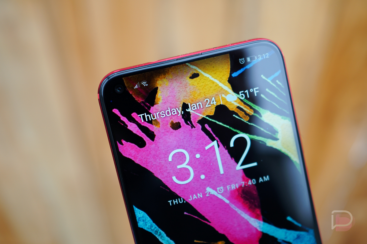
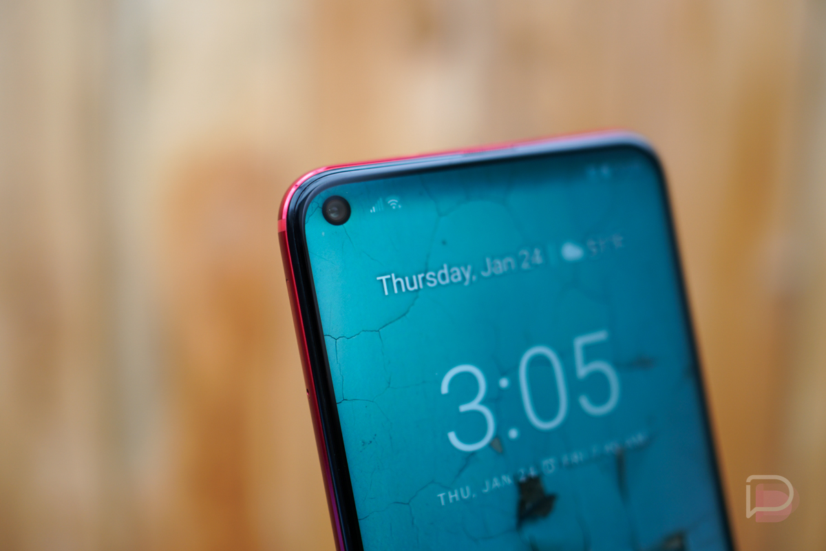
Display: While a FHD+ display isn’t anything to write home about, the headlines for this device always surround the hole punch cutout for the front camera. What is it like in the day-to-day operation of a phone? It’s fine, certainly better than the massive notch on the Pixel 3 XL. In terms of getting in the way, it’s somewhere between the teardrop notch on the OnePlus 6T/Essential Phone and a bigger notch. For the most part, not much is ever happening in the top corners of your phone besides system icons and notifications. When playing movie titles from Google Play Movies, the content never expands over the cutout, so it’s not blocking any viewing area. On YouTube videos, you can expand the content to completely fill the screen, which will then have the cutout blocking a small portion of the screen. However, most of whatever it is you’re watching likely won’t have much action in the bottom corner, so in my experience, having the cutout was never an issue in terms of something’s watchability.
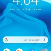
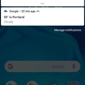
For me it comes down to this: Would I rather have an all-display experience or hefty bezels? This phone seems like a happy middle ground, with the very large screen-to-body ratio, but still enough bezel to operate the phone however I need to. I can hold it comfortably with one hand and send out a text or lay in bed and watch a video without fear of covering the screen up due to a lack of bezel. I don’t mind the cutout at all, with exception to how it affects notifications. This point will be different on the Galaxy S10 because its cutout is apparently on the right side, but the View20’s cutout does force everything to be pushed to the right. That means more icons creeping towards the center of the screen, which kinda drives my minor OCD crazy. My entire beef, albeit a small beef, could be squashed if companies put the cutout in the middle of the notification bar. With that placement, we’d at least have a bit of symmetry and no need for cramped notification bars and oddly placed system icons. Because we’re not seeing that placement, I assume there’s some type of technical/mechanical limitation. Notches are always in the middle, so why are hole punch cutouts being treated differently? I have no idea, but I do know it would look better and at least symmetrical.
At the end of the day, I can happily report that the cutout has yet to affect how I use a phone, which I suppose is the most important point of all. I’m #TeamHolePunch, folks.
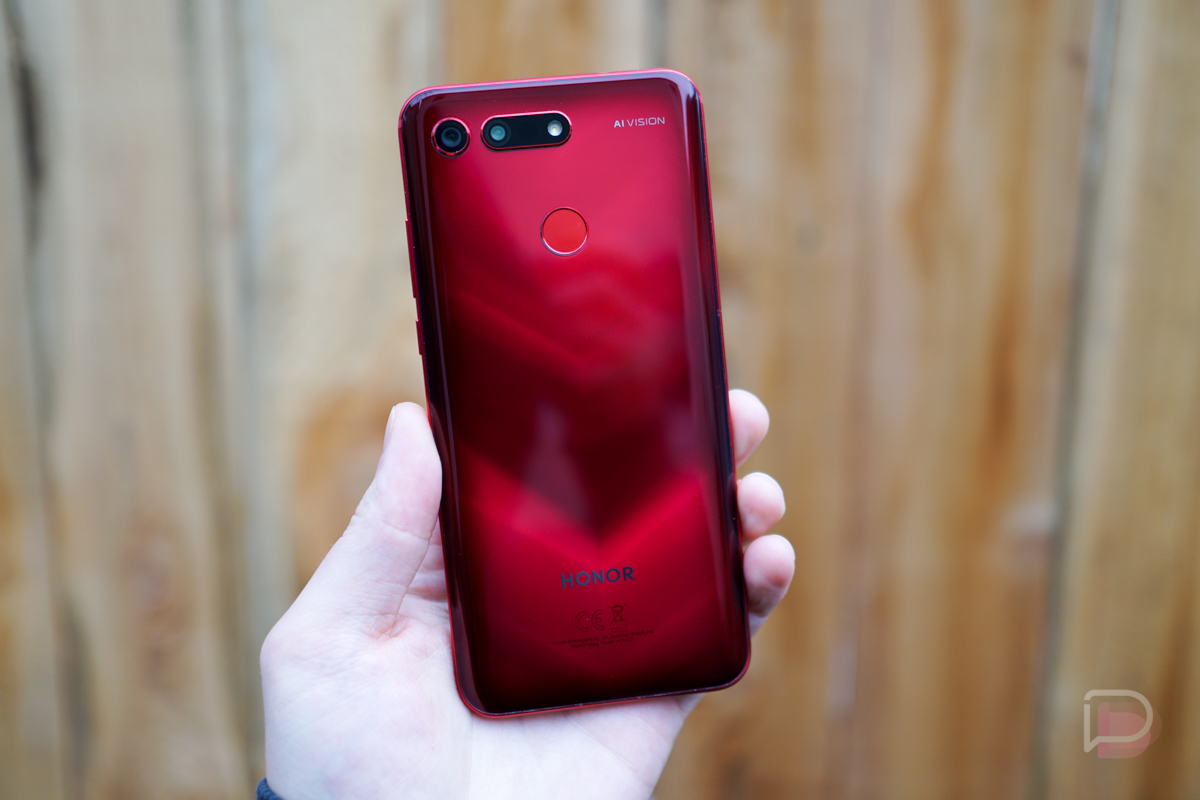
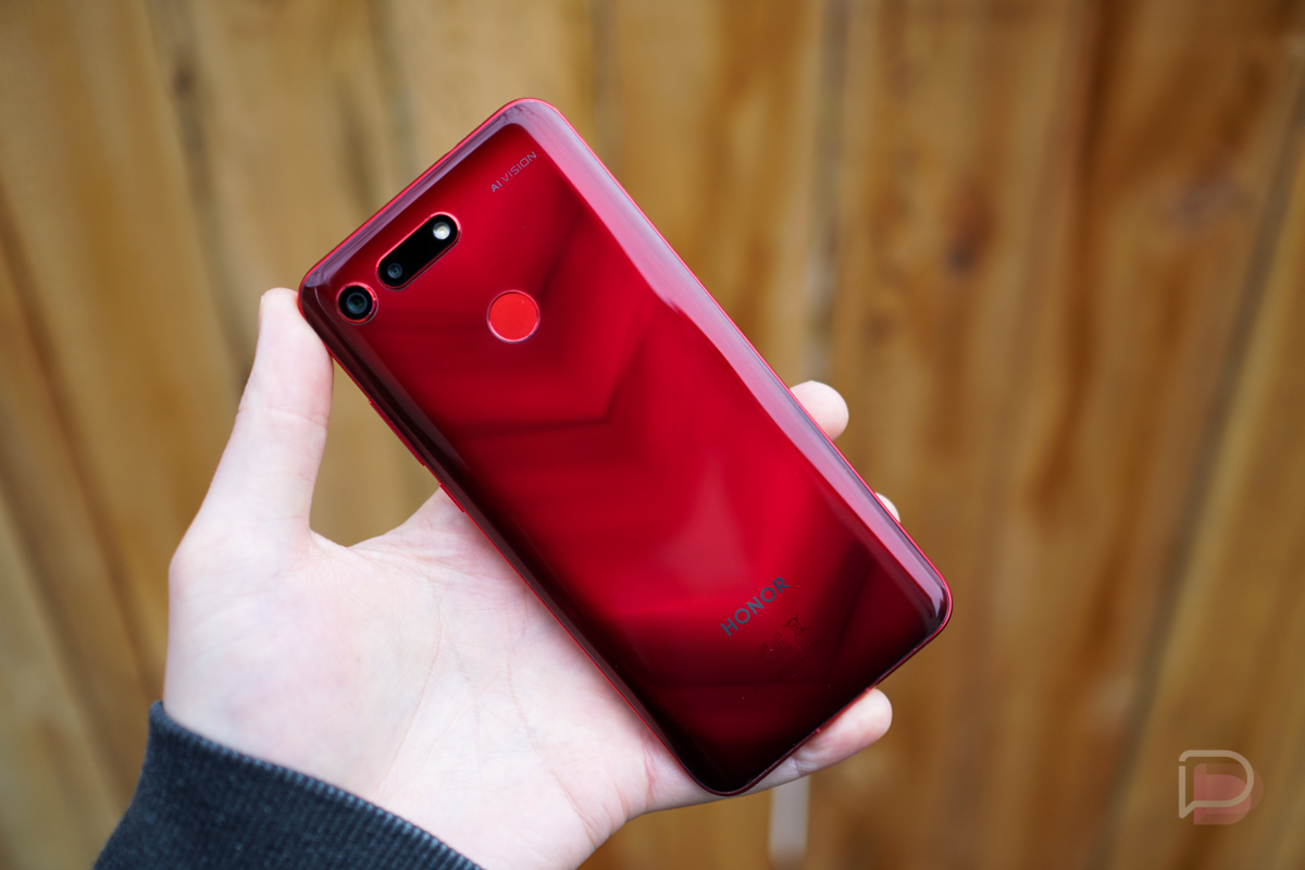
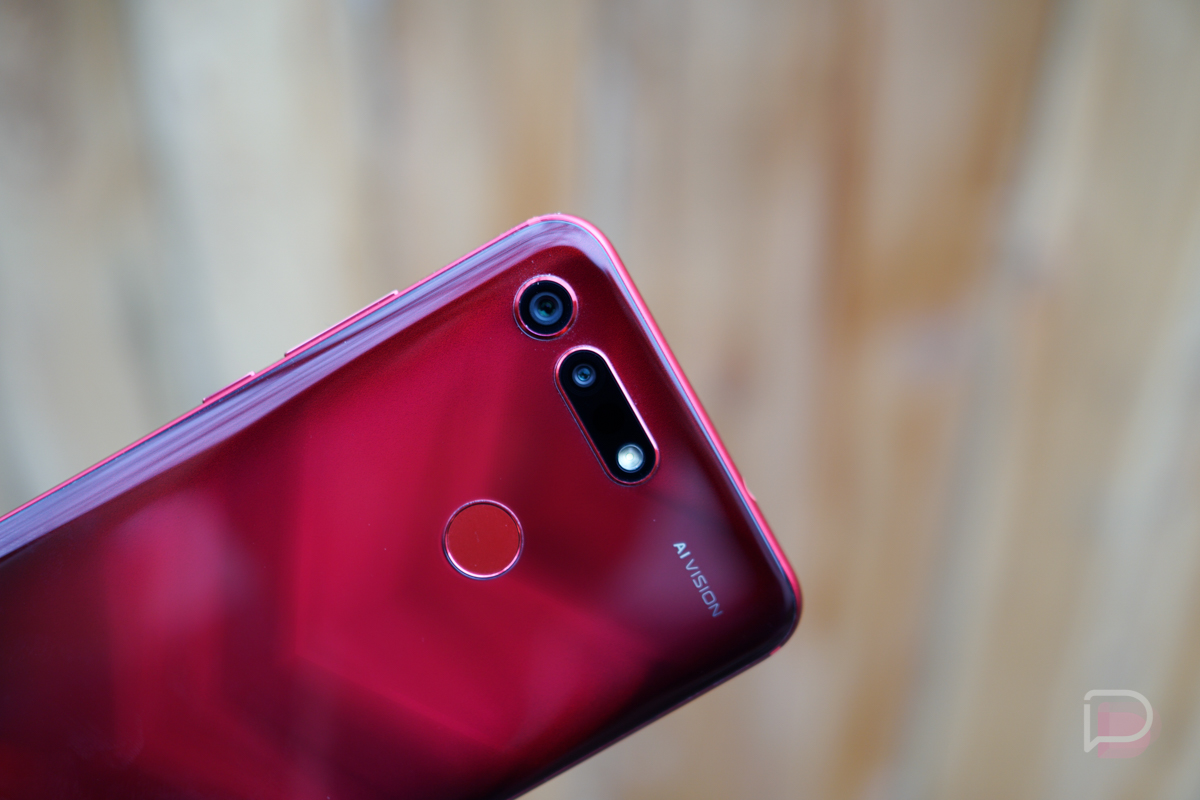
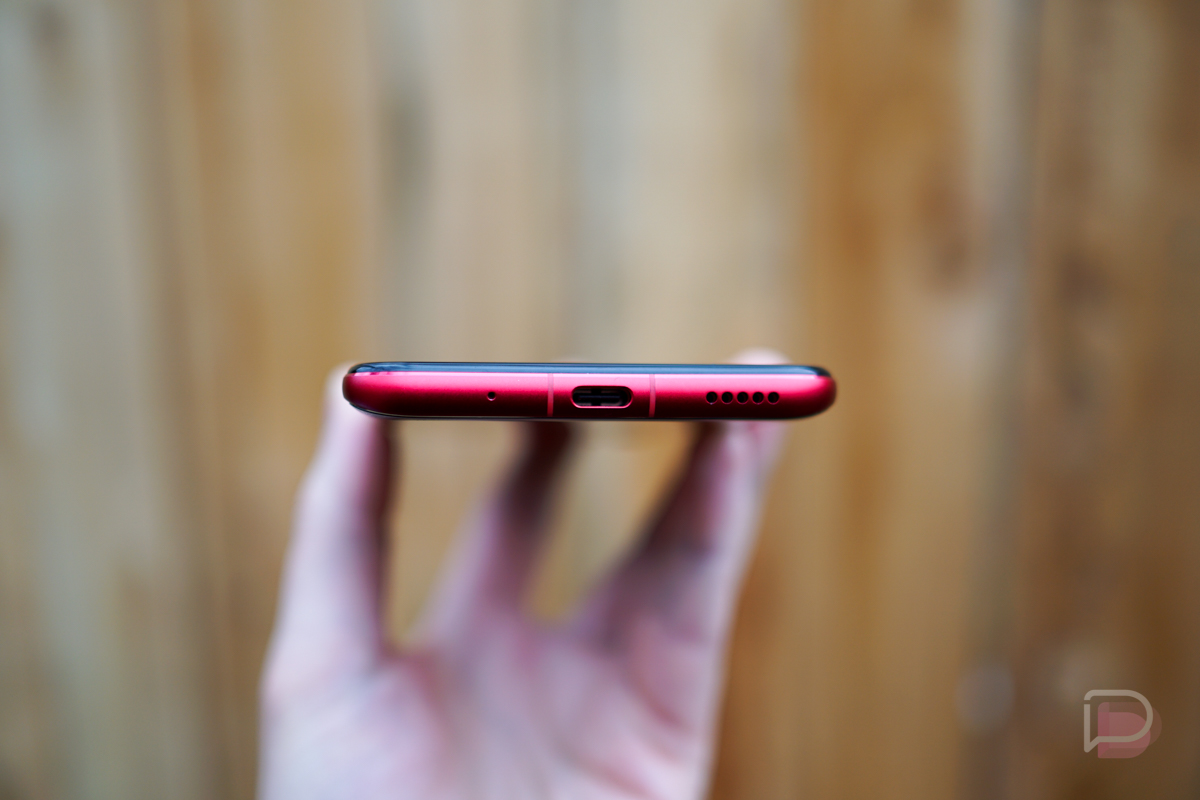
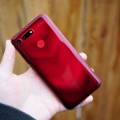
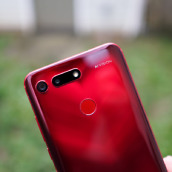
Hardware: The backside of the View20, both the Red and Blue versions, are total stunners. From what Honor says, it’s called an Aurora Nanotexture design, but regardless of what it’s called, the reflections you get off of these phones is pretty awesome. Beyond the backside, it’s a pretty unassuming phone design. On the back you’ll see the cameras and fingerprint reader, on the right side there are buttons for volume and power, the bottom has a USB-C port and speaker, and then the top has the headphone jack. It’s not a very heavy device, listed at 180 grams. For perspective, the OnePlus 6T is 185 grams, so it’s very similar to that phone in the weight category.
Software and Performance: This Magic UI 2.0.1 on top of Android Pie is just okay. It’s not great, but it’s not the worst ever. For one, customization options are very lacking, Even with a dedicated Themes option on the phone, you can’t actually customize all that much. You can change up the icons ever so slightly, but there is no Dark Mode or system wide themes like those on the OnePlus or Samsung phones.
One portion of the software I’m happy to see, dating back to my time with the Honor 8, are the knuckle gestures. I love this. Instead of a tap with your finger, you can knock on the screen with your knuckle, then draw a letter to open an associated app. For example, draw an M for music, C for Camera, or W for web browser. It’s a nice little addition that gets you into apps quickly from wherever you are.
As for performance, Honor sent us the 8GB/256GB model, and performance has not been an issue in any capacity. Apps open up snappily and quickly switching over to something else proves to be just as quick. The phones overall responsiveness is a welcomed change over the sometimes dragging experience I have on the Pixel 3 XL. No knock on that phone, but it does tend to stutter here and there. On this phone, I have none of that. Now, am I saying that all phones should have a minimum of 8GB RAM? No, but I don’t mind it one bit.
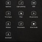
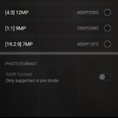
Camera: It’s hard not to get excited about the idea of a 48-megapixel rear facing camera. That’s a lot of pixels, and inside of the camera app’s settings, it shows you can achieve a resolution of 8000 x 6000. Big files. On the back, you’ll notice there are two cameras, but not a lot of attention is brought to that second sensor. I’ve used the phone for a week and haven’t seen any usage from it and I actually had to open up this phone’s reviewer guide to see what I can do with it. Apparently, it’s for 3D stuff, so I’ll just leave it there and probably not ever use it. Sorry, Honor.
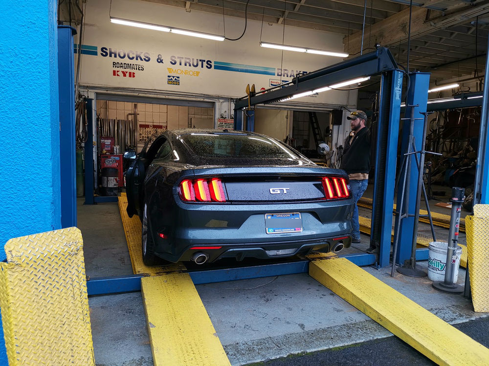
As for image quality and taking photos with the device, it’s a solid shooter. There’s an available Night Mode, not quite as good as Google’s Night Sight, but still completely usable. In some instances, when there is a lot of sunlight, some photos can be a little blown out, but when the lighting is just right, there is a lot of detail retained in the images. Offering even more detail is the phone’s AI Photography feature. With this, the phone takes multiple shots, then stitches the images together to create a very clear, sharp photo. This will help when taking landscape shots and retaining a high level of detail when zooming in. If I had one negative thing to point out, it’s that the software is rather aggressive when edge blurring. I think you’ll see what I mean in a few images below.
I’ll share some samples below, but overall, I’ve been enjoying this phone’s camera setup quite a bit.
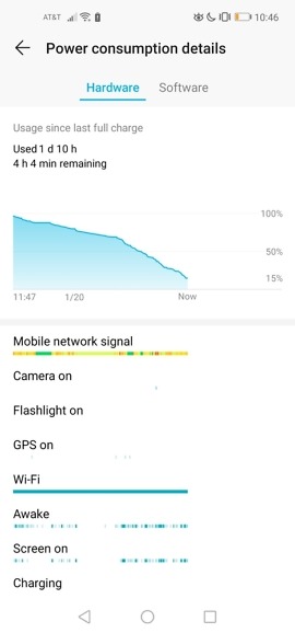
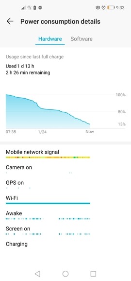
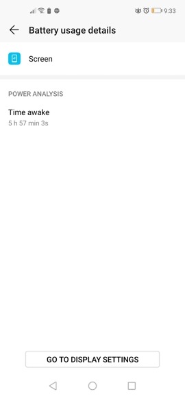
Battery Life: So far, the View20 has some of the best battery I’ve ever seen. I don’t usually get two full days of battery life from phones, but with this one, I have been with no problem. I’ve consistently gone from 7:30AM to the following night three times in a row now, and with all of the Twitter browsing, camera sample snapping, and Words With Friends tile laying I do, I’m loving it. I can never do this on the Pixel 3 XL, so in the battery department, I’m stoked.
External Speaker: The single bottom-firing speaker on this phone is not loud and doesn’t sound great. I’ve officially been spoiled by the many phones with dual stereo speakers now, so going back to a phone with a single external speaker has been a little rough. It’s forced me to remaster the fine art of cupping your hand to create a resonating effect for the phone, which honestly, kinda sucks. But hey, at least it has a headphone jack!
Availability and Price: Honor has announced that the phone is now available in many markets across Europe and Asia, but there is still no word on US availability. The price is set at 569€ for those markets, so if it does come to the US, expect something similar. Speaking candidly, we haven’t heard even the slightest peep from Honor or Huawei that would lead us to believe we’ll see this phone launch here. It most certainly could, but they can’t wait forever with plenty of other phones on the horizon. Naturally, we’ll keep you posted if we hear anything regarding a launch in the US.
Video
First Look and Impressions
Gallery
Should you buy it?
If you live outside of the US, I could easily recommend this phone to you. However, due to software that seems rather boring and tough to look at, I’d probably suggest the OnePlus 6T. If you want this hole punch cutout instead of the notch, by all means, check out the Honor View20. It’s been a lot of fun to use with its smooth performance and the battery life has been most impressive.
Now, for you US folk, I obviously can’t suggest you go buy a phone that isn’t available to you. However, should the View20 make its way here, it should at least be on your radar. And seriously, don’t knock the hole punch design. It’s really not that bad, unless you’re Samsung and are doing this.









Collapse Show Comments