This is going to sound weird coming from the guy who is regularly disappointed by all things Samsung, but the Galaxy S10 has grabbed my attention. There’s just two things left that I need Samsung to address and I’ll be fully onboard again. One of them is software related and the other, which I’m about to discuss, is a hardware-related gimmick that needed to go a long time ago.
On the software front – just to get this out of the way – you guys know I’m talking about timely software updates. Samsung has shown no interest in speeding those up, even as Google and Qualcomm have given them the tools to do so, so this post isn’t going to be about that never-ending battle. Instead, this is me complaining about the obnoxious-to-use curved displays they continue to include in every single damn phone, even as they serve no purpose other than to look pretty.
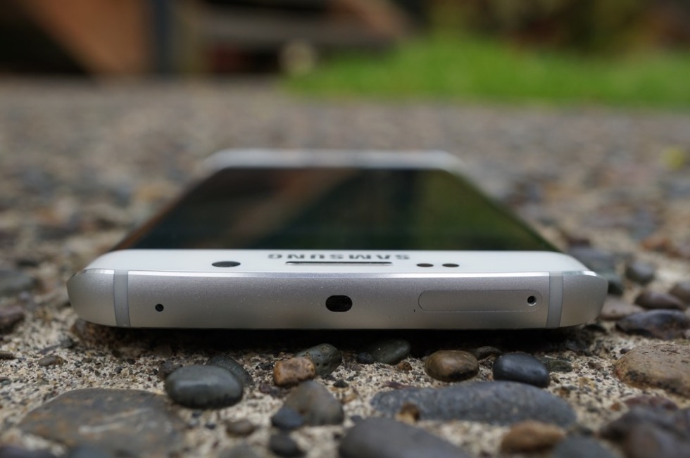
I’m being serious here. Samsung’s curved displays are awful. For years now, I’ve been trying to pinpoint what it is that I dislike so much about Samsung hardware, outside of all the glass, and I think I’ve figured it out – it’s the displays. As pretty as they look while on a desk or as I consume content, they are a nightmare to use because of those curved edges.
Android in general is built around swipes, whether they be an up or down swipe to get into apps or notifications, or edge swipes to access menus and change panels within an app. Samsung even built a special app edge feature to highlight the right side of their phones and the edge display they built for them. Almost all of Google’s apps contain a left-situated edge menu. Android requires a ton of edge-related swipes throughout a day. On Samsung phones, that regular swipe makes me want to smash things.
Something about those edges typically requires more than one swipe in order to properly register. You’d think I’d have gotten used to the mechanics of that gesture or figured out what Samsung needs for that to work every time. I haven’t. It’s been a frustration of mine since they debuted the dual-edged panel with the Galaxy S6 Edge.
The thing is, I don’t understand the point of this much curve. In that image at the top of this post, you can see that Google managed to slightly curve the edges of the Pixel 3. They did it with the Pixel 2 XL too. Most high-end phones have some sort of minor curve to their edges to help with in-hand feel, they just put the entire touch area within the flat portion. But Samsung, for reasons I’m assuming are only marketing related, has to make that curve extra dramatic with the touch area overflowing into it. Again, it does look kind of cool. What purpose does it serve, though?
I’m all for changing things up to try and improve usability. We’ve moved fingerprint readers from the front to the back to the front again as technology has changed. We saw notches run wild as manufacturers tried to go all-display. We’ve seen various forms of humps come and go, front cameras jump around, additional rear cameras arrive, moving pop-up parts, etc. All of that was done to make things better. A curved display was done because Samsung wanted to say, “Look at this sweet shit we did, bros.” Cool, you did it. What does it do?
With the Galaxy S10 starting to leak, it sure looks like the curved display is back once again. That’s disappointing. It’s disappointing because Samsung has finally put together a really nice skin to go on top of Android with their new One UI, knocking off one of our complaints about their phones. The UI is good enough that I tossed a SIM in my Galaxy S9 for the first time in months to give it some serious run. I really liked it. But something about using the phone pissed me off within 24 hours and I ditched it. It was the curved display. It drove me nuts.
We get it Samsung, you can curve things. You showed us. Bravo. Can we move on now?


Collapse Show Comments