The new Android Messages should have arrived on your phone today if it hadn’t already. That means you get the new super-white UI skin and optional dark mode. Hopefully, you like those two options a lot because two other changes that come with the update have angered many.
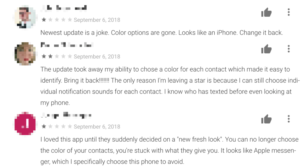
For one, this new Android Messages no longer allows for custom colors for conversations or people. Previously, you could choose a specific color for people, which according to reviews on Google Play, was highly utilized. There are still some colors, but they appear to be randomly used in place of missing contact photos or created by some system that none of us have quite figured out. Either way, the custom color options are missed and users of the app are telling Google about it.
Outside of the color rage, people are also not happy that the Android Messages widget is gone. I’m not sure why Google killed it off with this latest update, but it’s something that seems easy to bring back once they have time to splash this white skin all over it. At least, I’d imagine it would be easy to do. It’s a weird takeaway, though, since widgets are a big part of Android and messaging for those looking to be as efficient as possible.
So to recap, the new Android Messages picked up a fresh coat of white paint and optional dark mode as new features, but Google removed two of the most popular features at the same time. The 1-star reviews are flooding in to let Google know too.
Loving the new Android Messages or are you with color and widget mafia?


Collapse Show Comments