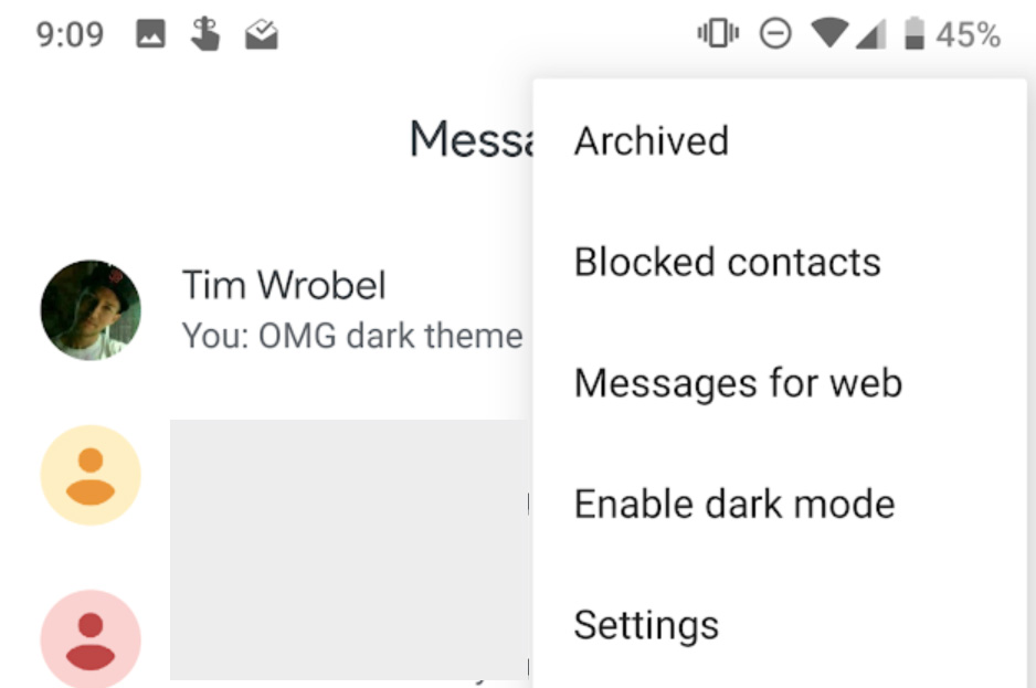
- UPDATE August 27: Over the weekend, a new update (3.5.052) brought back the dark mode and lighter theme, according to reddit users. We have no seen the update yet, but if you get it, follow the instructions below to activate the dark theme.
- UPDATE August 20: Google seems to have pulled the new dark mode and reverted everyone back that had already grabbed the update. That’s odd, but it has happened to our phones as well as numerous readers of the site.
Google is doing this thing with their apps that receive updates, where they’ve hilariously convinced everyone to call new UI changes “Material Design 2.” The funny thing is that nothing is really new or “2” worthy because it’s just a change from whatever accent color they were using to white. Nothing but white on white on white. And that sucks when you don’t like to be blinded by your phone with each use. It would be nice if those white changes were accompanied by dark modes, like with the new Android Messages update.
That’s right! Android Messages now has a dark mode in v3.5, which is rolling out starting today. I have no idea when you’ll get it, because Google hates the idea of you having nice things at the same time as your friends, but it is coming.
And when you get it, you’ll notice all the f*cking white everywhere instead of blue. You’ll also now find an option from the menu in the main screen that says, “Enable dark mode.” Do a dance, kid, do it. You deserve this.
Now, if Google would do the same to Phone and Contacts and probably every single other of their apps that are doomed destined to get this same “Material 2” refresh.


Collapse Show Comments