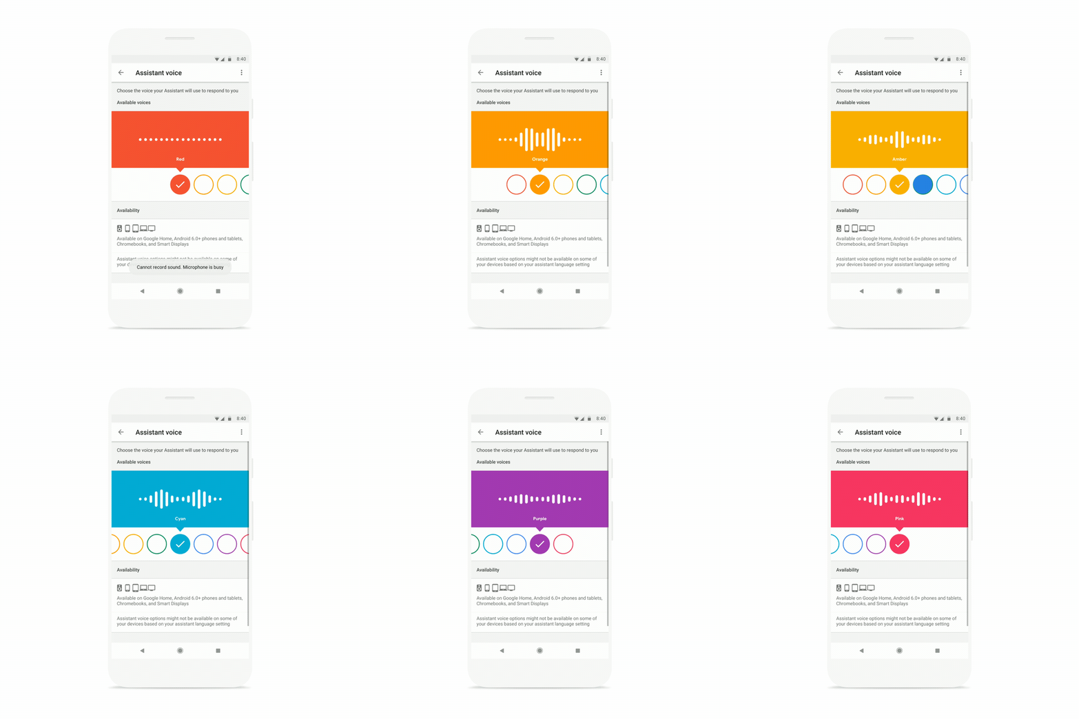
When Google first rolled out the 6 new voices to Google Assistant after Google I/O, the UX that came with it wasn’t exactly the prettiest. Because we love pretty colors and animations, Google says that it’s updating that voice picker and sent us a preview of what it’ll look like.
This new UX will arrive for US users (en-US) starting today and continue on throughout the rest of the week. Google says that this new colorful voice picker is filled with randomly selected colors, but that the voice you have chosen will be automatically mapped to a color out of the gate. We’re assuming the colors are there to help you remember which voices you prefer rather than the 1-8 number system.
Anyone seeing this yet?
To check, head into Google Assistant’s Explore screen>Settings>Preferences>Assistant voice.


Collapse Show Comments11 Comments