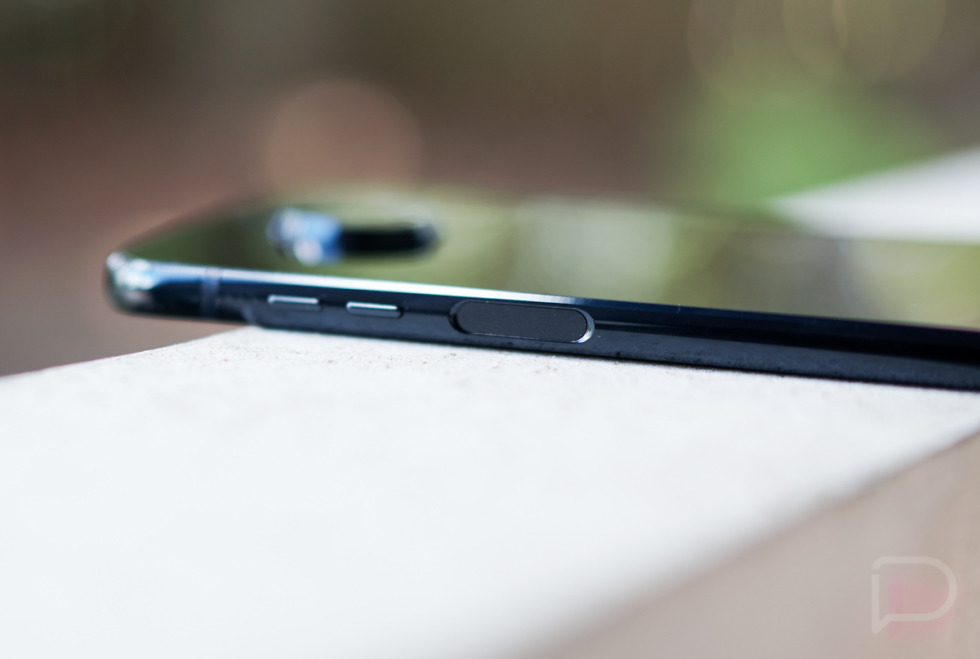
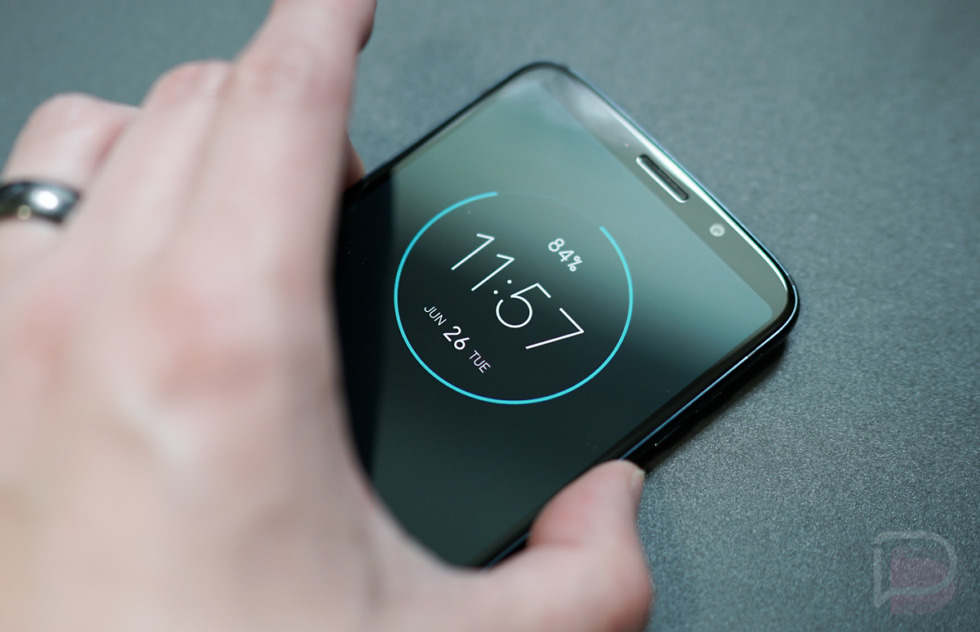
I’ve spent the last handful of days with the new Moto Z3 Play, and while I’m certainly a fan of the phone already, there is one particular design choice that I really like and wish more companies would adopt. The Moto Z3 Play has a side-embedded fingerprint reader and it’s pretty fantastic.
When fingerprint readers were first introduced to phones on a grand scale, we saw them typically embedded within home buttons on the bottom chins of phones. That placement made a lot of sense, but it also limited design somewhat by having to dedicate a space on the front of a phone for it. As companies decided against that implementation, we also saw them move fingerprint readers to the backs of phones, and in rare cases, to the sides.
Sony was one of the first to implement a fingerprint reader in the side as an embedded sensor within their phones’ power buttons. Nextbit did the same with the Robin, as did Razer with their first phone. It doesn’t happen often, but I think Motorola has the best implementation yet.
I say that because Motorola didn’t put the fingerprint reader within a power button. In fact, they moved the power button opposite the fingerprint reader to the left side of the Moto Z3 Play. That let them include a fingerprint reader that’s like the fingerprint readers on the backs of most phones, which is basically a touchpad that reads your fingerprint. There’s no fumbling between pressing a power button and also trying to scan or your phone immediately waking from scanning after you tried to lock it, which I always thought was an issue with Sony’s earlier phones and LG’s phones that did a similar double-up with power button and fingerprint reader in a rear placement.
With this Moto Z3 Play, that dedicated side area is only for fingerprint scanning. This move was done to free up space on the front of the phone to give the Z3 Play a full-display front, but also because they couldn’t put it on the back if they wanted to support Moto Mods.
What I really love about this location is that it’s probably the most accessible in any situation. If your phone is on a desk, you can reach over to the side and unlock it without picking it up. You can’t do that with a rear location. If you pick up your phone, your thumb naturally rests on the side of the device as you hold it, allowing it to unlock as well. With bottom, front readers, you always had to do an extra reach across the bottom of your phone. If you need to scan your finger for a purchase or another secure reason, your thumb is there, basically ready to be read at all times.
I think this location could get better too. One thing Motorola didn’t include was the swipe-for-notifications gesture on the fingerprint reader that Google has made famous. I don’t necessarily like that motion on rear-placed readers, but I would totally use it on the side, almost like a scroll wheel that your thumb could swipe on.
A side location like this also opens up phone makers to much cleaner designs. Samsung keeps putting together some of the worst rear phone designs because of their fingerprint reader choices and camera housings. If you take away the rear fingerprint reader and embed it on the side of any phone, it frees up that back space to be much more minimal. Another example would be the Oppo Find X. That phone’s whole identity is based around its design, so Oppo left out a fingerprint reader, probably because they wanted it entirely clean on the outside. A side fingerprint probably could have been used to help keep it that way without removing an essential phone feature.
I’d imagine that Motorola will do something similar with the flagship Moto Z3. After that, who knows if or when we’ll see another phone with this setup. From a usage standpoint, I’m going to miss this.


Collapse Show Comments107 Comments