The HTC U12+ is a phone that I’ve been looking forward to since late last year, when HTC released the U11+ and decided not to ship it to the US. That phone, at least from afar, looked like HTC had finally caught up to the competition. I assumed that the U12+ would only build on that and help set things on a positive path for the struggling company. Boy was I wrong.
Yeah, I just spoiled what you are about to read for the second review in a row, but I can’t help it. The U12+ has everything it needs to be great, yet here I am about to tell you how frustrating it has been to use.
Let’s dive into it – this is our HTC U12+ review.
The Good
Specs
You can’t argue against what HTC has put together here on paper. HTC packed the U12+ full if it all, including a Snapdragon 845 processor, big 6″ QHD Super LCD display, 6GB RAM, 64GB or 128GB storage, dual rear cameras (12MP + 16MP), dual front cameras (8MP), 3500mAh battery, IP68 water and dust resistance, USB-C, fingerprint reader, and Android 8.0 under HTC’s latest Sense skin. It doesn’t have a headphone jack, but HTC does care about audio, which they show through their latest take on BoomSound speakers, and the included USB-C earbuds in the box. They brought back their squeezy Edge Sense technology again too, and have included more features within it.
The only other thing to point out that this phone doesn’t have is wireless charging, though I’m not sure wireless charging is ever going to be a dealbreaker omission. Wireless charging is overrated when you have faster wired charging in the form of Quick Charge 4.0 that the U12+ supports.
So yeah, the U12+ has everything a 2018 flagship phone needs and then some.
Hardware and Design
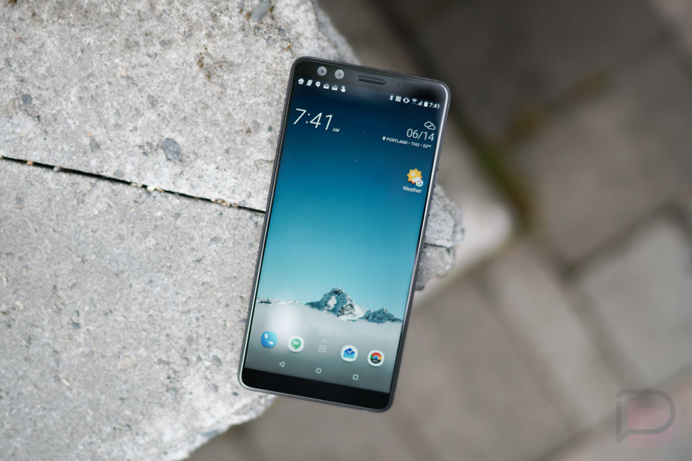
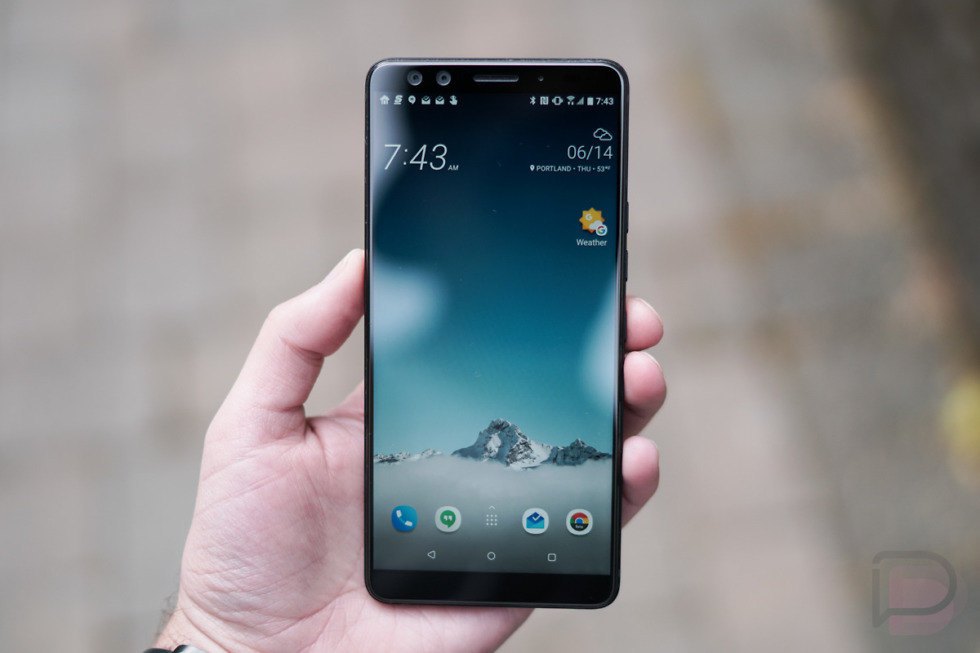
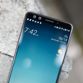
The U12+ is a joy to look at and hold. HTC has almost always built really nice hardware, at least in terms of material usage and the way they are designed to rest perfectly in your hand. The U12+ doesn’t deviate from that history at all. It has slim bezels (without a notch) and an all-display design with the now-standard 2:1 display ratio. That means the phone is long and tall, yet not wide. In fact, it’s skinny enough side-to-side that this big phone fits in your hand nicer than the OnePlus 6 or Pixel 2 XL. My guess is that HTC went thicker front-to-back in order to give it this less-wide in-hand feel. It was the right call.
It does feel a bit on the heavy side, but I have no problems with that. The Essential Phone was a little tank and I loved it. There is something about added weight that makes my mind believe I’m getting more in return, whether that’s true or not. And sometimes those are the reasons a phone stands out, especially when hundreds of dollars and our emotions are involved.
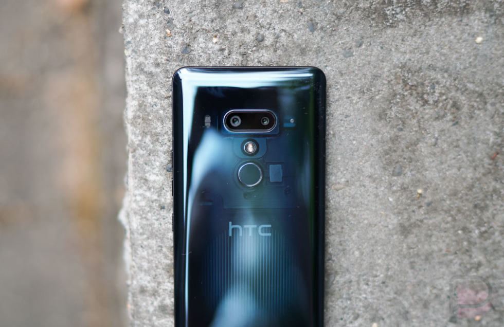
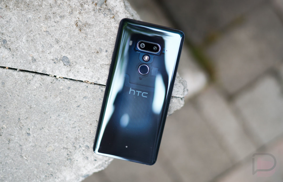
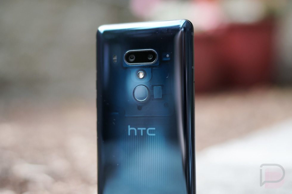
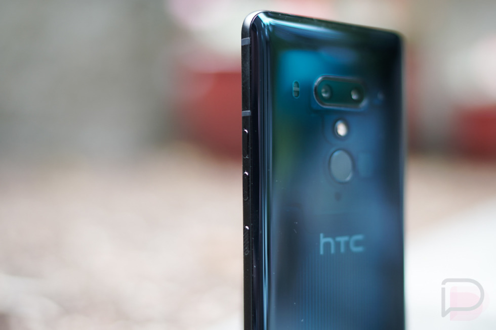
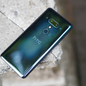
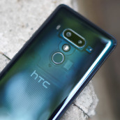
I’m also a big fan of HTC’s liquid metallic appearance that has lived on from the U Ultra and U11. That’s about all I have to say about that, though, because I’m a bigger fan of the version of the U12+ you see here, which is Translucent Blue. This is the flagship model from HTC, which means the model they plan on selling the most of (it comes in both 64GB and 128GB options, unlike the others). It’s different because you can actually see through part of it. In a way, that allows the phone to be more personal or vulnerable, which again, brings out that emotional state of a purchase. Uniqueness in a world of sameness is a big deal to me. Something as subtle as a semi-clear back that lets me in on HTC’s design work is 100% a selling point.
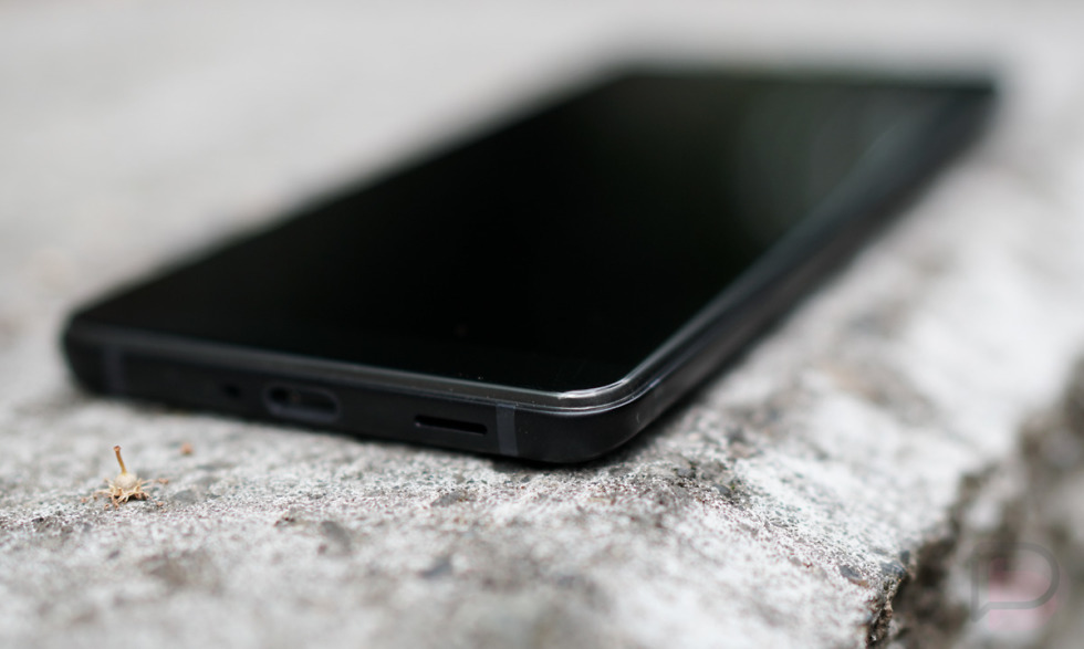
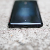
For downsides to the design, I’d have to point out that it looks a bit Franken-phoneish. If you look at the picture below, I think you’ll get what I’m suggesting and it’s mostly because all of the pieces seem like they were smashed together to create an end product. Unlike Samsung or OnePlus or Google phones where seams match-up, even if they are a joint between glass and metal. The U12+ goes from curved rear glass into a metal frame that then doesn’t even come close to matching up to the frontside. That gives you a ridge that isn’t all that attractive and certainly doesn’t seem as precisely engineered as its competitors’ phones. This is a bit nitpicky, yeah, but as I keep saying – it’s these little things that do matter.
Overall, though, the HTC U12+ is a stunner. It fits really nicely in the hand, carries a unique rear appearance, has good weight, and uses all of the hottest materials of the moment that you’ll find in almost every other major smartphone. HTC can still design.
Camera
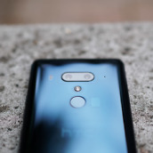
Last year’s HTC U11 had one of the best cameras in the smartphone world, you just didn’t know that because no one owns that phone. Like that device, the U12+ has a really good camera, only this time its made up of a 12MP wide-angle lens (f/1.75) and a secondary 16MP telephoto lens (f/2.6). It also has optical image stabilization, as well as laser and phase detect autofocus. DxOMark scored it really well, if that means anything to you.
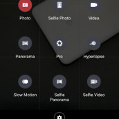
I found the U12+’s camera to be mostly fast to load and focus, quick to take multiple shots, and it has all the bells and whistles of a modern top tier smartphone. You’ve got auto and portrait modes, manual controls, 4K video at 60fps, panorama and timelapse options, and slow motion capture. The camera app isn’t cluttered or confusing, but you do still have a number of options to make the experience yours.
As for results, it kept up nicely with the Pixel 2 XL, even if it does overexpose more shots than I’d like. But it’s pretty versatile indoors and out, thanks to that f/1.75 aperture and that secondary telephoto lens. I found its portrait mode to be solid too, plus HTC gives you bokeh controls over it. HTC isn’t doing a bunch of wild contrast ramping like Google does, though photos on-phone do look a little cartoonish because of the display.
Overall, I think this camera is one of the better available.
Somewhere-in-the-Middle
Display
I’m a big fan of AMOLED displays and still cannot figure out why HTC continues to use LCD panels. It’s not that the 6″ Super LCD display used here is awful, it’s just that AMOLED is the future and this phone’s display acts like it wants to be one. Either way, here are some thoughts on the U12+’s big screen.
Out of the box, you get a DCI-P3 profile, but you can choose an sRGB color profile if you want. The DCI-P3 option provides a cartoonish color vibe that really took some getting used to. I’ve tested out sRGB as well, though that just uses too much of a brown hue that my eyes don’t like, even with a cooler temperature set on top of it. I don’t know what the deal is, but it’s almost like HTC knows they should have used an AMOLED, so they punched-up colors to weird levels that are supremely unnatural out of the box in DCI-P3. It’s not a great look.
Viewing angles are not as good as other phones. You can see an immediate shift to darkness when not looking directly at the U12+. Overall brightness levels have been fine indoors, just not excellent out. You have a night mode, one-handed mode, and the ability to choose between 1080p or QHD+ resolutions. Just keep in mind that if you toggle to QHD+, you might also want to adjust the display size option to “small” or you won’t see much of a difference.
One cool thing to point out is this smart rotate feature that HTC built-in as a part of its Edge Sense 2 tech. If you are holding your phone, the Edge Sense recognizes that, so if you lay down or tilt the phone slightly to the side, it won’t flip the screen to horizontal because it realizes how you are holding it. It’s a slick trick. It’s also not really display related.
I’m not the ultimate hater of the U12+’s LCD display and I’m also not a fan. Something just seems off with it and I haven’t been able to pinpoint what that is even after a couple of weeks with it. I’ll just say that it is far from my favorite display in a 2018 phone.
Software and Performance
For the past 2 or 3 smartphone releases from HTC, I’ve asked company reps if they’ve changed anything with their Sense skin that we could highlight in our coverage. Each time, they do this really awkward explanation of how they don’t really consider it to be a skin or Sense or something I should focus on. That’s weird because their official spec sheets all refer to the software on the phone as running Android with HTC Sense. The launcher is called Sense Home. There is an HTC Sense Companion app. Sense is still very much a part of the HTC phone experience. Anyways, with that in mind, let’s talk about Sense!
It’s starting to age and since HTC doesn’t think it’s a thing, I’m wondering if it’s ever going to change going forward. The UI of the dialer reminds me of 2015, the app drawer is still obnoxiously paginated, BlinkFeed is on and alive, the widget picker is definitely from 2013, the stock keyboard from TouchPal is really bad, and the settings layout is super confusing and doesn’t match any other phone’s order. Like with LG, HTC needs to put together a full skin makeover to try something new. Oh and trust me, I’ll get into Edge Sense 2 here in a bit, but it belongs even lower than this section.
It’s not all bad, of course. HTC has an always on display, even with the use of an LCD panel. They still have their lock screen Motion Gestures that get you into items quickly, the U12+ supports themes, and in many ways, the overall UI has some stock-like skinning that will be familiar to Pixel users. I also like that you can swipe across the navigation bar to get to additional tools, like the screenshot or screen recording tools.
The performance of the U12+ is pretty solid too. The phone doesn’t necessarily get hot or slow down after lengthy periods of use and is quick to get in and out of apps or from the lock screen. In fact, the phone is quite snappy in most situations. I have run into this odd couple-of-second stutter when you swipe up on the app drawer before the drawer arrives with apps to appear for selection. That’s odd, since this is HTC’s launcher. Other than that, performance has been fine.
My problems with HTC’s skin are that it feels like they aren’t improving it at all anymore. It very much comes off as if HTC has forgotten that Sense is there and that it’s fine as is when slapped on top of whatever the newest version of Android is. On top of that, I’m also not sure that HTC is pushing regular updates to phones like they once were. At the time of this review, I took a look around and it appears that HTC hasn’t updated the U11 since January. It’s June, folks.
Price
$800 for a phone with these specs is probably about right if you aren’t HTC. Samsung has similar specs in it’s new phones, as does Google and LG. However, I’m not a huge fan of that price tag because of the section below and the fact that with HTC’s years and years of struggles, I just think they need to compete on price. At $800, you are saying that people will look at the Galaxy S9 or Google Pixel 2 XL, two similarly priced phones, up against your HTC U12+ and choose the U12+. I just don’t know that that is ever going to happen. And I know that that’s not going to happen because it hasn’t been happening. HTC isn’t selling phones and so they might want to re-think this strategy.
I don’t know the margins for HTC’s U12+, but you’ve got to give someone a reason to look at your phone if you are HTC. HTC is no longer a company that is thought of in the same sentence as those companies I just mentioned. In order to get back in the conversation, you might need your price to be the conversation starter. At $800, you aren’t doing that.
The Not-so-Good
Edge Sense 2
Man, Edge Sense 2 and the faux button setup on the U12+ are so bad. This decision from HTC is what will kill this phone. It’s so bad, that I think people will buy the phone and then immediately return it because of what they’ve done in this area.
In case you don’t know, the U12+ includes HTC’s squeezy side tech called Edge Sense. This is version 2 and it really sucks. You can squeeze it with a short or long squeeze to do a number of things that include launching apps, the camera, the flashlight, or your favorite assistant. It can control music, expand the notification shade, go back a screen, and take a screenshot. You get to customize the pressure sensitivity of those long and short squeezes, so you should be able to really fine-tune the experience.
In new experiences, you can now double-tap on the sides of the phone to do similar tasks that I described above. HTC has it switch to one-handed mode initially, but it’ll go back a screen, launch the camera, open an app, etc. And then you have that smart display rotation sensing that I mentioned above in the display section.
Look, if you own this phone, just turn all this stuff off. I’ve had the phone for a couple of weeks and there is something wrong with how it senses pressure and whether or not you are touching it. The squeezes took days and days for me to get just right. The double-tap shortcut became annoying if and when it worked, as the sides are often sporadically sensitive. And the phone often reacts with a squeeze UI on top of apps because it thinks I’m trying to perform a squeeze, even though I’m not. I also couldn’t tell you how many times I’ve simply picked up the phone or tried to press the power button and had it think that I was performing a squeeze action.
Ugh, it’s been so frustrating. And I say that as someone who appreciated what HTC did initially with Edge Sense in the U11 and am a big fan of how that tech made its way into the Pixel 2 line. I use the squeezy side on my Pixel 2 XL multiple times per day to launch Google Assistant. With the U12+, this thing is a wild animal that I want no part of in a phone.
What the f*ck are these buttons
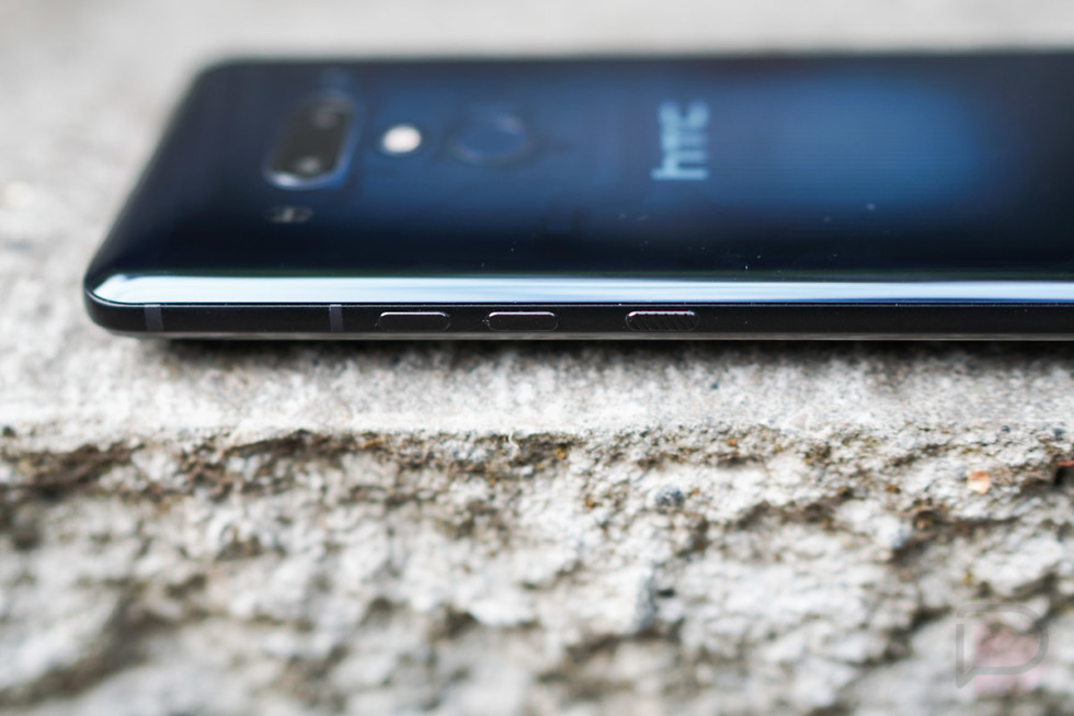
And on that note, Edge Sense 2 led HTC into one of the worst manufacturing decisions I’ve seen on a smartphone in quite some time. They decided to remove the mechanical buttons from the side of the phone and replace them with pressure sensitive nubs for power and volume controls. I cannot even begin to describe how big of a mistake this was.
When you press these buttons, they give you a sort of response like you might get with one of Apple’s new Macbook Pro trackpads. It vibrates to let you know that you have pressed something, but nothing is actually moving. While this sounds kind of neat and reasonable at first, in practice it has not been good.
The power button works about 75% of the time. The volume buttons probably work less. It’s impossible to tell without looking at your phone if pressing those volume buttons is actually controlling volume. It’s one of those situations where you press and hold to drop volume down or up and then realize 3 seconds later that you’ve done nothing. I’m not sure if the phone thinks you are squeezing its sides and are trying to perform a squeeze action or the sensitivity under these buttons is that bad. Either way, the buttons here have made me want to smash the phone on a desk a handful of times. I’ve seen random ghost presses on them, some wigging out of the buttons after waking the phone, where a reboot is all that stopped them from doing whatever they were doing, and I think I managed to break one of the power buttons on a unit during my briefing that initially alarmed me. You know the double-tap on the power button that launches the camera on most phones? Good luck ever getting that to work on the HTC U12+.
The thing is, you can turn off Edge Sense 2 if it bugs you. You can’t turn off sh*tty buttons. You are stuck with a core functionality of the phone that there is no work-around for. I know this may seem like a small thing to complain about if the phone feels great and takes great pictures, but come on, adjusting the volume or waking/locking your phone shouldn’t ever be something you worry about.
Battery Life
The battery life of the U12+ has been really disappointing, especially after the U11 which had incredible battery life. I thought that the Galaxy S9 managing 4 hours of screen on time and dropping to 20% at 7PM was bad, but after running this phone between Verizon and T-Mobile, I’ve found a new bad-battery king for 2018.
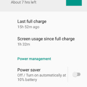
As you’ll see in the screenshots, I didn’t hammer on this phone much. In fact, I got to 3 hours of screen on time only a couple of times and the phone was basically dead (around 10-15%) within 12 hours. 12 hours! The rest of the time, I was hitting 2-2.5 hours of screen on time and the phone was dipping to around 25% battery in 13-15 hours. I had a day where I only managed 1.5 hours of screen on time and the phone dropped to 32% in 16 hours. That’s awful. That means the U12+ is constantly sipping heavy amounts of battery when I’m not even using it.
How does that compare to good battery life phones? With the OnePlus 6, I was typically hitting 5 hours of screen on time in a day and lasting as long as the U12+. On days where I went lighter, it was lasting well into a second day.
I don’t know if HTC can fix these battery issues. A 3500mAh battery should last longer than this. If you plan on buying it, you better keep that charger handy.
Availability
As with pricing, HTC’s distribution model is not good. It’s pretty obvious at this point that they no longer care about the US market. HTC has struggled in recent years to land carrier partners and is only selling the U12+ directly through their own store, as well as Amazon. Sure, the phone works on Verizon, AT&T, and T-Mobile, which are the important carriers, but not having the phone in any of those stores isn’t good. In the US, people (unfortunately) still mostly buy phones from their carriers. And when your phone is priced at $800, not giving people the opportunity to get their hands on it first before they fork out that kind of cash, is almost like shooting yourself in the foot.
Other Notes
- This is not OK, HTC?
- 3.5mm headphone jack: Again, it doesn’t have one, but HTC includes USonic earbuds in the box.
- Verizon: It works on Verizon! I tested it for a couple of days on Verizon and had no issues. It doesn’t work on Sprint, though.
- Android P: HTC is not a part of the Android P Beta program and I kind of doubt they will be. They are saying that this phone will be upgraded to Android P, but of course it will be. Android P will be here in August. If they didn’t update a phone that’s months old to the newest version of Android, we’d tell you to never buy an HTC phone again. What you should care about is if they’ll give it Android Q and R.
- Translucent Blue: See-through phones are cool. I wish others would copy this idea from HTC.
Video
First Look
Gallery
The Verdict
I came into 2018 excited for HTC, but the U12+ just killed it all for me. As good as the camera and specs might be, and as much as I like looking at and holding this phone, it’s just not that fun to use. HTC screwed up buttons, which is something I’m not sure I expected to say…ever. Their Edge Sense technology is mostly a mess, battery life on this phone is not good at all, and I’m really worried that HTC has given up on updating their phones regularly. Couple all of that with the fact that its an $800 investment and you should probably pass on this one.













Collapse Show Comments90 Comments