On the developer side of Android P, we know what’s new, thanks to a blog post and entire Android P Developer Preview portal from Google. But what about the other stuff? What about the UI changes or subtle tweaks to Android that maybe didn’t get a big callout from Google? We figure that you’ll still want to know about them all, so here’s a list of the fun new Android P features we’re stumbling on.
(We’ll be updating this regularly.)
Updated Pixel Launcher
We already showed off the updated Pixel Launcher at this post, but yeah, we should still mention that it’s getting an update with Android P. The changes are minor and mostly just include a subtle shading to the bottom tray, as well as a microphone button in the Google bar.
You can download it here.
Side volume controls, device menu
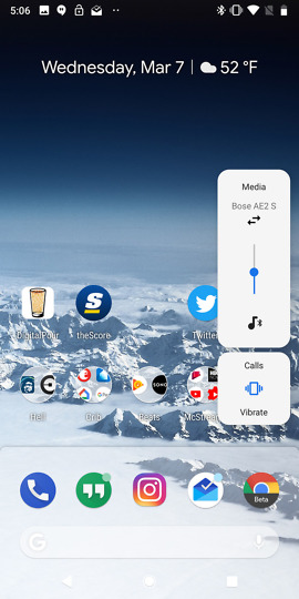
Another UI tweak I think most of you will love is the change to volume controls. When pressing your volume buttons, you’ll now see a vertical volume menu, similar to the power menu introduced with Android 8.0. You have a volume slide on-screen that you scroll up or down, a mute button, and separate button to change your phone to silent, vibrate, or volume-on.
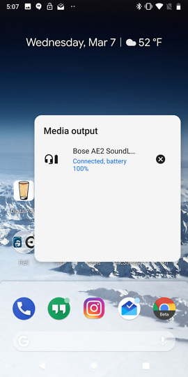
Not only that, but there is now a device menu, where you can see the devices you are connected to, their battery life, etc. You access that by tapping on the “Media” area at the top of this new volume menu.
Power menu gets screenshot button
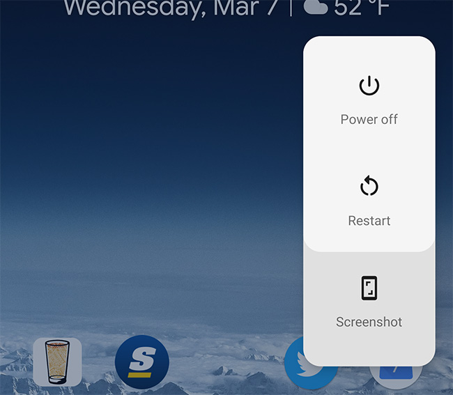
Hey, look at that, a screenshot button in the power menu! That’s pretty handy. Of course, you can still press and hold volume down + power for a second to do the same action, but this is neat, for those times where you can’t make that double-button-pressing-action happen.
New “Markup” screenshot editor
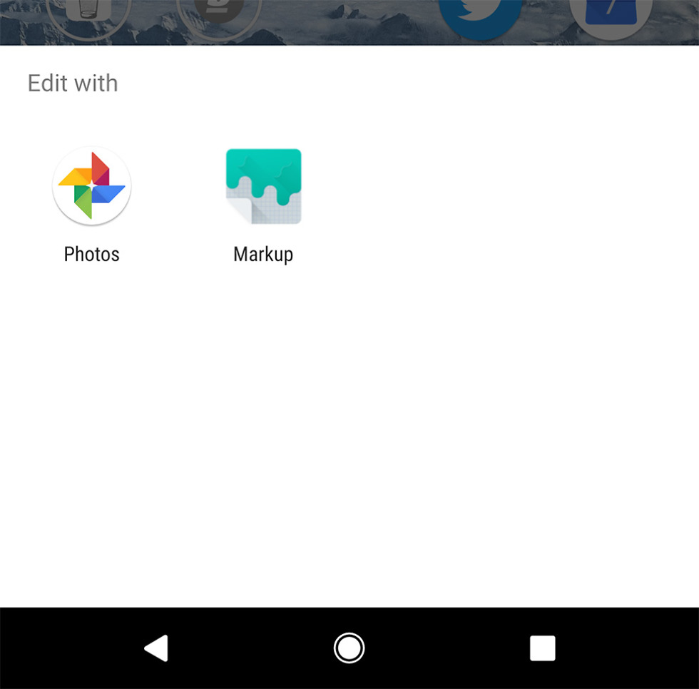
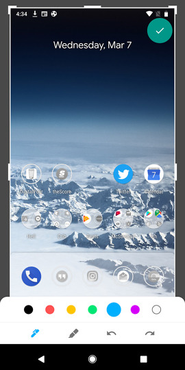
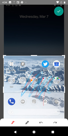
Speaking of screenshots – after taking a screenshot on Android P and tapping the “Edit” button in the notification for it, you’ll get to choose whether you want to edit that screenshot in Google Photos or a new Markup tool. If you choose Markup, you’ll get quick access to cropping, as well as pens and highlighters (with color options). When done, you’ll tap a check mark that’ll save your edited screenshot to your Photos library for sharing.
Additionally, you can access Markup while viewing an image in Google Photos’ edit tool by tapping the bottom right corner, where Photos offers up additional apps to edit in.
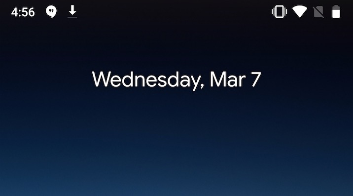
Clock moves to the left, ugh.
I’ll let you decide how you feel about this.
Refreshed notification panel arrives
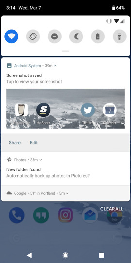
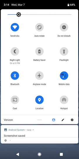
The biggest UI change I think everyone will notice is in the notification area. Not only is Google adding even more features to notifications (like full images, clearer contact info, etc.), they’ve given us a rounded-corner card appearance now. In addition to the cards, the notification quick settings panel is no longer paginated, plus some items have moved around.
For example, the date and time have moved to the top left, the carrier has moved to the bottom left of the quick settings panel, and battery sits alone in the top right corner.
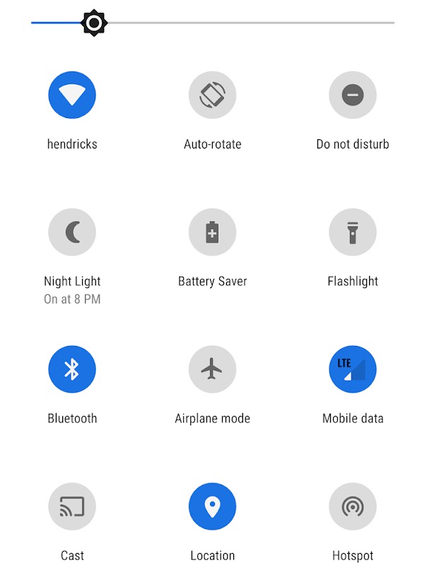
Outside of the re-arrangement and rounded corners, you’ll notice we now have color circles to let us know when settings are on or off. The dropdown menus for certain items (like WiFi or Bluetooth) are gone, so you’ll have to long-press each if you want more settings.
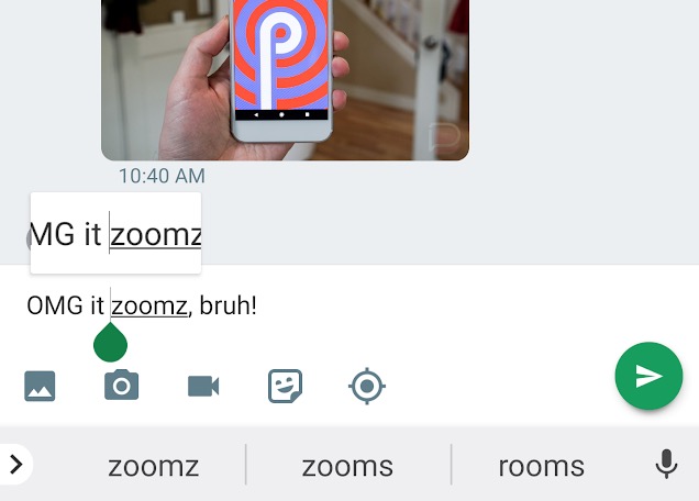
We have text zooming!
OMG.
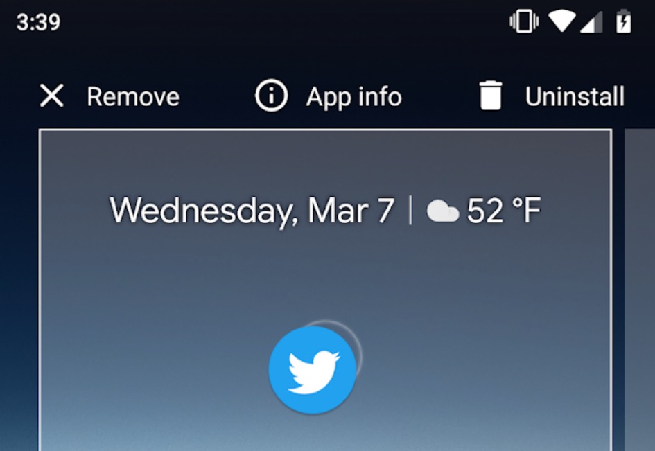
We’re back to describing drag actions on the home screen.
Google can’t seem to decide what it wants to do when it comes to grabbing and dragging icons on a home screen. For a long time, it showed “Remove,” “App info,” and “Uninstall,” before removing the words in stable Oreo. Now, in Android P DP1, they are back.
About Phone menu changes
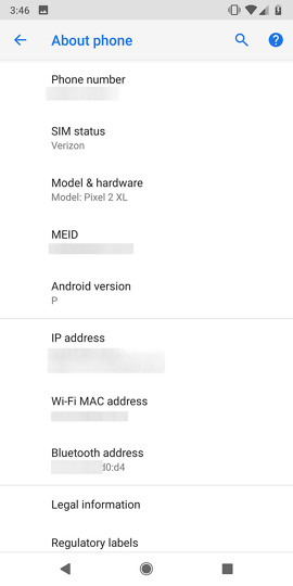
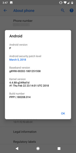
Google has once again rearranged the About Phone menu. The phone number, along with WiFi MAC, IP, and Bluetooth addresses are now on the About page. Also, to access the security patch level, you tap on the Android Version, which shows you a pop-up with kernel, build, and baseband. You can still tap like crazy on the Android version in this new pop-up to get to the Easter Egg.
Curious about Android P notch support?
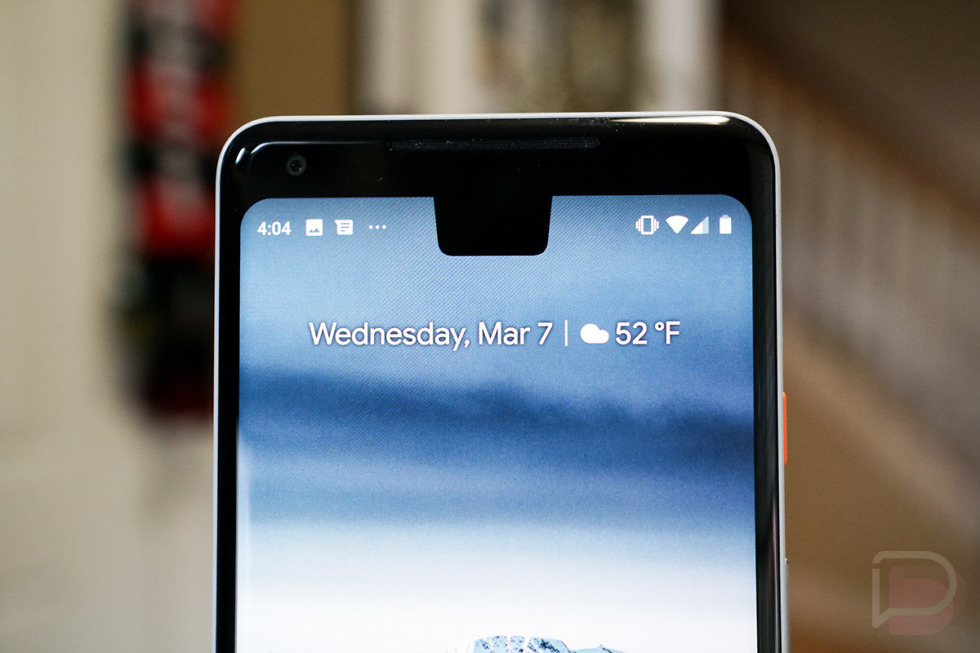
With this first Android P Developer Preview, we get to see how Google plans to treat all of the notches that are coming to Android phones. So far, I’m not a fan, and that’s because they moved the clock over to the left in the status bar, which is an area that notifications are supposed to live in. That’s a bad move since the notch is already killing space for notification icons. You can see that even on a phone like the Pixel 2 XL, this notch setup will only show me 2 notifications before the “…” arrives to tell me there are more.
Swiping on either side provides the same pulldown action. In other words, Google isn’t copying Apple’s take on the notch, which gives you different actions depending on which side of the notch you swipe from.
Also, this is how a notch will treat items that want to go full screen, like photos. It’s not pretty, unless you love black bars surrounding your content.
Notch life. pic.twitter.com/y12eWeeQGj
— Kellen (@iamkellex) March 7, 2018
Do Not Disturb separates from Volume control
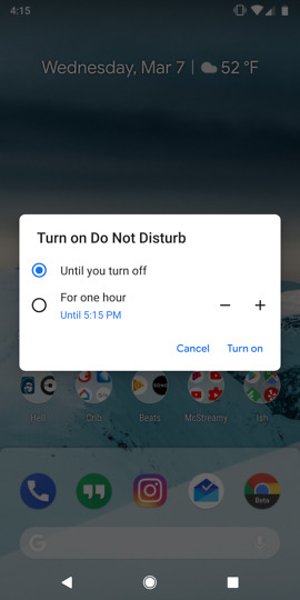
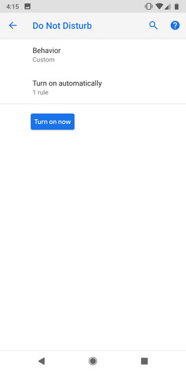
Do Not Disturb (DND) controls are now a separate setting outside of volume. In the past, you could shoot your volume all of the way down and it would trigger DND. That’s no longer the case. Now, you have to toggle DND on or off, or set a time for it to expire. If you just want to silence your phone, you have to do that through the volume settings panel I mentioned above.
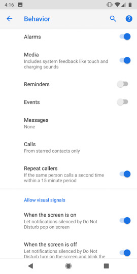
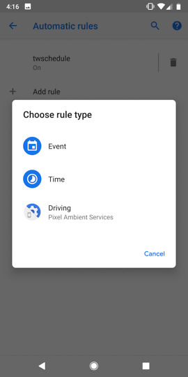
You can still set schedules and define DND by rule type. There are a couple of new settings, though, both that allow you to decide what happens to notifications when your screen is off or on.
For now, the best way to get into DND is to tap the DND shortcut in quick settings or set a schedule.
New Lockdown Mode arrives
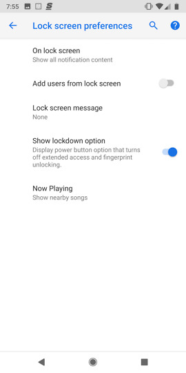
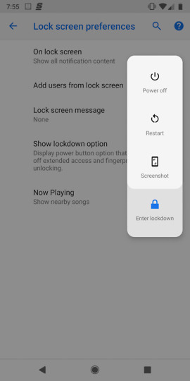
Android P adds a new “lockdown” mode that is enabled through lock screen preferences. With this enabled, it kills the fingerprint reader temporarily, as well as extended access. In order to get into your phone, you’ll need to enter your pattern, password, or PIN. Once you do, it opens back up like normal.
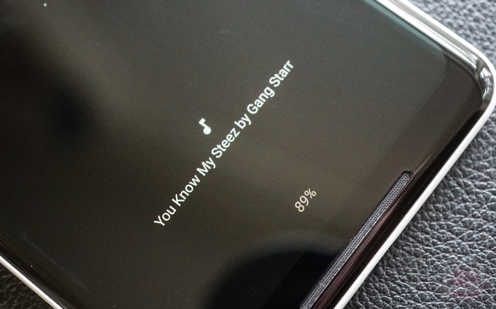
Always-on Display now shows battery percentage
Cool, right?
MORE COMING.


Collapse Show Comments47 Comments