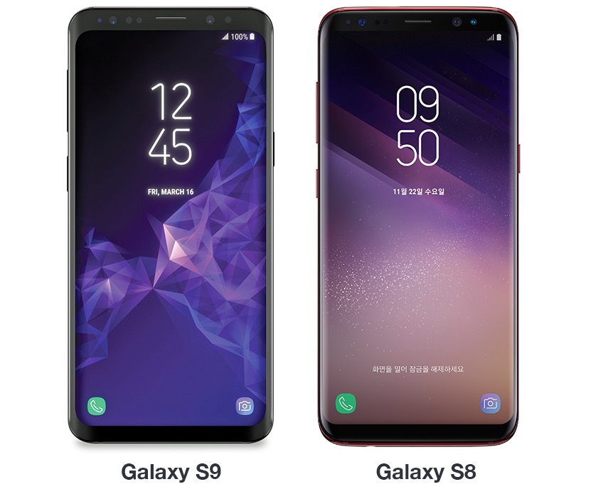
Thanks to @evleaks, we’ve got what is likely the first official press renderings of the Samsung Galaxy S9 and Galaxy S9+ to get excited about ahead of their February 25 unveiling. The images are included in full below and show the two phones side-by-side. They look very much like the Galaxy S8 and Galaxy S8+ as expected, although I’m seeing a lot of Pixel 2 XL and LG V30 in the design as well.
First, here are the images.
First Galaxy S9 / S9+ Images
These are the Samsung Galaxy S9 and S9+ https://t.co/deXGg39m0d pic.twitter.com/RNGezrF4Bs
— Evan Blass (@evleaks) January 26, 2018
Nice, right? They show the rounded corners we got with last year’s phones, that Infinity-style display, and a whole bunch of sensors up top, likely because Samsung is going to fully invest in face unlock or something similar. That’s fine, since we also are expecting fingerprint readers on the back, in a proper place this time. We’re getting a March 16 date on there as well, which could very well be the release date for each phone.
How does it compare to the Galaxy S8? Here.
Galaxy S9 vs. Galaxy S8
I’m seeing a lot more bezel this year. Last year, Samsung took those side bezels so close to the edge, that you have to wonder if they had feedback suggesting they dial it back some, and give hands a bit more cushion while holding the phone to avoid accidental presses or to make the experience more ergonomic (Maybe for stereo speakers?). Because look at that Galaxy S9 vs. Galaxy S8 image and you should be able to see it immediately. And no, I don’t think it’s a shadow effect – I think there is more bezel on the Galaxy S9.
Will that mean less curve to the display? Tough to say. As a Pixel 2 XL user, it certainly doesn’t offend me.
Galaxy S9 vs. Pixel 2 XL vs. V30
Note: These are not to scale; we’re just comparing designs.
Here, though, you can really see what I’m talking about when I suggested above that it looks a lot more like a Pixel 2 XL or LG V30 than a Galaxy S8. And really, that’s because of that bezel. Samsung appears to have added some this year, which again, doesn’t offend me as someone who uses a Pixel 2 XL on the daily and was a huge fan of the V30’s design. I’d argue that when the Galaxy Note 8 came out, following the Galaxy S8, that Samsung probably did take the bezel-less trend to an extreme and might have been why the Note 8 was so unenjoyable to hold.
What do you guys think? Loving the design? Think it’s a step backwards?
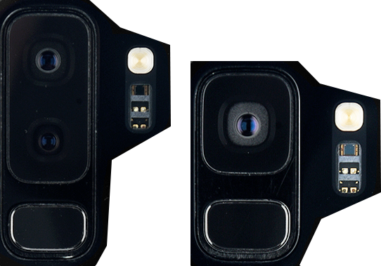
UPDATE: Evan added to the story on Friday by posting up the rear camera components, so you can see the placement of the fingerprint reader, as well as an angled shot for those worried about bezels.
Those new images change your opinion at all?


Collapse Show Comments168 Comments