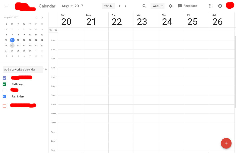
Google’s lack of consistency in how its apps look on different platforms should be no surprise to anyone. However, if the screenshots posted to reddit this week are legit, then we’re in for a big Material Design overhaul for Google Calendar.
Posted to the Google subreddit, a special someone received the redesigned look for Calendar on desktop, bringing a more refined and Material aesthetic. Everything from the monthly view to creating new events has been given a facelift, one which Google Calendar has been in desperate need of for what seems like years.


While this is all very exciting for anyone who uses Google Calendar on a desktop (me: slowly raises hand), we aren’t exactly sure on when everyone will see this UI. Thanks to the posting of the G Suite roadmap back in March, we do know that it is penciled in for late 2017. And with testing taking place, I suppose Google is on track for that.
As soon as more people start seeing this, we’ll let you know.
To check out the full gallery of screenshots, follow the link below to see the original post on reddit.
This post was last modified on August 14, 2017 3:57 pm

