During last week’s The Droid Life Show, I was reminded of the Samsung Continuum. You know, the phone from 2010 that had a ticker display below the capacitive buttons? Either way, it got me thinking, let’s highlight a few of the Android devices that we would label as funky for this week’s #TBT. Are we calling them bad or completely ugly phones? Absolutely not, we just think they’re funky lookin’.
Let’s get to it!
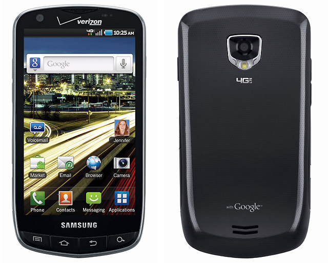
Samsung DROID Charge
Samsung’s first and only attempt at a DROID-branded device for Verizon. Bask in its glory. For a bit of backstory, this phone was called a few things back in the day, including the Samsung Stealth, Samsung Inspiration, and Galaxy S Aviator. It launched 2011, labeled as the first DROID device with LTE. Needless to say, it was a big deal, so we reviewed it.
The funkiest part of this phone would be the physical buttons on the bottom frontside. They are placed directly on the bottom chin, leading to sometimes awkward holding positions. Coming from Samsung, who was known for well-designed phones, the DROID Charge and this button setup was a bit of an oddball.
I’d love to share just a few lines with you from our review.
- “There is no denying that the 4.3″ Super AMOLED Plus screen on the DROID Charge is a thing of beauty. As the first device in the U.S. to sport one, you at least have that to brag to your friends about.”
- “Well, it’s not the greatest battery on the planet, but when we compare it to the Thunderbolt, it’s a winner.”
- “Someone tell Motorola to kang whatever Sammie is doing with their cameras, because it’s nothing but right.”
- “This may sound like a simple little “Good”, but I love the fact that TouchWiz puts your toggles into the notification bar.”
RIP, DROID Charge, according to Kellen’s review, you were a pretty good phone back in the day.
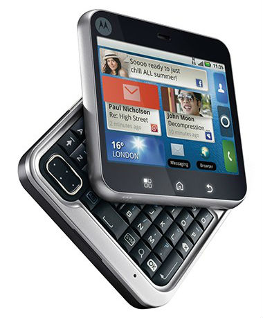
Motorola FlipOut
Ah, the FlipOut. Many of you may have missed the existence of this phone completely, as I don’t recall it being marketed very heavily, but it was pretty funky. Launched in 2010, the phone had a 2.8″ (320 x 240) display, somehow capable of playing Angry Birds. It also had a TI OMAP 3410 processor, 512MB RAM, and a 3MP camera.
While I appreciate the approach to offering something different, you have to admit, this phone is incredibly funky. Motorola, instead of going with a standard slide out or clamshell design, opted for this flip-spin mechanic. Indeed, it was very interesting.
Please, watch the below video, which details the flip and the amazingness of Motoblur.
Did you own this phone? I have to hear from you! Was it awesome?
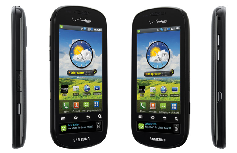
Samsung Continuum
So, yeah, the Samsung Continuum. This phone was obviously way ahead of its time, thanks to that secondary ticker display. Unlike the recent LG V10 and V20, this phone’s ticker was complete separated, placed underneath the frontside’s capacitive buttons. It could show you notifications and little tidbits of info. Again, it was way ahead of its time, but still funky.
To recap for those who didn’t own this piece of work, specs included a 3.4″ (480 x 800) Super AMOLED display, 5MP camera, Hummingbird processor (same as Nexus S), 336MB RAM, and Android 2.1. Ugh, good times back in 2010.
As an added bonus, I already wrote up how I feel about the Galaxy S5, which I’d say is Tier 1 funky.
Did we miss one? Let us know in the comments below!


Collapse Show Comments43 Comments