There has never been a shortage of 3rd-party launchers on Android, but there has always been a few that stand above the rest in terms of features and quality. Residing on that short list of great launchers is Action Launcher, which just underwent a serious overhaul that users are going to love.
The changelog for Version 25 is utterly massive, so I will just give you the highlights, which is already a pretty big list. The change you will immediately notice is the new icon (design by our good friend Dave Kover), as well as the addition of “Pixel Edition” to the launcher’s name. This addition signifies the leaving behind of the Lollipop days, and moving forward, everyone’s Action Launcher will be similar to the UI you will find on a Pixel device (sliding app drawer, folders, etc.).
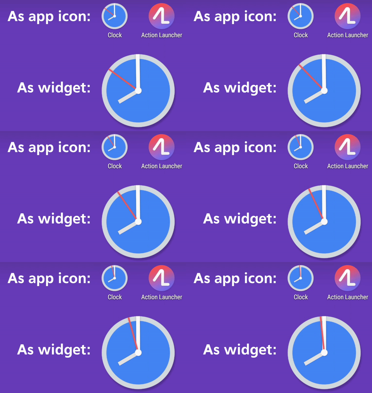
On top of the visual changes, there are many features we’re excited about. One in particular is an animated clock widget, based on the clock icon used in Android O. Think of it like an animated icon, which is something Google has referenced.

Speaking of icons, users will find app shortcuts when pressing on app icons, but you can also toggle the ability to launch an app’s widget from a flick of the icon. For example, if you have the Play Music icon on your home screen, you can flick it, which can open your music controls. This is done by integrating App Shortcuts and Action Launcher’s existing Shutters feature.
As I said, there are a lot of other changes, all of which the developer details very well on his blog. Follow the via below to read all about it or head to Google Play, download the app, and find out for yourself!
// The Blerg
This post was last modified on January 13, 2020 9:54 am


