Twitter looks different today, you may have noticed. People are freaking out a bit because some things are now round and the buttons have different icons. And look, this wouldn’t be Twitter if people didn’t have obnoxiously volcanic takes on Twitter changes, so just roll with it and ignore them.
The new look has actually been in the Android beta for a good week or so. We’ve been using it, getting used to it, and not throwing tantrums about its freshness. I kind of like it, to be honest, because it does feel like a lighter experience, which is what Twitter was going for.
Either way, this is what’s new:
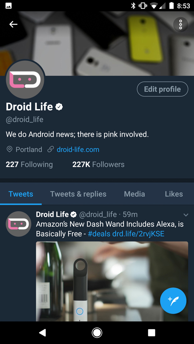
- Profile photos are now round. FREAKOUT.
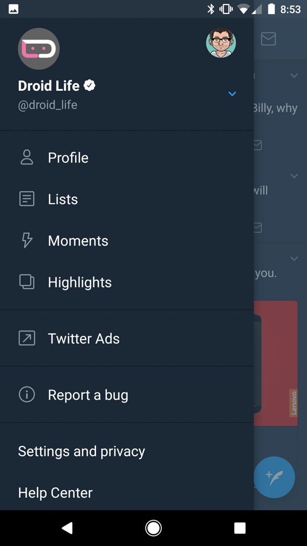
- The slideout menu is simpler, with less options or at the very least, a more compact view.
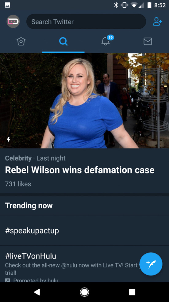
- The icons up top for each panel are new.
- The icons in Tweets are new too, like the quote button that has replaced the confusing reply button.
- The typography across the app is now “more consistent,” plus there are bolder headlines.
- Tweets now live update as they are retweeted, liked, etc.
The update should be rolling out to stable Twitter very soon if it hasn’t already. Again, it’s in the beta, so you could always just sign-up or that to get it now. Twitter is also updating the web client and Tweetdeck.


Collapse Show Comments22 Comments