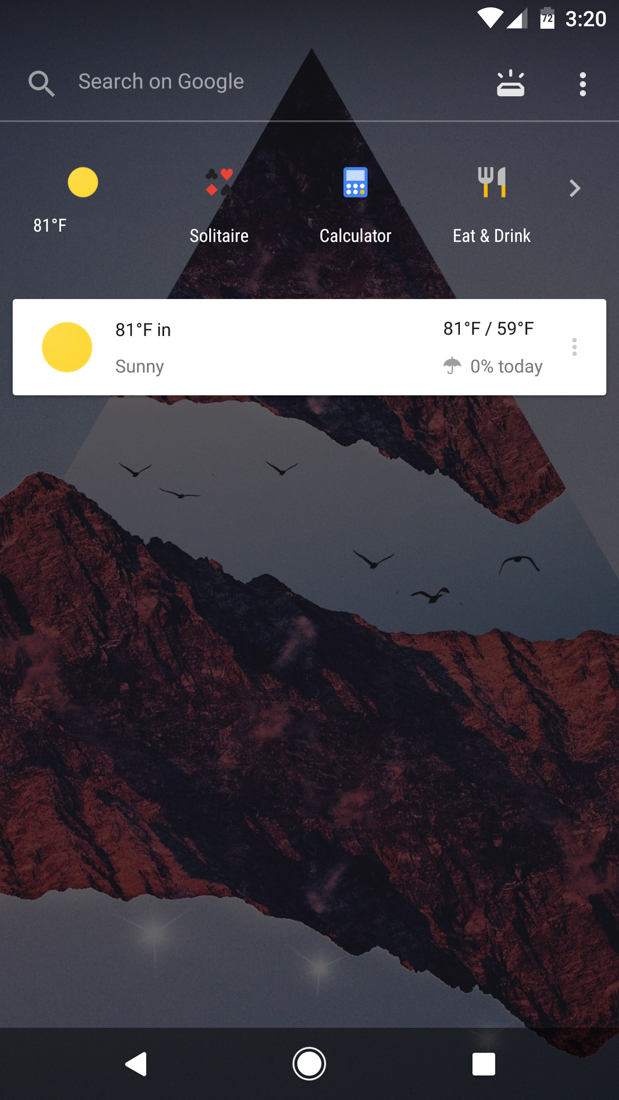
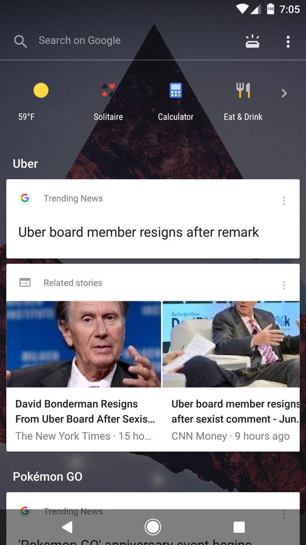
According to a single user on reddit (Edit: and now a bunch of our readers), Google is testing some sort of transparent UI to the Google Now panel. It’s, umm, an interesting look that I’m not sure I’d like to stare at each day, but it’s certainly different.
The redditor claims to not be rooted and running clean Android 7.1.2 on a Pixel XL with the May security patch. He has a stock phone, from what we can tell.
The UI itself (seen above and below) is similar to the Google Now panel you have right now, except the background is transparent and shows the current wallpaper. It does look like the “Upcoming” page’s shortcut within Now has been moved up top too. Well, for those who were seeing that “Upcoming” page at all, since I am on some phones (non-Pixel) and not on others (Pixel). From this redditor’s description, it sounds like some items are either broken or have odd/new behaviors (swiping way cards, for example) as well.
It doesn’t seem like anyone else has this UI at the moment, so it’s tough to say if Google is actively rolling this out or just testing it and this dude got in on some super early action. Anyone else seeing it? Would you want a transparent Google Now?


Collapse Show Comments37 Comments