Given the misfortune Samsung went through last year with the Galaxy Note 7, the company undoubtedly needed to bring its A-game for 2017. Intro the Galaxy S8 and Galaxy S8+, the company’s latest flagships to help consumers forget that it accidentally shipped out devices that could set a house ablaze and not regular ol’ smartphones. Our Galaxy S8 review dives into whether or not that happened.
Instead of a Edge variant like last year, we’ve got two identical devices, with exception to the battery size and display size. Other than that, it’s the same phone, so we’ll kill two birds with one stone in this review.
This is our Galaxy S8+ and Galaxy S8 review.
Samsung Galaxy S8 Review
The Good
Specs
As I said, both the Galaxy S8 and S8+ are the same device, minus the display size and battery size. Inside both devices you will find a Snapdragon 835 processor, 4GB RAM, 64GB built-in storage, microSD support, NFC, iris scanner, fingerprint reader, facial recognition technology, 12MP rear-facing Dual Pixel camera, 8MP front-facing camera, IP68 water and dust resistance, USB Type-C, 3.5mm headphone jack (no courage!), MST for Samsung Pay, and Android 7.0 “Nougat.”
For the differing specs, the S8 features a 5.8″ Infinity Super AMOLED (Quad HD+, 2960×1440, 571ppi) display and 3,000mAh battery, while the S8+ features a 6.2″ Infinity Super AMOLED (Quad HD+, 2960×1440, 529ppi) display and 3,500mAh battery.
On paper, it might be hard find devices as good as the Galaxy S8 or S8+ at the moment. However, there’s always something to complain about. One could hope Samsung could find a way to fit bigger batteries into these things even though they are incredibly thin phones. The cameras didn’t receive much of an upgrade either this year either, but they were already so good in the Galaxy S7 and S7 Edge, it’s not like you’ll hear anyone actually complaining.
Design
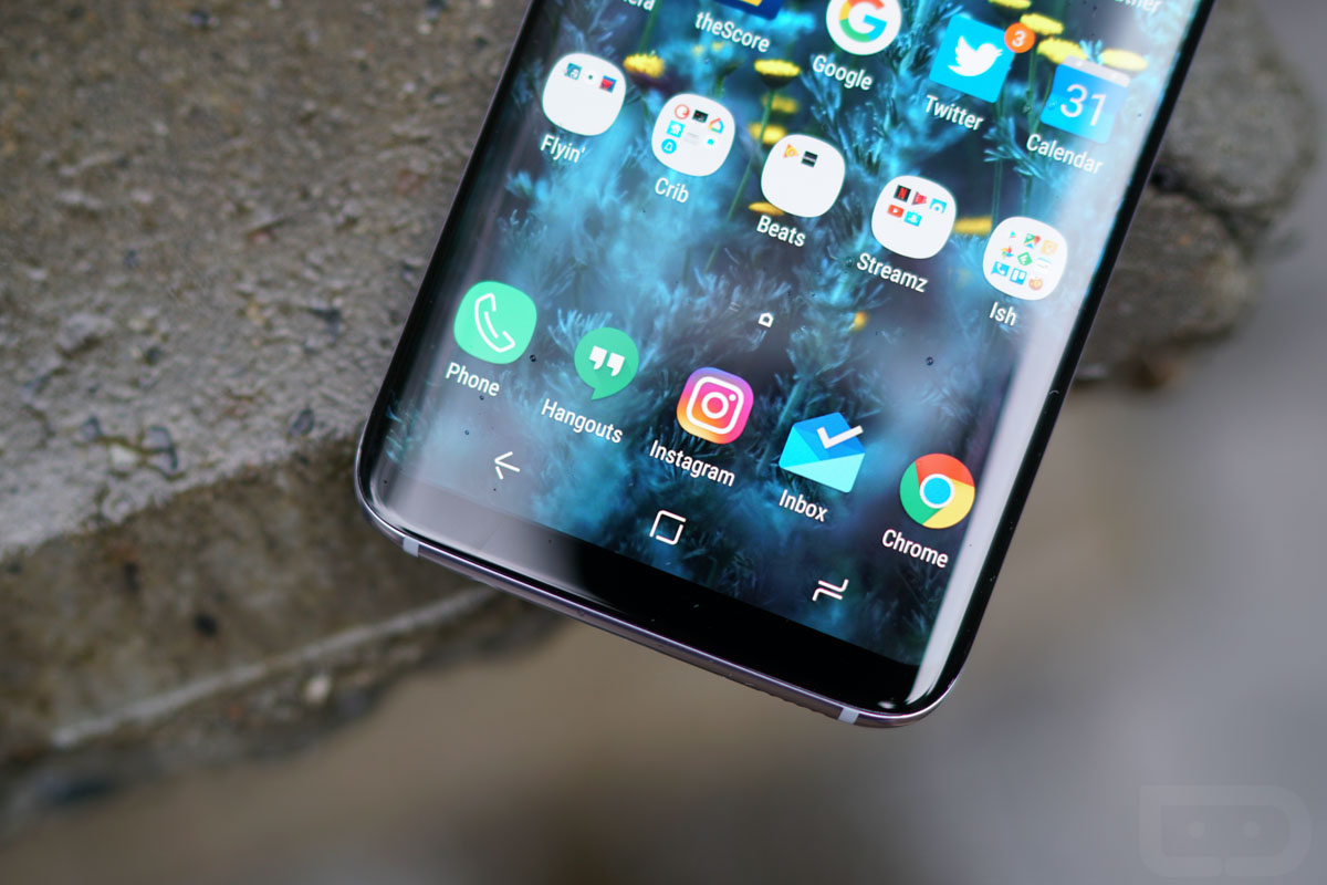
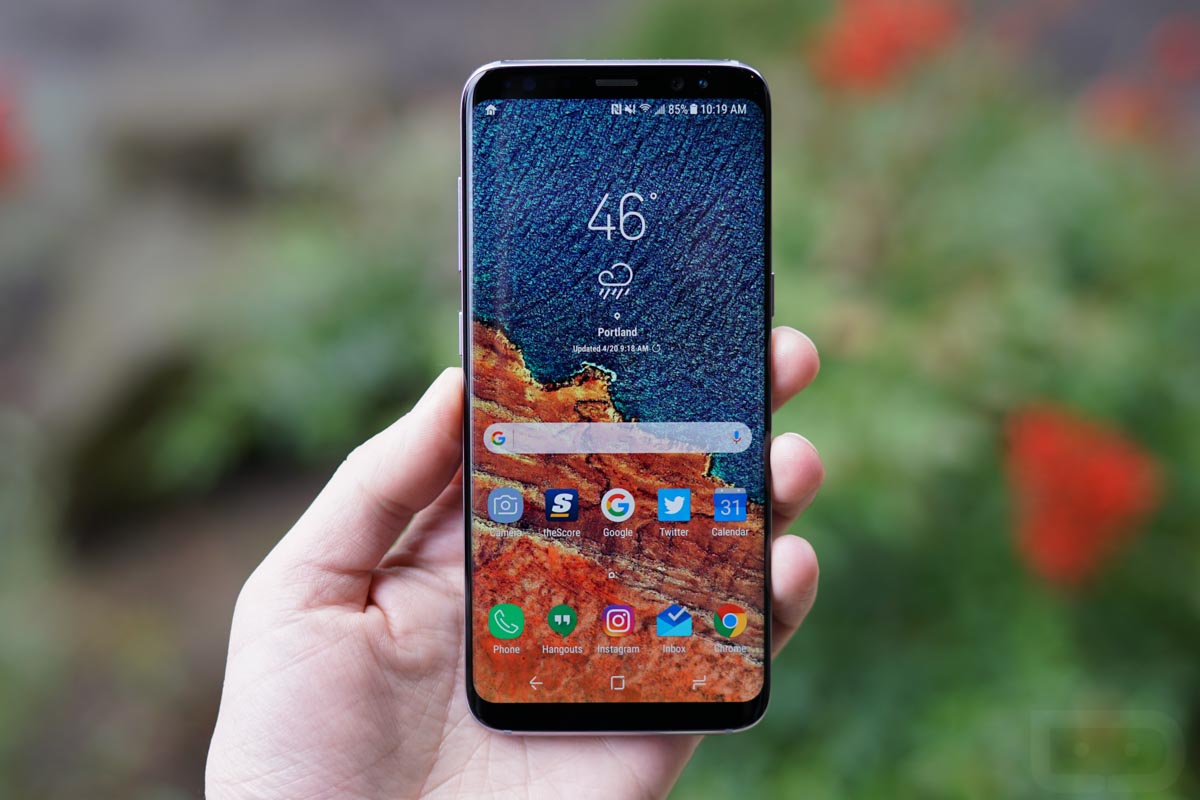
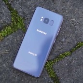
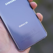
The design of the Galaxy S8 and S8+ is where these devices shine. It’s gorgeous and Samsung outdid themselves this time around. If you haven’t held these devices, think of them like the Galaxy Note 7, but with no home button on the front. In-hand, the Galaxy S8 feels like no other device I’ve held, and it could possibly be my all-time favorite phone to hold. I can’t quite say the same for the Galaxy S8+, simply because of its size. Don’t get me wrong, the S8+ is still nice, but not as nice as the smaller S8.
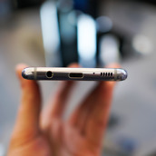
Both phones are covered in glass, with metal along the siding. I don’t typically bring up the slipperiness of a phone, but the S8 and S8+ feel so darn good when sliding your finger along the display and interacting with things. Buttery smooth. Along the bottom is a USB Type-C port, as well as Kellen’s favorite placement for the 3.5mm headphone hack.
In this design section, I could rip Samsung’s placement of a dedicated hardware button for Bixby, but I’ll get to that in the software section below. Because there are applications that allow for the remapping of Bixby, you can’t necessarily hate the added button. If you want quicker access to Google Now or Assistant, you have that choice. If Samsung ups and kills that “exploit” yet again, then we’ll have some words for Samsung, but until then, just customize the button however you might see fit. I will say, I have accidentally pressed the Bixby button a few times, though it’s not a constant mishap that has me screaming in my sleep.
I could also bring up Samsung’s placement of the fingerprint reader in this section, but again, I’ll save that for where it belongs – down in the not-so-good.
While ripping on those things is easy, I must also praise Samsung’s inclusion of on-screen buttons. They really help this design. I know a few may not be fans of the icons used, but hey, too late now. I give major props to Samsung for taking the chance on them, because you know company executives had countless meetings regarding the ditching of the home button. Think about the engineers who had sleepless nights over that damned home button. Either way, it’s gone, and the world seems like a better place without it.
Display
Infinity. Display.
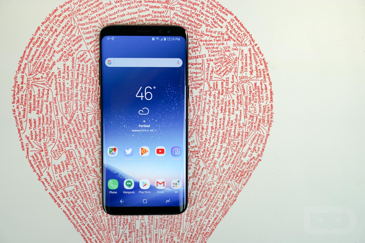
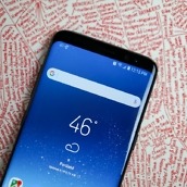
2017 has been awesome for display technology. Earlier this year, LG gave us the G6, with its extremely minimal bezels and we loved that. Now, Samsung is giving us the Infinity display, and let me tell you, this is slick. On the sides you have a curve that gently trickles over the sides of the device, but it’s not as drastic as it was on the Galaxy S6 Edge. It’s rounded smoothly, not a steep drop off.
On the regular S8, you have a 5.8″ Super AMOLED panel, rocking a resolution of QHD+ or 2960×1440 for those here that speak pixel. With regard to the aspect ratio, it’s much like LG’s on the G6, but with fewer software additions to benefit the size, at least from what I saw.
On the G6, LG built in software tweaks for the camera and entire modes to help users benefit from the ratio. On the Galaxy S8 and S8+, you don’t really get the sense that this is something new or great, just that it makes your YouTube videos look weird due to black bars on the sides or the stretched look when you “optimize” them. However, I will say that apps tend to act more naturally on the S8 than the G6, but there’s still a few that have issues. I have problems inside of Snapchat with this aspect ratio, and I’ve also had someone report they had issues with Instagram. Considering this whole 18:9 (G6) and 18.5:9 (S8, S8+) thing is new, I’ll give the developers some time to optimize their work.
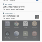
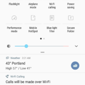
One tweak made on the S8 and S8+ that I cannot live without, as it has become standard on almost all other devices, is the Blue Light Filter. Finally, Samsung, you did it. Instead of being blinded by the AMOLED’s retina-piercing colors (that’s a compliment), I’m now able to view my device at night and in the morning while laying in bed with no strain to my eyeballs. If you aren’t a user yourself of blue light filters on your device, get with it, folks.
Camera
For the camera in both the Galaxy S8 and S8+, Samsung is utilizing a Sony-made IMX333, very similar to what was found in last year’s Galaxy S7. While some may have expected a big upgrade, as Samsung tends to do each year, there isn’t all that much to improve in terms of overall quality. I mean, the S7 and S8 are some of the best shooters out there already. Not to say that you can’t improve upon it, you can, but I’m not over here crying about it.
For specs, the rear-facing shooter is 12MP, f/1.7 with phase detection auto focus, OIS, 1.4 µm, 4K video support, slow-mo (not 1000FPS as was reported), and support for 60FPS at FHD. This all adds up to a fantastic shooting experience, with the auto focus speed really blowing the doors down.
We recently conducted a camera showdown between the S8, Pixel, and G6. What we learned is that you can’t go wrong with any of the high-end smartphone shooting experiences, with the S8 really excelling in certain areas. It does have its cons, though. For example, the S8 tends to let in a lot of light, leaving some pictures overexposed. It does handle color quite well, especially purples and greens. I’ve found that Samsung phones deliver a certain warmness to photos, too, which others may see as just a yellowish hue. A lot of this is subjective, so I’ll typically just let the photos speak for themselves.
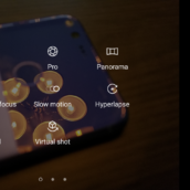
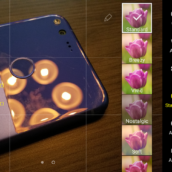
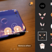
As for the software, the camera app is getting better yet again. Samsung used to bloat the heck out of the camera, but things seem much more streamlined. You’ve got your video and photo modes, as well as Slow-Mo, Food, Pro (enhanced scene settings), Hyperlapse, Panorama, Virtual Shot, Selective Focus, and you can even download others if you want. Point being, you probably won’t come across a shot you can’t handle, which is all anyone can ask for.
We have a ton of camera samples below, so give those a look.
Performance
Whenever I use a Samsung device, I have flashbacks to the Galaxy S5. How far we have come since then. Samsung’s latest UI and the overall system seems extremely snappy, with much of the credit going to the Snapdragon 835 processor and 4GB of RAM. From my experience, it’s a quick phone, one that is hard to slow down.
During my time with the S8 and S8+, I noticed a consistent experience on both models, which left me happy. I could dive into apps quickly, hit that recent apps button, then dive right into another. During gaming, I never experienced real lag or jank, which is something I’m always on the look for. I also didn’t run into any random reboots or freezes.
Inside the Settings menu, there’s a section for Device Maintenance. With this, Samsung assigns a numerical value to your device’s performance. If it’s low you can hit “Optimize,” which then clears up your memory and closes background apps. It’s like a task killer from back in the day. When I did experience a tad bit of lag, I went in there and hit Optimize, which freed up the phone rather well, I’d say. If you come across your own hiccup, don’t be afraid to go in there and give it a tap from time to time.
Somewhere in the Middle
Software
Considering the Galaxy S8 and S8+ might be the best hardware in the game, you should expect nothing but excellence from its software, too. And while I stress that Samsung’s skin has matured into something much better than it used to be, it’s still not as elegant or easy to navigate as vanilla Android.
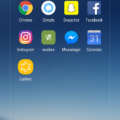
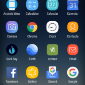
Once you get beyond the skin deep tweaks, such as subtle animations and popup bubbles that alert you of incoming messages, which all look and feel fantastic by the way, you realize that there are a few things that Samsung still can’t quite nail down. For example, if we look at an app folder that isn’t full of app shortcuts, the folder utilizes the entirety of the display, which is an awful waste of space. Not only that, but while I appreciate Samsung’s inclusion of an app drawer that you slide open, it does seem odd that I can swipe up or down to get into it, and when I attempt to swipe through apps, I will sometimes close the drawer because I can swipe up or down to close it, too.
These are the minor things that irk me, and when it comes down to it, this is why I say that Samsung’s skin has matured very well. It’s getting better, but there’s just minor things here and there that some may find bothersome. One areas in particular that has improved would be the Settings menu, which is completely navigable and no longer a labyrinth of confusing text and endless options. There’s Google Assistant, too, something I use on countless occasions. That does bring me to Bixby, though, Samsung’s wannabe digital assistant. Let’s discuss, shall we?
Bixby, at this exact point in time, is not Bixby. What Samsung shipped out on the S8 and S8+ is some half baked Google Now, perfect for absolutely nothing. Will that change? Yes it will, so I find it useless to sit here for an hour and bash something that is not even ready for the public. I will say, Bixby Vision is up and running on most S8 and S8+ devices, and that’s pretty cool. With it, I can snap a photo of toilet paper, then it will take me to Amazon to buy more toilet paper. When I showed this off to my girlfriend, she had that look of, “Hmm, I want to be impressed, but is this really the future of handheld computing?” Yes, my dear, yes it is.
Later this year, we can expect Samsung to formally launch Bixby, with its voice activated commands and broader usability. I will try to reserve most of my judgement for that time, which should be rather soon. Once available, we’ll definitely have a standalone review over of Bixby and what it is actually capable of.
Battery
On the Galaxy S8, I’ve seen pretty average battery life. In a typical day, I’d have about 10-20% juice left with 3-4 hours of screen on time. Not too bad, not too good. Typical and average. On the Galaxy S8+, though, I was seeing much better numbers. Provided it does have a bigger battery, I was going to bed with a solid 30-40% each night, always getting somewhere between 3-4 hours of screen on time. That’s much better and unlike the regular S8, I wasn’t too worried about running out of juice before bedtime.
I will say, I would love for a flagship, top tier device to come around that isn’t just average. I know it’s hard to jam a 4,500mAh battery in these ultra thin devices, but really, I’m okay with a somewhat thicker device. I’m not talking brick in the pocket, but come on already. Considering how many people value battery life, one of these companies will surely answer our prayers at some point.
Galaxy S8
Galaxy S8+
The Not-so-Good
Fingerprint Reader Placement
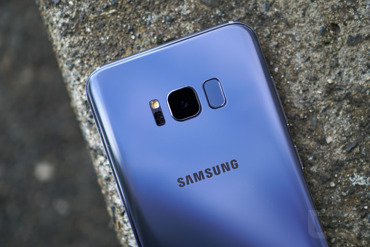
Worst fingerprint reader placement ever? Well, technically, yes, but only because this is the first device I’ve ever used with such a poor place for it. I mean, we’re all about having it on the backside, but up by the camera? Sorry, that won’t work for me.
Interestingly enough, before the S8 was announced and all we had were rumors and renders, I wrote my thoughts down about this positioning and essentially all of my fears were confirmed — I have placed my nasty little grease fingers on the camera’s glass way too many times to be comfortable with.
Now, on the Galaxy S8, I’ve at least been able to get somewhat used to the spot. Once I take the phone out of my pocket, I’m getting pretty good at where my finger goes. On the S8+, though, I simply don’t care for it whatsoever. In fact, I don’t even try to use it and just rely on facial recognition and using a pattern unlock to get into my phone. The fingerprint reader is just not worth the trouble.
Is it safe to say we never see this placement again? Samsung is typically pretty good at listening to feedback, so my hope is yes. It may be on the Note 8 later this year, but once Samsung and Synaptics have their fingerprint reader under glass tech complete, we should never have to deal with this again.
Software Updates
No, the Galaxy S8 and S8+ are not Pixel devices. You won’t see super fast software updates. Should that surprise you? Absolutely not. We’re Android users, so we’re used to this. On the upside, the S8 and S8+ ship with Nougat and Samsung has been very good about delivering monthly security updates. You can’t really ask for much more from a company that isn’t Google. Considering these are Samsung’s latest and there’s no Note 7 devices to update, Samsung’s main efforts should be focused entirely on the S7, S7 Edge, S8, and S8+. That should be manageable for Samsung.
Other Notes
- Headphone jack – It’s got one! Stick that in your pipe and smoke it, Apple!
- Expandable storage – MicroSD cards are here to stay apparently and we’re very happy about this. You can load up your phone with as much as 256GB of extra storage.
- Girlfriend impressions – My girlfriend is out of town this week, but I recall her mentioning she thought the S8 was oddly small for how large the display is. For the S8+, she wasn’t a fan. Too big for her girly hands.
- Samsung Pay – If my bank would ever support Samsung Pay, maybe I could talk about it. Until then, I’ve heard great things, but hey, what can you do? My bank sucks.
- Fast charging and wireless charging – Fast charging or some variant of it is basically offered on every high-end and mid-tier phone sold these days. On the S8 and S8+, you can get a wireless charger that is “fast” charging, which is awesome. If you have yet to invest in a wireless charger for your compatible phone, do it.
Availability
Provided these are Samsung flagships we’re talking about, you can find them everywhere. Verizon, Sprint, AT&T, T-Mobile, or wherever else you might be a customer. Pricing differs for each, so you will need to check with your carrier of choice for the latest details. Be sure to check Best Buy and Samsung’s site directly, as you could always find a random deal or promo taking place.
- Verizon: Galaxy S8 | Galaxy S8+
- AT&T: Galaxy S8 | Galaxy S8+
- T-Mobile: Galaxy S8 | Galaxy S8+
- Sprint: Galaxy S8 | Galaxy S8+
- Cricket: Galaxy S8
- Best Buy: Galaxy S8 | Galaxy S8+
- Samsung: Galaxy S8 | Galaxy S8+
Videos
Unboxing
[responsive_vid]
First 10 Things to Do
[responsive_vid vid_url=”vhfyod3D2fc”]
Best Cases for the Galaxy S8 / S8+
[responsive_vid vid_url=”08e4CVP6Q8M”]
Gallery
Samsung Galaxy S8 Review: Greatness or nah?
I’ve seen plenty of people say they don’t like the Galaxy S8. Why is that? Is it just because they’re haters of everything Samsung? I mean, even if you’re a Samsung hater, it’s hard to dislike the Galaxy S8, at least in my view. It’s one of the more beautiful devices to ever launch (yes, I know, beauty is subjective), it has fantastic specs, and Samsung’s custom software has come such a long way from the TouchWiz days of old. Seriously, get over it.
Now, should you run out and buy this phone? I’d recommend it, for sure, but it’s not the only phone I’d recommend. There’s a lot of great options out there and the S8/S8+ are just two of the best. You’ve got the G6 from LG that’s nice, plus plenty of other upcoming devices to look forward to. If you’re in the market, though, and need a phone right now, you’d be crazy not to at least consider the Galaxy S8 or Galaxy S8+, depending on how big your pockets are.







Collapse Show Comments217 Comments