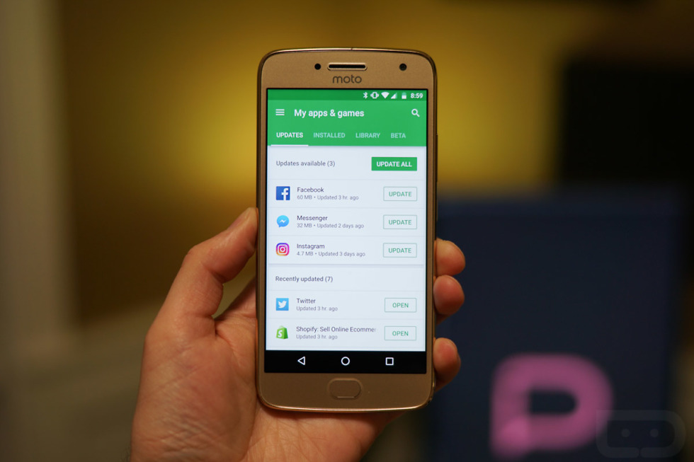
I’m not sure I can even recall when exactly this new Google Play Store “My apps & games” made its first appearance, but it feels like it has been popping up for months. Either way, Google must be ready to give it to everyone, as we’ve had a number of readers point out today that they are now seeing it. I’m also seeing it on my Moto G5 Plus.
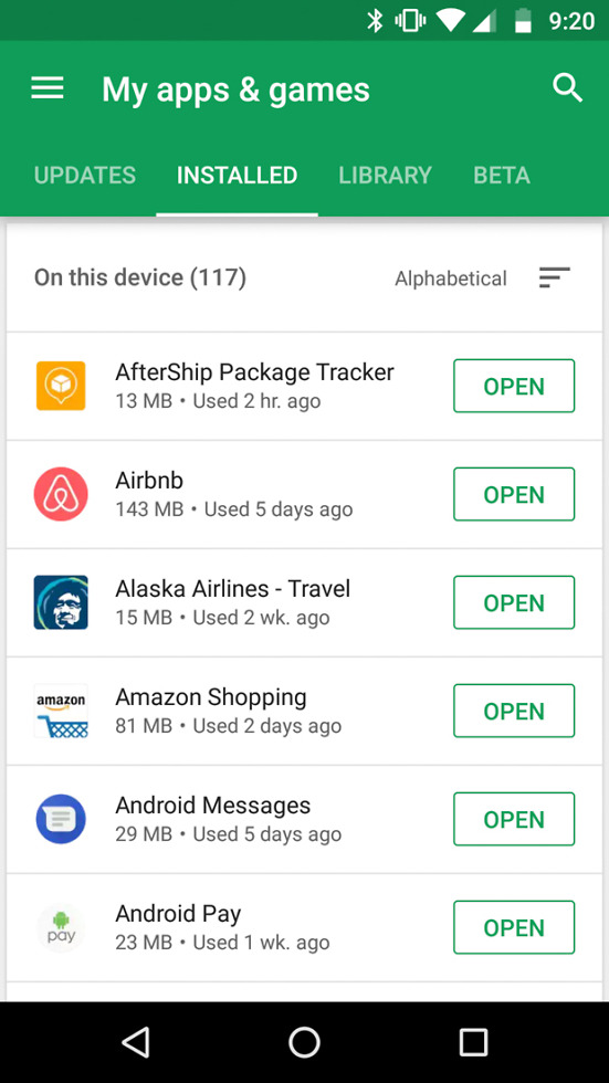
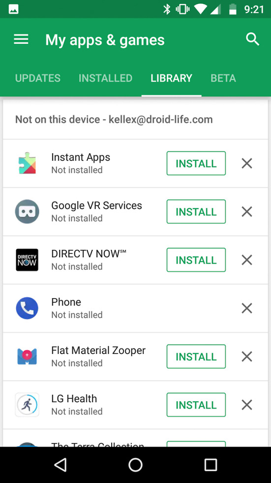
What’s new? You can see it, can’t you? Look at that new “Updates” tab, those “UPDATE” boxes, along with the update count, font size change, extra bits of info, option to sort your apps, and less bloated, card-tastic layout.
With this new layout, you can quickly update apps from a dedicated panel either individually without having to go into their app pages or still “Update all.” You can also see when an app was updated last and how big the app file is, open them from new “Open” boxes, and easily install old apps from your “Library” (formerly “All”). These might seem like pretty small changes, but they are soooo welcomed.
Everyone seeing this new layout on their devices?
NOTE: If you kill your Google Play store or wipe its cache or even just back all of the way out, it should reload with the new setup.


Collapse Show Comments36 Comments