I hate to pull out the, “If you aren’t doing this, you are doing it wrong,” thing, but seriously app developers and mega-tech companies, if your app doesn’t have a dark or night mode, you are doing this sh*t so wrong. Wrongly even. Wrong in a bigly way. So big league wrong, it’s bigly wrong. Add a night mode. Please.
Not that night or dark modes are new to this world, because back in the day when Android was still fresh, we had ROMs and hacked stuff and were root gods and flashed themes that had dark skins to “conserve” battery. Remember those times? They were good! But after all these years, none of the big dogs seem to have figured out that this is a big deal and that we want darkness. Well, except for Twitter, who had to hire a 3rd party Twitter app developer in order to get there. At least they did it.
Why do we need night modes? Because phone displays are bright, LCDs in particular. In dark situations, like when you are about to call it a night, only you need those last 3 or 4 refreshes in Twitter to see if World War 3 has started, you’d rather keep your retinas fully intact. Night modes help with that. They could help with battery life too, which of course is still a concern in 2017. They also help those significant others of yours sleep peacefully without your phone’s bright ass display interrupting. They’ll keep your airline neighbor on chill through that red-eye, because no one wants him activating United Mode and dragging you out the cabin. And honestly, even during the day, if done properly like Twitter’s, night modes are just nicer to look at.
So while Twitter has had night mode for a cool year now, there aren’t many other mainstream apps that have taken on the task. Think about Gmail or Inbox or Hangouts or Instagram or Facebook – all of these apps are beyond white.
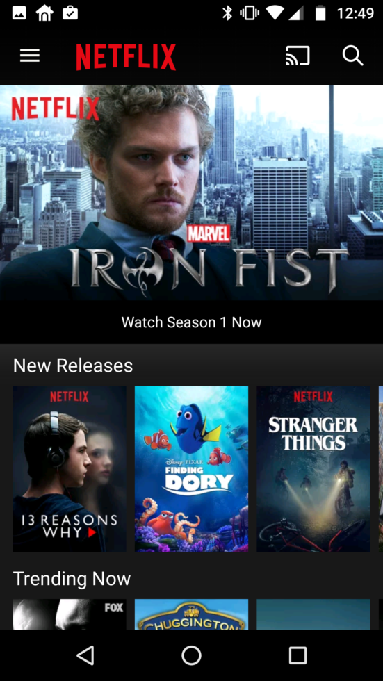
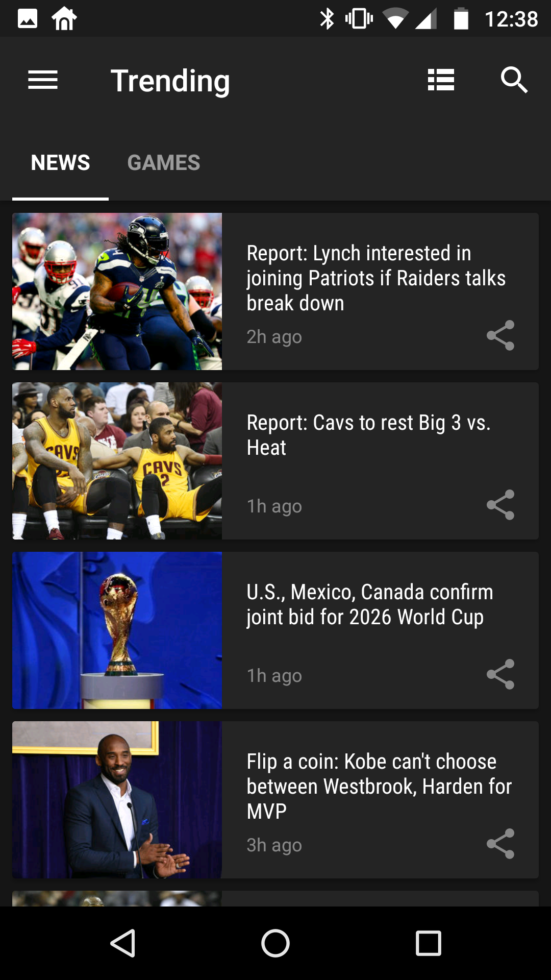
ESPN’s app is so absurdly white, there is no way I’ll ever strongly consider using it. I use theScore for sports because it’s not only a really good sports app, it’s also a dark-themed app out of the box. What’s even more interesting, is when you look at Google Play Movies & TV, which Google turned dark only a few months back. I don’t have an official statement on this, but my guess is that Google considered the fact that people might consume content through Play Movies & TV in bed at night or on a plane or in another dark situation and so having a dark-themed app would make sense. Netflix gets it. Even Google News & Weather gets it. But then look at YouTube or Google Play Music. White AF.
I’d imagine there is a bit of work behind a proper dark mode that isn’t just a flip on colors. However, if almost every single third party Twitter, reddit, or read-it-later app has had dark options for years, why can’t the big dogs?
We know Google has played with a Dark system settings option in Android for a couple of years now, yet that hasn’t been fully realized. Their implementation was pretty great, though, because you could set it to automatic and the system would flip the switch for you at the proper time. An automatic setting actually makes a lot of sense, just like Android’s Night Mode, where you can have it timed to flip over or have it scheduled to do so with sunrise and sunset. But look, dark modes having these choices seems like a much more important feature than Android’s system settings.
When you talk about continuing to improve upon the Android experience, to me at least, these are the little changes that go a long way.



Collapse Show Comments44 Comments