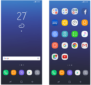
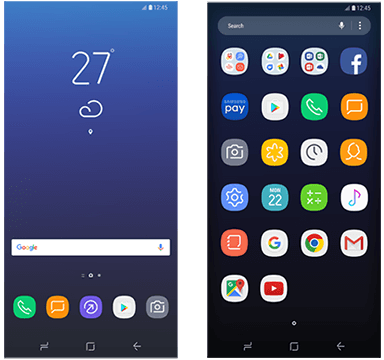
I don’t know about you guys, but I can only take so many more blurry cam shots of the front of the Samsung Galaxy S8 and Galaxy S8+. While I’m all for a good leak or three, what I really want to see is the software or something unique about these new phones outside of their wild display setup. Today, we got that a bit thanks to a decent first look at the software setup we should see on the each phone out of the box.
The images are official, as they come from inside the Samsung Smart Switch app that helps users migrate from an old phone to a new Samsung device. In the most recent update, a Samsung developer left behind images of the home screen setup with app drawer for the Galaxy S8 and Galaxy S8+. The files aren’t necessarily labeled as such, but look at these on-screen navigation buttons, buttons that have only ever been seen in S8 leaks.
So all of Samsung’s icons are changing to match the on-screen navigation buttons. They all have slits cut out or missing pieces from their identifiers. I’m not sure how else to explain that, but I’ll be nice and call it an acquired icon taste.
In these screenshots, we also get to see the icon layout from one screen to the next, along with the app drawer open that includes a search (with voice) at the top.
Pretty clean, right?


Collapse Show Comments197 Comments