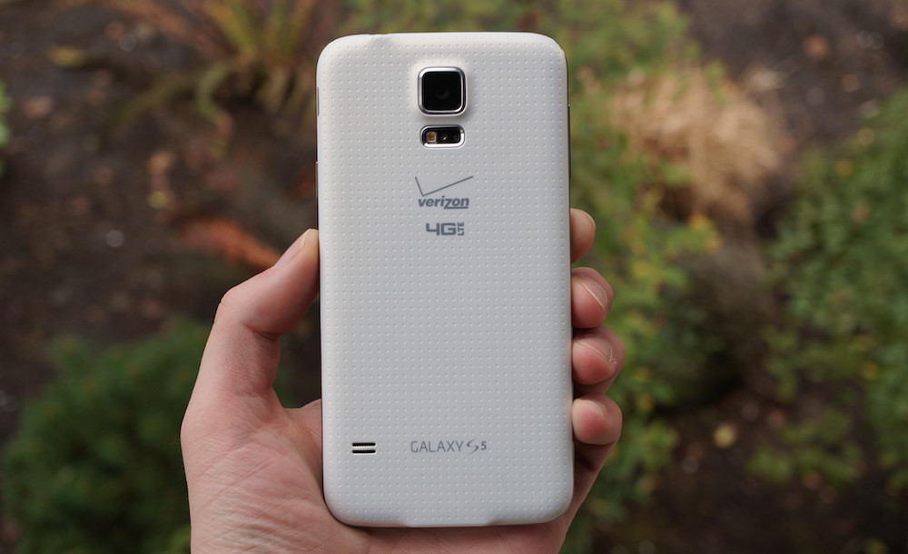
If we polled readers to see which flagship phone had the worst design, it’s quite possible that Samsung’s Galaxy S5 would rank pretty high on the list. With its obnoxiously large bezels and silly flap that covered the charging port, Samsung’s water resistant Galaxy S5 didn’t quite rub us the right way.
On the backside, surrounding the excellent camera Samsung incorporated, the company opted for a dimpled material, often compared to the texture and aesthetic of a Band-Aid. If we’re talking about something being sexy, the word Band-Aid probably shouldn’t come up in the conversation.
To truly sum up our thoughts on the design of the Galaxy S5, here’s an excerpt from Kellen’s review posted in April of 2014.
The design of the Galaxy S5 just feels like a step in the wrong direction for mankind. The phone is abnormally large when compared to what Samsung did with last year’s flagship phone. They squared it off, making it uncomfortable in the hand. They tossed on a slippery, dimpled exterior coating. They increased bezels dramatically. There is this really obnoxious flap that covers the charging port that will likely break within two months of use. And the faux-metal rim job is nothing but an ugly disaster that makes the whole package look and feel cheap.
LOL. He said “rim job.”
As the saying goes, things usually get worse before they get better, with the Galaxy S5 being a prime example of that. It took this mess to get us to a metal and glass-centric design on the Galaxy S6 and Galaxy S7, with Samsung now creating what are some of the more attractive smartphones to date.
Here’s hoping we don’t see any backward steps from Samsung in the future.


Collapse Show Comments128 Comments