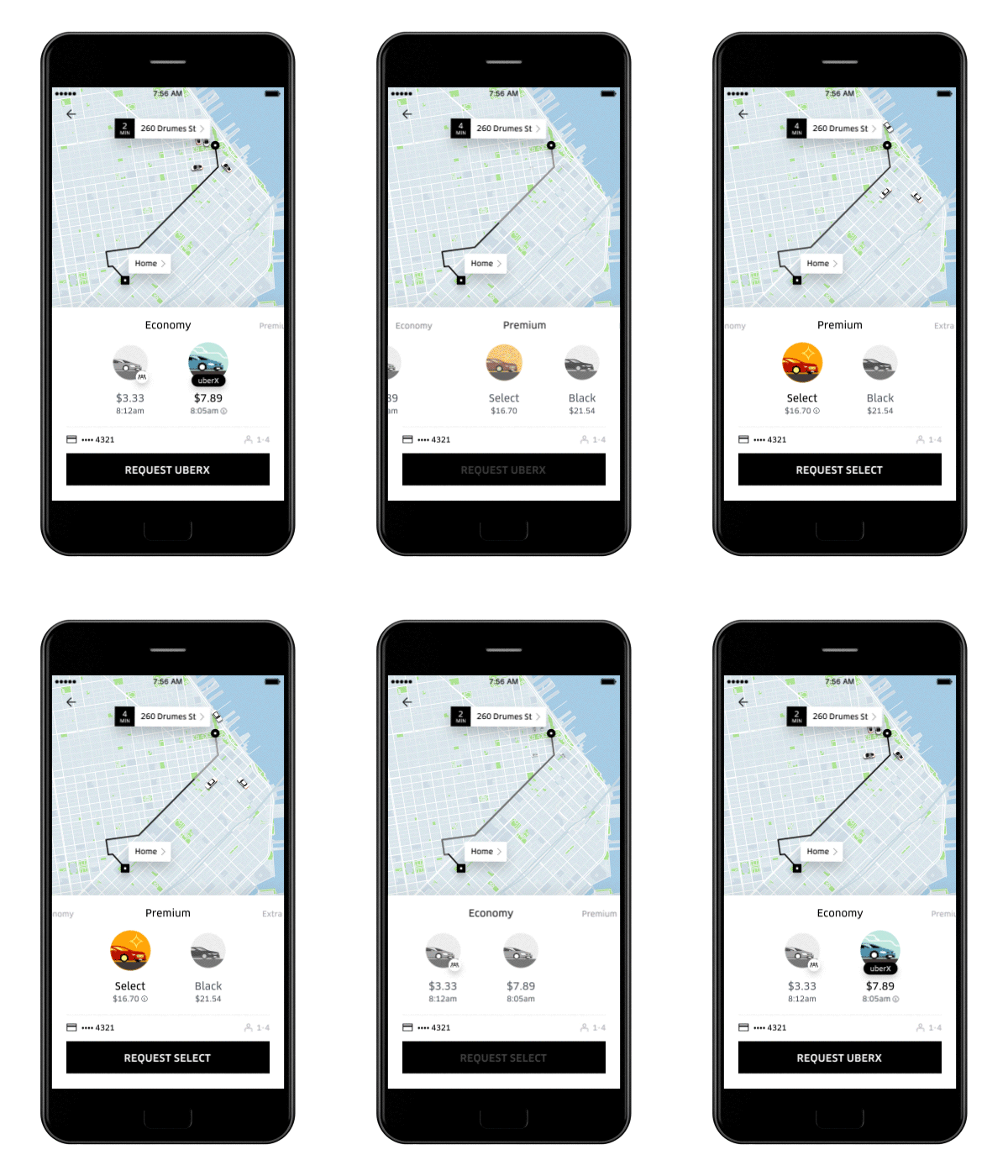
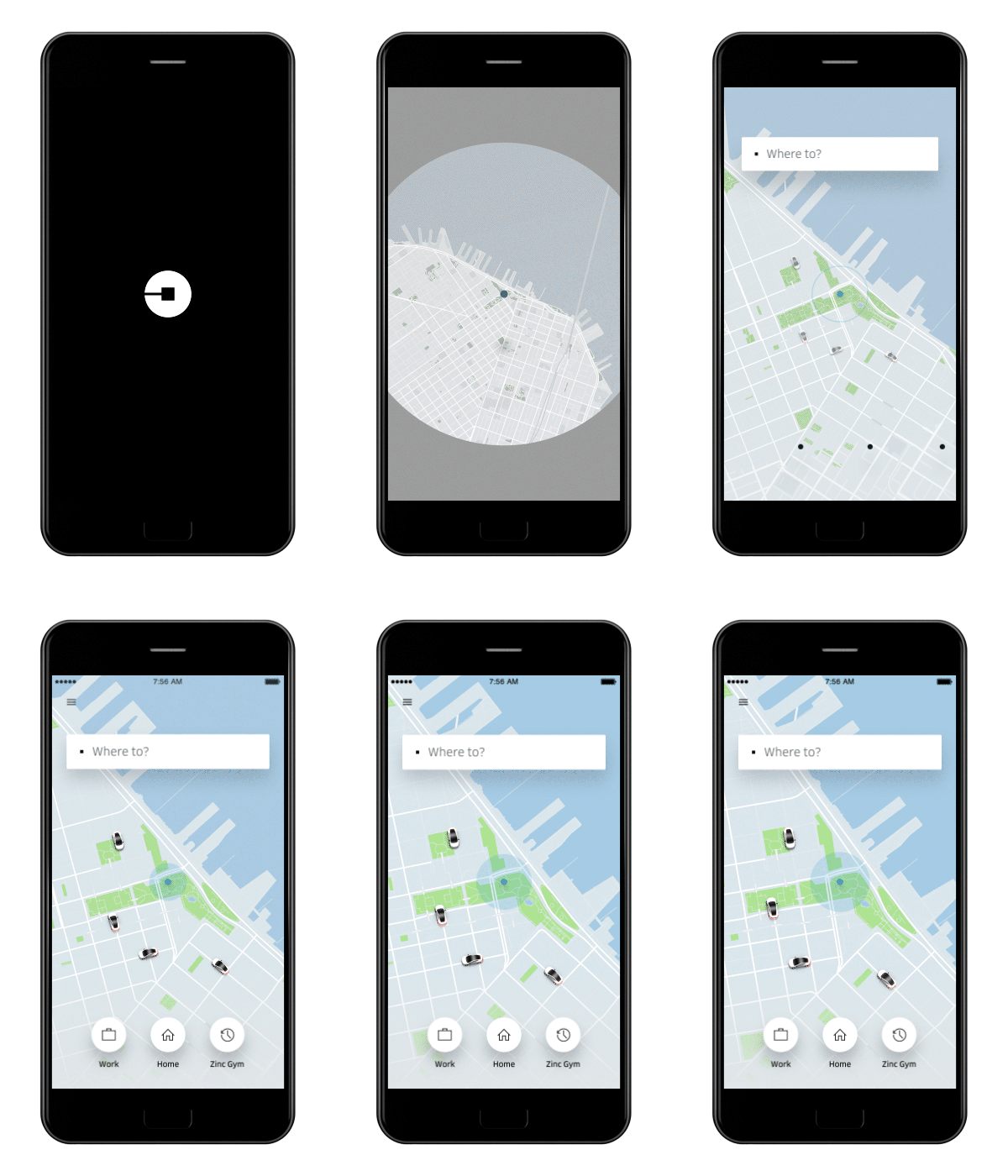
Uber dropped a new redesign on us this morning, one that flips the experience a bit by starting you off with a question, “Where to?” That’s in a way Uber realizing that when someone requests a ride, the whole point is that they have a destination in mind and would rather tell Uber where to take them upfront instead of telling it where to pick them up. That make sense?
In the new Uber app, the “faster, smarter” experience for riders not only asks you “Where to?” at the top, but it’ll even recommend frequently traveled to locations as shortcuts. In the near future, Uber will also allow you to connect the app to your calendar to make those predictions and shortcuts even timelier.
To make the app a better person-to-person experience, Uber is going to introduce a feature that lets you set a person as your destination. By giving Uber the power to sync your contacts with the app, as soon as they share their location with you, Uber will pull that as you end point. Again, that’s a “coming soon” feature.


As for fares, the new Uber app shows upfront charges for each type of service (uberX, UberBLACK, uberPOOL, etc.), letting you easily compare. Not only that, but better estimates for when Uber expects you to arrive are also included.
Other incoming features include:
- Using Uber to get to the station? Check Transit to see upcoming departures for the train, bus, and subway.
- Headed somewhere delicious? Browse Yelp reviews right from the app.
- Exploring a new neighborhood? Use Foursquare for tips on what to do and where to go next.
- On your way to friends? Play with exclusive Snapchat filters or stream your favorite songs on Pandora to get you in the mood.
- And if UberEATS is in your city, order food on the way home so you and your burrito can arrive together.
The new app starts rolling out today on iOS and Android. The rollout will continue over the “next several weeks.”
Via: Uber
This post was last modified on November 2, 2016 12:33 pm
