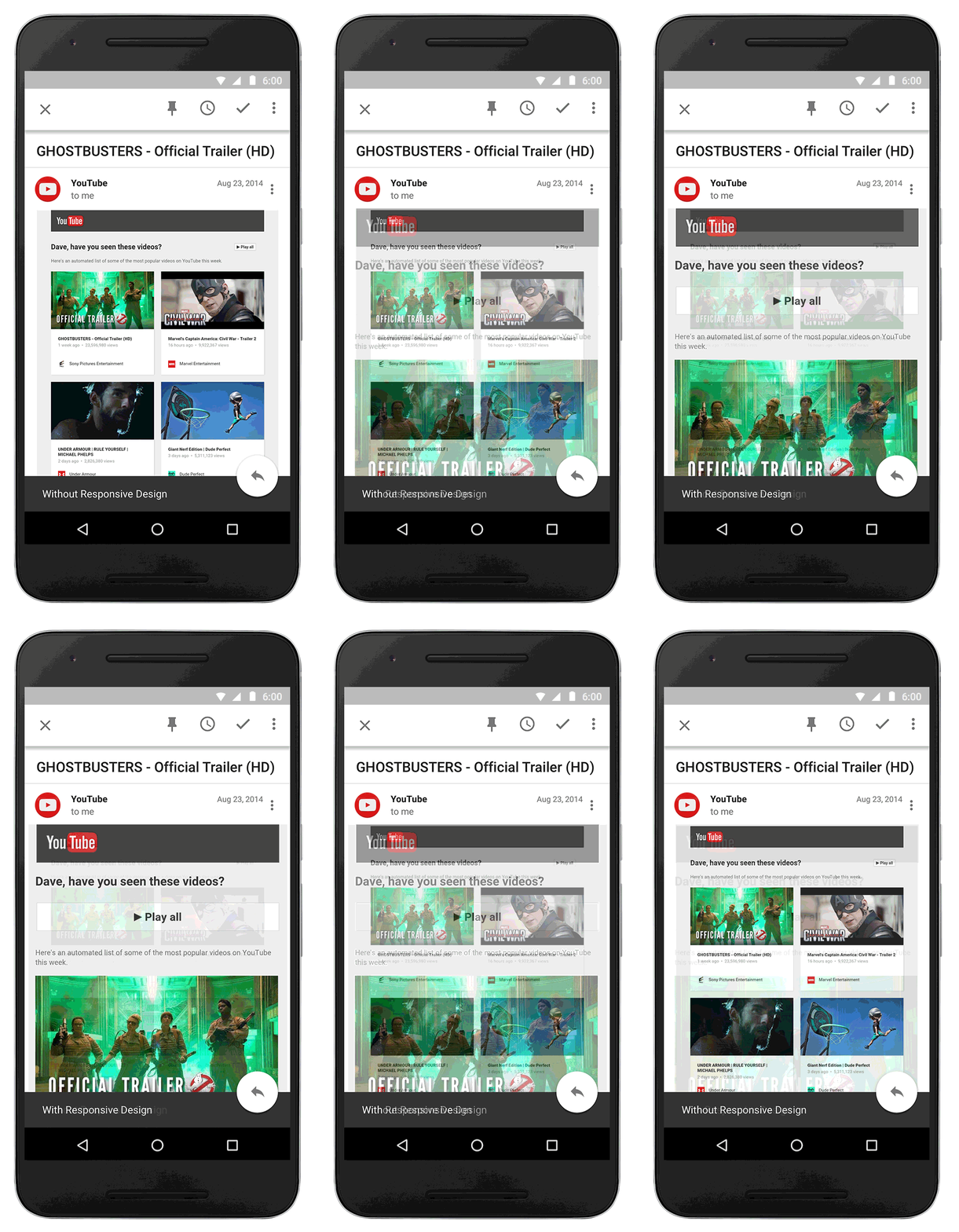
Because you probably read a whole bunch of email from your smartphone these days, Google wants to make sure those emails looks great, especially as you navigate from one screen size to the next. Starting this month, Gmail will begin supporting emails made with responsive design.
What does that mean? That means if an email has been created to automatically format differently depending on the screen size (the basic idea of responsive design), Gmail will allow that magic to happen. Not familiar with responsive design? If you are on a computer right now, grab your browser with Droid Life open, and resize it from skinnier to wider and you will see responsive design in action. The thought here is that a website (or email) shouldn’t need dedicated layouts that require refreshing or redirecting or large files in order to look great at all times. All resizing should happen automatically as the size of a website or email adjusts.
Google says that text, links, and buttons will “enlarge to make reading and tapping easier on a smaller screen,” but that many of the improvements will carry across to the desktop Gmail experience as well.
Once this all starts happening, you may not notice it has gone live because a responsive email should just work better no matter the screen size.

Collapse Show Comments20 Comments