In 2016, if you aren’t Apple or Samsung and you make smartphones for a living, you need to find new ways to stand out or you may not be around for long. This industry is tougher than ever and has become increasingly difficult for anyone to sell enough phones to remain (or become) profitable. For Motorola, they think that could all change through modularity and the idea that a smartphone can be improved depending on the situation, thanks to swappable hardware.
With the Moto Z and Moto Z Force, Motorola has introduced phones that are not only high-end devices with top-tier specs, they are also compatible with Moto Mods, a line of modules that attach to the backs of each via pins and magnets that could help improve an audio experience, battery life, etc. Motorola may not be the first to usher in the era of modules (that would be LG), but they more than likely are the first to at least get it close to right.
Over the past week, we’ve spent time with both the Moto Z DROID and Moto Z Force DROID, the Verizon versions of Motorola’s new phones, to see if 1) they are any good at being high-end phones, and 2) if this Moto Mods deal is worth your attention and investment. I took on the Moto Z, which you’ll find out all about below, while Tim has the Moto Z Force. You can read his review right here.
This is our Moto Z DROID review.
The Good
Software
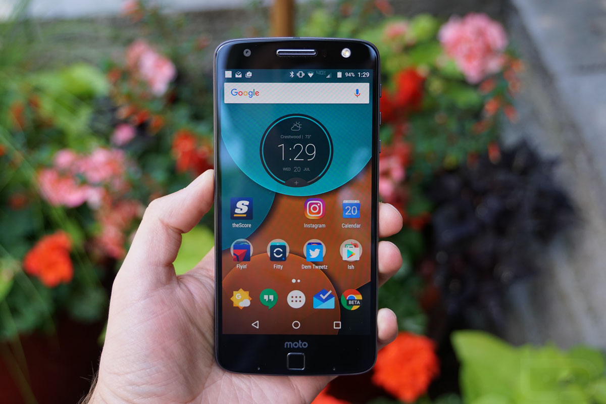
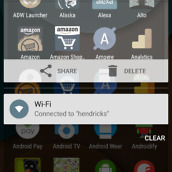
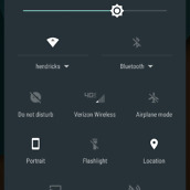
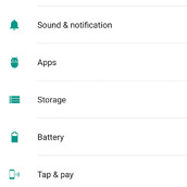
Motorola continues to put forth one of the best software experiences on Android. Even though the company is now owned by Lenovo, they are sticking to the “pure” Android experience that delivers most of Google’s vision, then improves upon it with their Moto suite. You get the almost purely stock appearance with on-screen navigation buttons, the notification shade that you want, settings menus that haven’t been messed with, and no extra fluff that could slow the phone down. Performance here, thanks to that light software, is very quick.
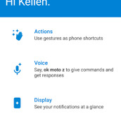
My favorite features from previous Motorola phones are all here, like Moto Display. With this latest version of Moto Display, Motorola is allowing you to more easily manage notifications from the lock screen and appears to be showing more detail too. Of course, the Moto Z still has the bottom IR sensors that let you just wave your hand over the phone to light up Moto Display for quick time and notification checking. Then you have Moto Voice, to give you powerful voice control over the phone’s functionality and a bunch of Moto Actions. For Actions, you are able to turn on the phone’s flashlight mode with the chop of a wrist, flip it over to activate Do Not Disturb, twist your wrist to launch the camera, and even swipe up on the phone’s screen to get you into a one-handed mode.
Again, all of that stuff sits in the background for the most part, so that you can just enjoy Android for what it is without extra layers of garbage and unnecessary skinning. There are times when I wish that Motorola would push to do more or take Moto Display or Voice to the next level, but I can’t exactly complain. I’ll take this over what Samsung and LG are doing any day of the week.
On another bonus, Motorola has basically stripped everything out of this phone in terms of pre-loaded apps that aren’t Google’s or Verizon’s. So yes, you do get a massive list of Verizon bloatware, but you then only get Google’s apps alongside them. So instead of having a Gallery app and the Photos app, you just have Photos. You also are basically just expected to use Gmail and Google Calendar instead of a Moto-made email or calendar app.
Now, there are a couple of areas that do bother me, though. For one, Verizon insists on making Motorola put this random launcher on the phone called Launcher3. It’s like Google’s Now Launcher, only it lacks functionality and will probably never see updates. I don’t get the point of doing this, especially since all other non-Verizon Moto phones come pre-loaded with Google’s Now Launcher.
Finally, and maybe most importantly, the software update situation here is a scary one. I’ll touch on it more in a section below.
Fingerprint reader
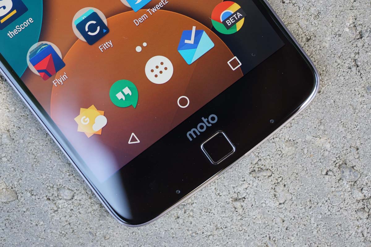
The fingerprint reader on the Moto Z line is quite good. I can’t say that I love the placement of it, directly in the middle of the phone’s giant chin, but it works and does so quickly. I tend to prefer fingerprint readers to be on the back of phones for pulling-out-of-pocket reasons. However, I get the idea of having them on the front. They are accessible no matter what you are doing, which includes the phone sitting on a table or desk.
The fingerprint reader here is quick to learn fingers – not as quick as a Nexus, but way quicker than a Galaxy – and also has an additional feature that I wish others would take on. Once the phone is awake and you decide you want to lock it again, you can press your finger over the reader one more time and the phone will lock. This is one of those minor yet incredibly handy features that allows you to get in and out of your phone without doing much.
As for reading times, I’d put this fingerprint reader somewhere towards the top of the list. Since it isn’t a physical button and instead acts more like a capactive touch pad, you can just rest your finger on it to have it read. That saves quite a bit of time, especially when you compare it to a phone like the Galaxy S7, where you have to physically press the fingerprint/home button in first before it’ll read. On the Moto Z, you just rest your finger on there, it reads and unlocks your phone. And then, if you decide you are done right away, you can rest it back on there to lock. No other phone, outside of the OnePlus 3, can do that at the moment.
Display
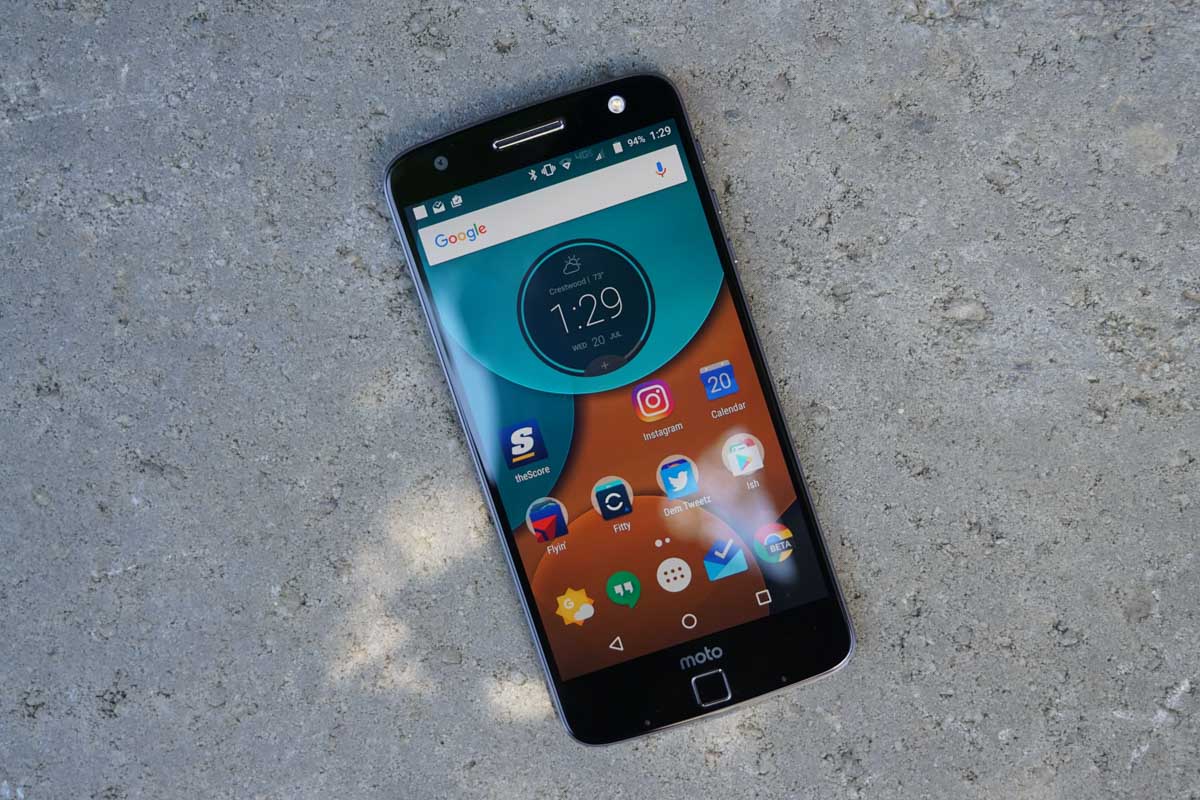
This year, Motorola went back to an AMOLED display and delivered a winner on the Moto Z. The resolution weighs in at quad HD, while the size tops out at 5.5-inches. It’s big, but most phones these days tend to be big and 5.5-inch is largely thought to be one of the sweet spots.
The AMOLED display works perfectly with Motorola’s Moto Display and makes sense to be included, since it allows only specific pixels to be lit up each time new notifications arrive. Why they went with an LCD last year is beyond me, unless they really were trying to pinch all the pennies. Because it is an AMOLED, you also get create color saturation, some punch and vibrance, yet you can tone all that down if you want to a more natural look. Out of the box, my Moto Z came set to “Vibrant” mode, but there is a “Standard” mode as well that is described as displaying “realistic color.”
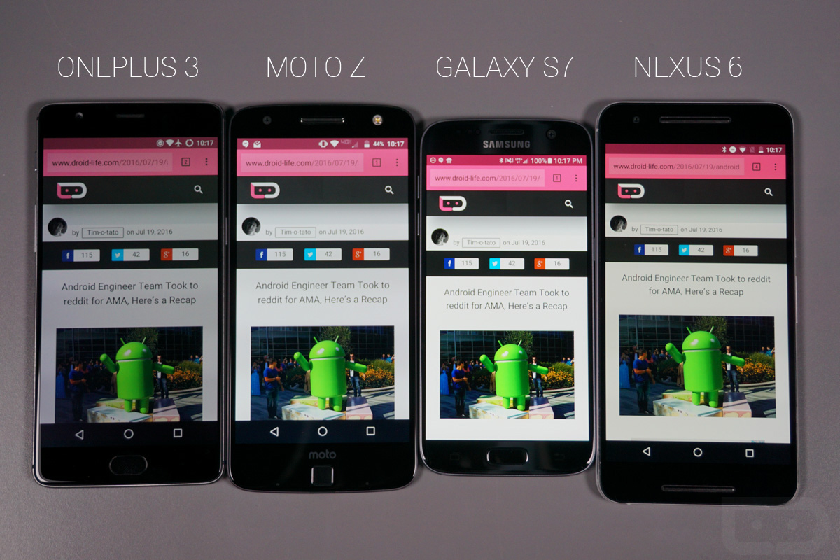
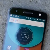
The viewing angles are great, as you can see below, brightness levels are adequate, and the overall experience is one that I don’t have any major complaints about. The Moto Z’s display isn’t on Samsung’s level just yet, but it’s certainly not far from it.
If you are looking for a complaint, it’s the fact that this phone doesn’t have Motorola’s Shattershield technology like is in the Moto Z Force. With Shattershield, you get a display that can’t be shattered. Why leave it out of this phone and only put it in the Force? Clearly it’s a play to get you to upgrade and pay more, which isn’t exactly a customer-friendly move.
Fast charging
Fast charging is one of those features we’ll probably stop pointing out within the next few months during reviews, because almost every phone has some form of it, but Motorola being one of the first to adopt it and also continuing to do their part in pushing it forward is worth acknowledging. On the Moto Z, even with its smallish 2600mAh battery, the claim is that you can grab 8 hours of power in just 15 minutes worth of charging. I don’t know what percentage that calculates into, but the point is that with a supplied Motorola TurboCharger handy and a dead battery, you only need a few minutes to get juiced up for the next few hours. Motorola is claiming that this is the “world’s fastest charging smartphone.”
I should also point out that Motorola does indeed include one of their new TurboChargers in the box. “New” meaning this is a substantially slimmer charger than the original TurboCharger. It no longer looks like a giant black box and instead isn’t such a nuisance to pack around with you. Just keep in mind that this is a charger only and doesn’t have a detachable USB cable.
Plenty of storage
Thanks to the re-adoption by almost everyone of the microSD slot, storage on phones in 2016 shouldn’t be much of a concern. The Moto Z will come in either 32GB or 64GB models (64GB only available on Moto Maker), but you can add on up to 2TB of extra storage via microSD. For now, that really means an extra 256GB, since those are the highest capacity cards available. Still, should you opt for the 64GB model and then toss in a 200GB or 256GB card, you are looking at upwards of 300GB of available space on your phone. That’s got to be enough, right?
Somewhere-in-the-Middle
Camera
There aren’t many differences between the Moto Z and the Moto Z Force, but one of the big ones lies within the camera department. On the regular Moto Z, you get a 13MP camera with optical image stabilization (OIS), laser autofocus, and an f/1.8 aperture. On the Moto Z Force, you get a super high-end Sony IMX338 21MP camera with OIS, laser autofocus, phase detection autofocus, and an f/1.8 aperture. The Moto Z Force clearly has the upgraded shooter here and I think it shows in both performance and results.
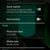
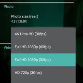
Before we get to the results, though, here is a look at the software. In years past, Motorola’s camera software was so bare bones that it was a bit underwhelming and frustrating at times. You just didn’t have much control over what you wanted to take pictures of and I think Motorola realized that their customers want more. This year, they have a brand new camera app with a more traditional layout, along with new settings, and a full “Professional” or manual mode. The software has been greatly improved, to put it lightly.
As for the results, well, I’m just not all that impressed. For one, camera performance here is too slow when compared to other flagships. The camera can be loaded with Motorola’s wrist twisting gesture or a double-tap on the power button, but it’s just not all that fast to fully boot and be ready to shoot.
The slowness only carries over to focus times and actually taking pictures. With auto HDR activated, this camera tends to like to use HDR, which I normally don’t have a problem with, except that it’s painfully slow in HDR mode at snapping and processing. In fact, you’ll often be greeted with a message telling you to hold still for a few seconds. Seriously, in a 2016 flagship, your phone reminds you to hold still in order to capture the right shot. And with the slow autofocus, I found myself in too many situations where I wasn’t sure if it had refocused, was still focusing, or if I needed to tap to tell it to focus properly in the correct position. That’s just too much work for a smartphone where you would rather it take good photos without any fuss or question marks.
Speaking of shots, below you will see a handful. I will say that the camera is capable of taking some decent pictures and even does a respectable job at capturing plenty of light in low-light situations, thanks to the f/1.8 aperture. But in the end, I’m not overly happy with the detail in a lot of the photos and often found close-ups to be murky and overprocessed. The camera clearly, as I just mentioned, favors HDR, which is fine, except that with HDR on all of the time you get those ultra-fake looking photos that get too wild with color reproduction.
The camera here isn’t on par with the Galaxy S7 or LG G5 or HTC 10, unfortunately.
Full resolution images can be found in this .zip file.
Moto Mods
This section probably almost needs its own separate review because of its importance to not only this phone, but the smartphone world in general so hang with me while I talk about the Moto Z and Moto Mods at length.
I can’t help but think that Motorola came really close to getting this idea right. I say that because the Moto Mods integration into the Moto Z is quite good – almost too good. What I mean is that, as someone who tinkers with tech, I want to know more, yet it all seems buried in secrecy. There aren’t really any menus to adjust or tweak, nor is there software to customize. Instead, you just pick a Moto Mod and “snap” it onto the back to get whatever functionality it offers. It is the simplest setup ever and probably for good reason. When you are adding and removing hardware from a phone, you don’t want consumers to have to go out of their way to get anything to work – you just want it to work and that’s what Motorola is offering here. It’s quite brilliant, in all honesty.
If you look at the LG G5, the other supposedly modular phone of 2016, you get an incredibly clunky modular setup that requires you to eject parts of the phone, turn it off, and swap batteries around. Actually, “clunky” is probably giving the G5 too much of a compliment, because Motorola absolutely crushes LG’s approach.
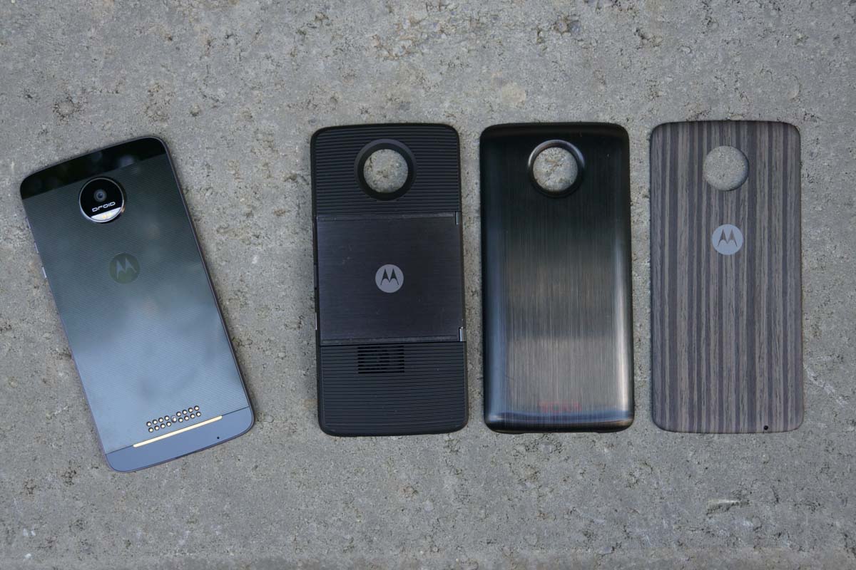
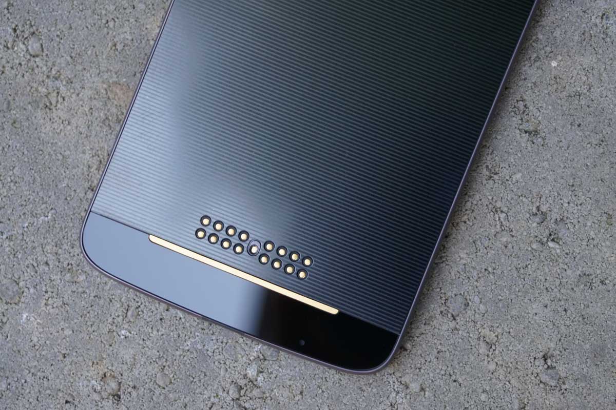
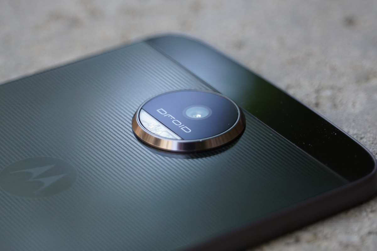
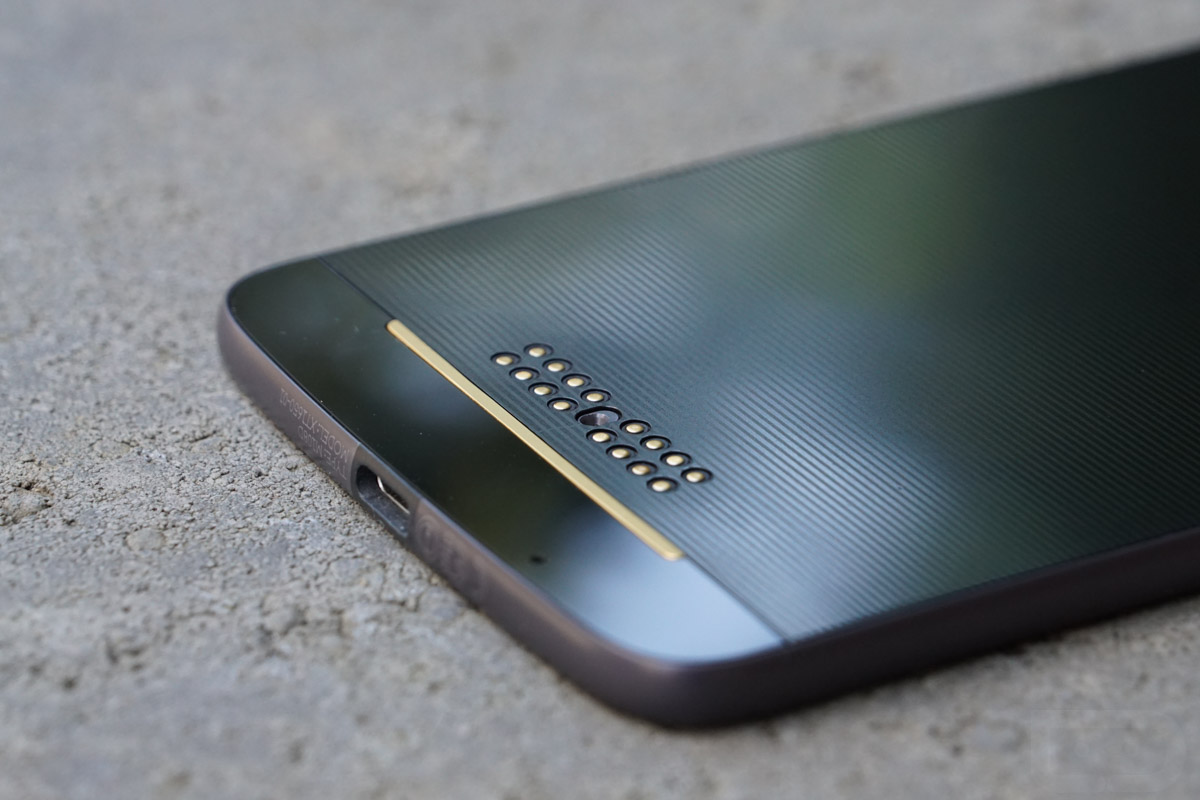
Motorola is using a system that involves both pins and magnets to hold Moto Mods in place. In order to attach a Mod to the Moto Z, you line up the pins and the hole that will sit around the camera and snap it in place. It then just stays there until you use a fingernail towards the bottom of the phone to pry it off. The Mods don’t wiggle much or give off any sort of feeling that they may fall off while in use. And trust me, it was the first thing I checked on because I assumed they’d slide and wiggle all over the place. Thankfully, they don’t.
Motorola let us have the whole suite of Moto Mods that will be available at launch to test for this review. While I don’t know that each needs its own review, I’ll try to sum up some thoughts on each here. After all, each is pretty self-explanatory in functionality. Oh, and on that note, Tim has the JBL SoundBoost speaker for his Moto Z Force review, so if that’s the Mod that interests you, be sure to check out his review.
Tumi Power Pack ($59-$89)
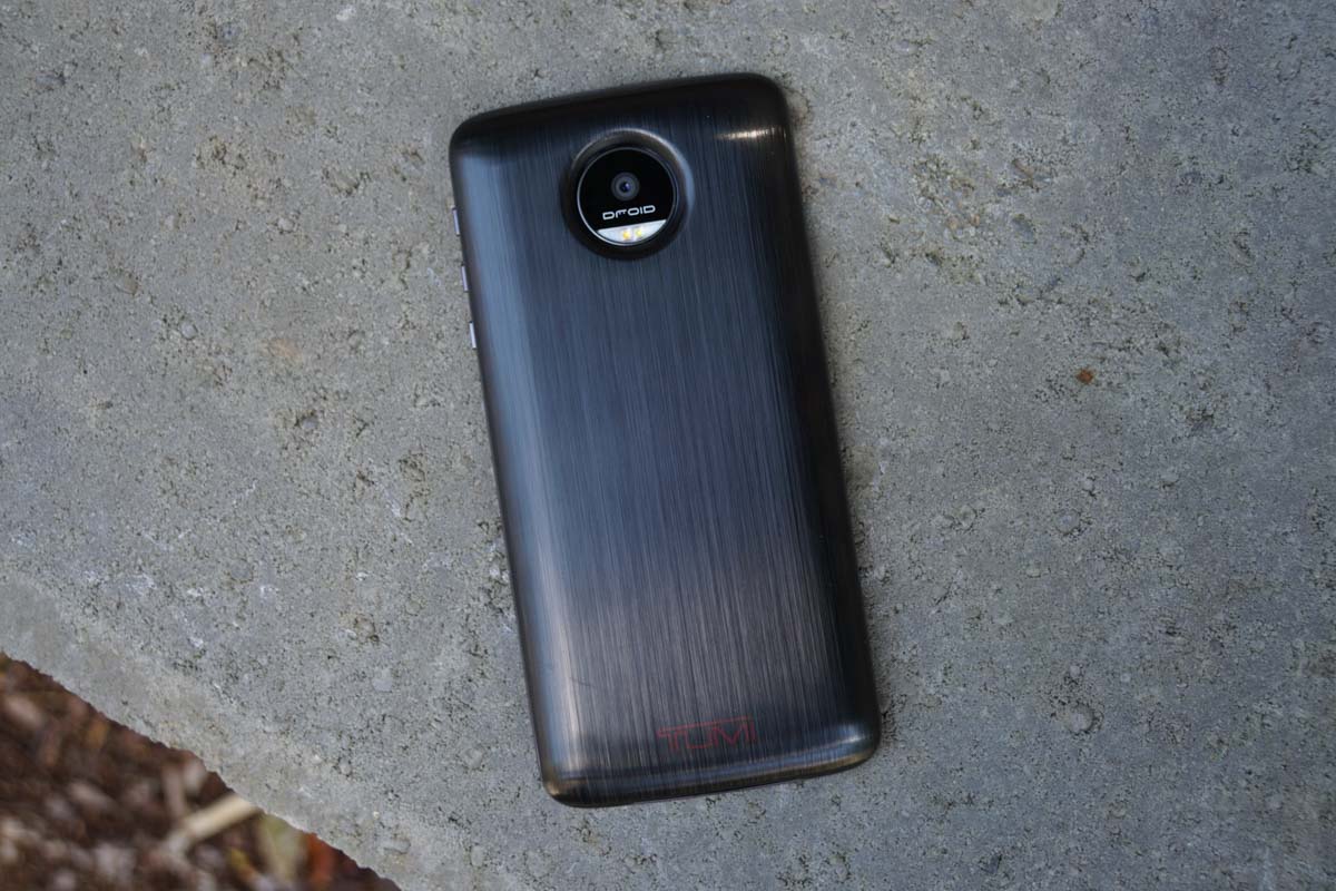
The Tumi Power Pack is a branded Moto Mod from Incipio, a company known for making cases and power packs. There will be Incipio branded ones as well, along with Kate Spade options for the fashionistas in the building. This pack offers your Moto Z an extra 2200mAh in juice, or as Motorola puts it, up to 22 hours. It’s fairly sleek and looks nice, assuming you don’t mind your phone having Tumi branding on it.
I will say that at first, I was really excited at the possibility here. To think that if your phone was dying and you had no charger around and aren’t interested in a big ass battery case, this would be the perfect solution. Sadly, I have to report back that the integration fails for the most part. Sure, it will charge your phone, it just does so at an incredibly snail-like pace. There is no Turbo Charging here with this power pack.
Why is that so bad? The best example I can give you is the experience I had one my way back from New York City last week after picking up the Moto Z. I was sitting on an airplane and the phone had dropped to around 12% or so. I slapped on the Tumi Power Pack and hoped that it would keep up with my ongoing use. It didn’t. Over the course of 15 minutes or so, it did jump up to around 15%, but I actually watched it drop a percentage point while attached and the phone in use. That’s really not OK. If a battery pack can’t keep up with your phone usage, what’s the point? You may as well go seek out an outlet and Turbo Charge for 10 minutes.
Also, keep in mind that at 2200mAh, this pack can’t even get you a full charge. In fact, in the times I used it, it was only able to get me up to around 60%. That 60% took almost 2 hours to complete.
Finally, the only way to charge the Tumi Power Pack is to have it attached to the phone while the phone also charges. That’s not the worst setup, but it does make you think about how and when you can keep your Mods full of juice. I’d much rather be able to plug the power pack in separately.
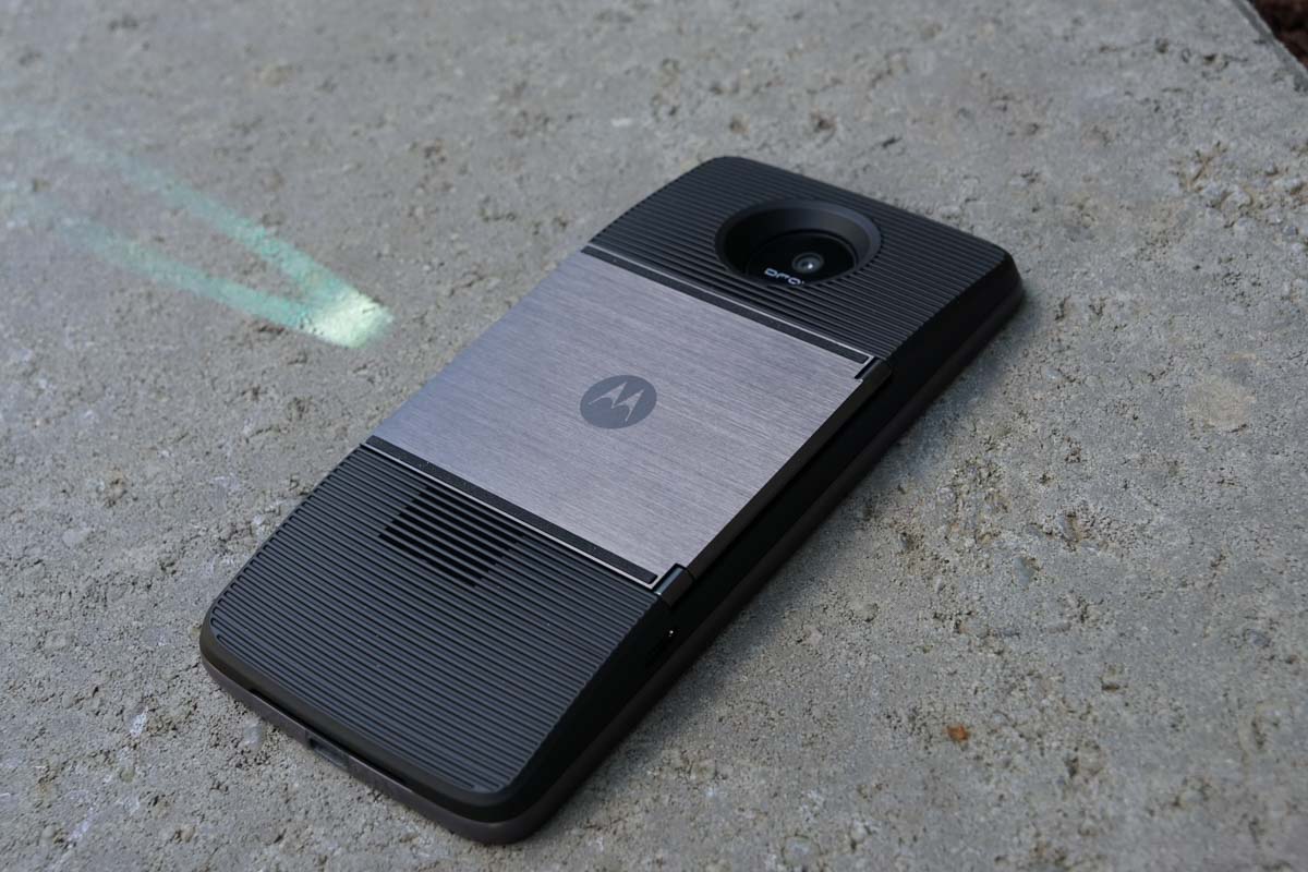
Moto Insta-Share Projector ($299)
The projector that Motorola is selling as a Moto Mod is a fun idea, I just don’t know how practical it is for most of us. For one, it’s $300. Two, it’s low 480p resolution doesn’t exactly make you want to put up a movie onto a big screen or wall and enjoy with friends and family. I could see it coming in handy for meetings in smaller conference rooms or on a camping trip, where you want to have some fun in the tent, but other than that, it’s one of those meh accessories.
It works for about an hour (1100mAh battery inside) at full charge before then digging into your phone’s battery. Thankfully, you can charge it through its own USB Type-C port, so you don’t need it to be attached to the phone, like you do with the power packs. It also does pretty nifty keystone correction to get auto-lined up on any surface and has a built-in stand for easy propping.
But then it uses your phone’s average single speaker for audio, doesn’t really get all that bright, and again, costs $300.
Style Shells
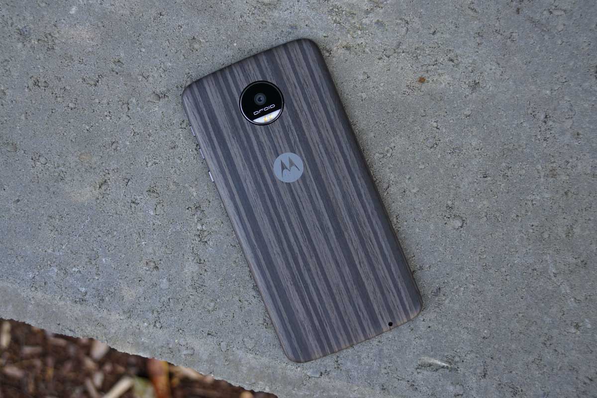
Motorola hasn’t talked about these much, but Style Shells will allow you to customize the look of your Moto Z in a snap. They included a wood Shell in the box, so you do get one right away. However, my assumption is that they will sell others, including those with leather, nylon, and other woods. I’ve seen some of the other options and they all look great. This is a brilliant way to add some personality to your phone and I don’t even think they’ll be that expensive. I say that because Incipio is making a series that only cost $15 individually. I can’t imagine Motorola charging much more than that for their own.
So in the end, my thoughts are that Motorola really did a nice job with the idea of modules attaching to a smartphone. The setup is so seamless and fun to use for the most part. At this time, though, the available Mods, outside of the JBL speaker, just aren’t really worth the extra investment. We saw a Hasselblad camera Mod leak months ago, so that could arrive, plus, Motorola seems to think that developers are really interested in creating their own. Give it a couple of months and we may see a really nice ecosystem. Heavy on the “may” there.
Design
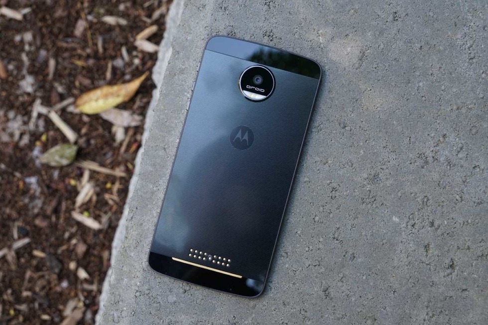
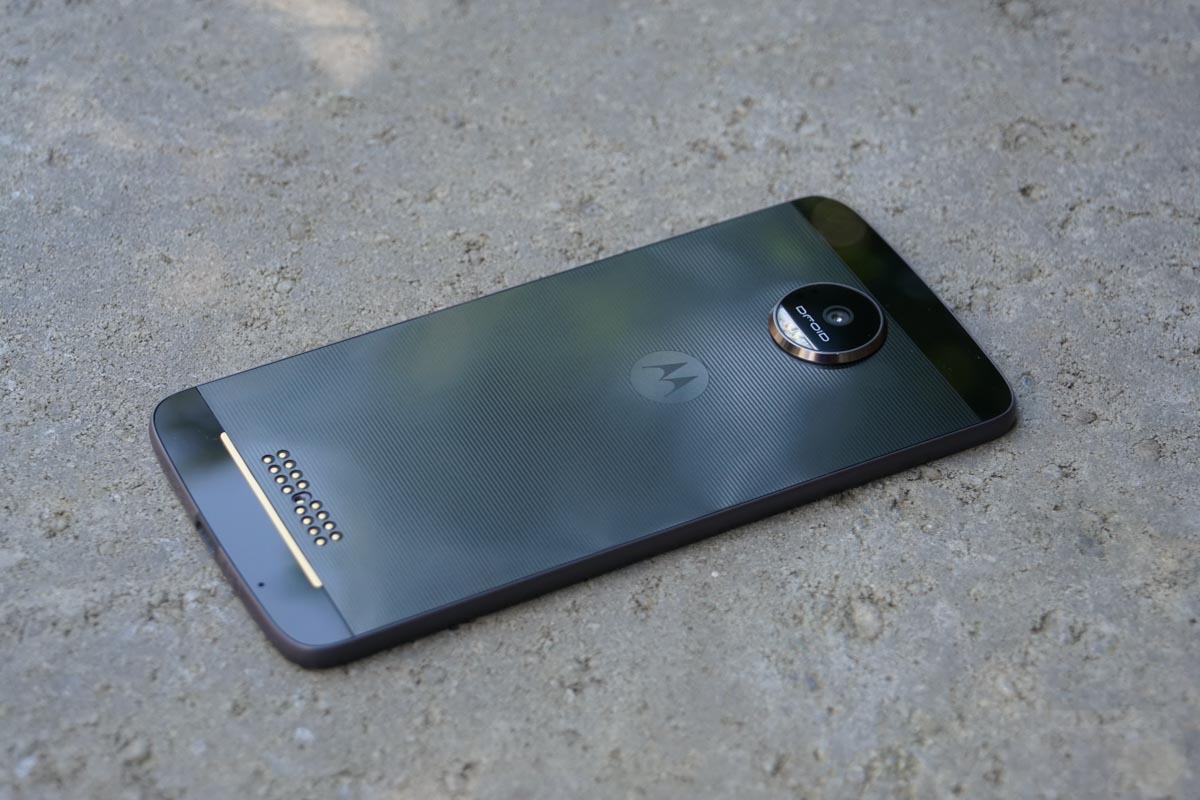
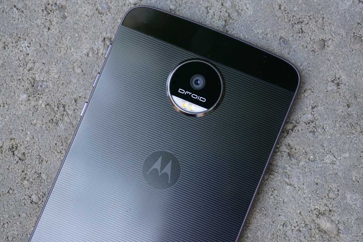
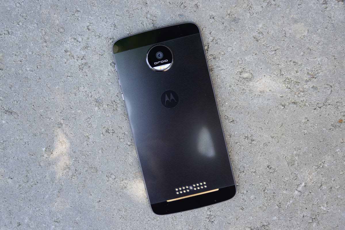
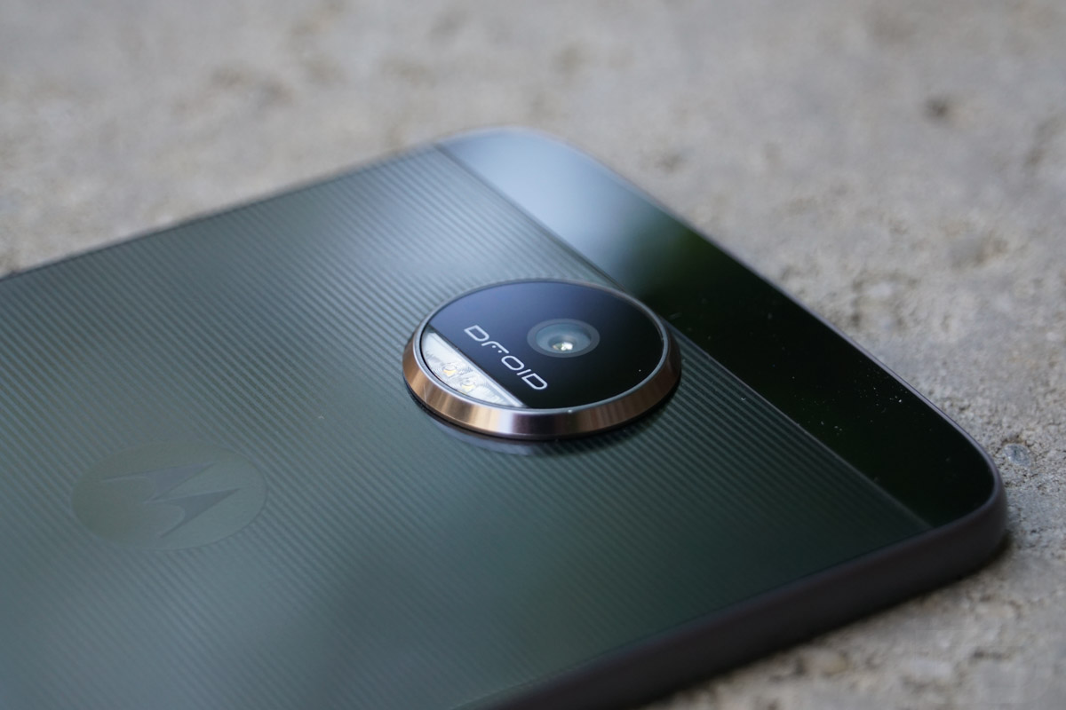
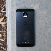
The overall design of the Moto Z is a mixed bag of love and frustration for me. On one hand, this is a phone that has a very unique design identity that is quite beautiful. There is a good mixture here of metals, glass, plastics, and textures that you don’t see often in a phone. My review unit happens to be the black and charcoal model, so you get these really nice contrast of gold pops from the pins that attach to Moto Mods. You get that massive camera puck as well, though it’s growing on me for some reason. I think it’s just so outlandish looking that it becomes refreshing in a world filled with flat smartphone slabs. I also really appreciate the cleanliness of the entire exterior, including the fact that there is no headphone jack, the subtle lines running across the phone’s back, and the cartoonishly thin body.
The phone frustrates me in the sense that it might be too thin and too wide at the same time. Because Motorola made a phone that is 5.2mm thick, they more than likely had to flatten out the design, which leads to the added width and that massive chin that holds the fingerprint reader. I think the thinness to it also made it not that comfortable to hold in hand. Rather than the phone having backside curves that lay gently in your hand, I keep finding that I constantly squeeze the sides to make sure I have a good grip on it. This is one of those phones that isn’t the easiest to use with a single hand and really does fall in the two-hander category.
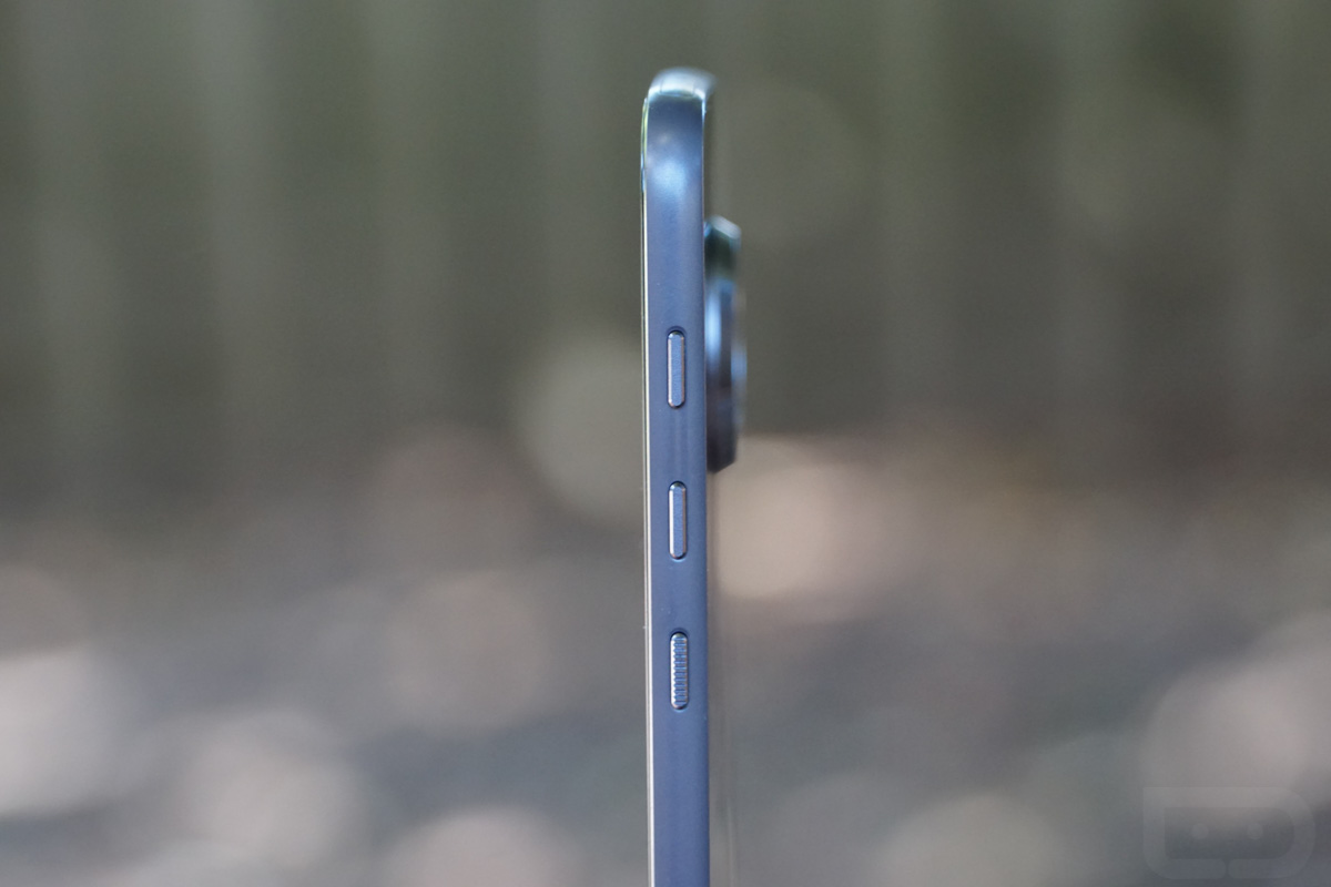
Speaking of using, the buttons on the side of this phone are no good at all. Motorola took the HTC One M9 approach to buttons on the Moto Z and it was a mistake. As you can see from the image below, the volume rocker has been separated into two buttons that match the power button in size and spacing. Because of this setup, it makes it incredibly difficult to know which button you are pressing even with the texture added to the power button. The buttons also sit way too high up the side of the phone and are tough to reach without a shimmy.
Overall, I love the appearance of the Moto Z. If you take a look at not only this review unit, but the others that have gold trim or fully gold backs, I think you’ll agree that this is one of the most unique phones on the planet. I would love it if all companies took some more chances with design like Motorola has here. Unfortunately, the phone just doesn’t feel great in hand. The width, height, ultra-thinness, and button placement make it kind of a frustrating experience.
Battery life
Thankfully, this phone is the “world’s fastest” when it comes to charging, because you’ll more than likely need to charge it mid-day depending on your usage. In my testing, the phone was sort of all over the place. On this last day, leading up to the review, I’ve had my best day, where I’ve gone a solid 11 hours with 2 hours of screen on time so far and I have 45% left on my battery. But then I also had days where I came off the charger in the morning at 6AM and it was down to 27% or so by 2PM or practically dead by 4PM. I had a day that went from 6AM to 9PM as well, though, so it’s tough to call this good or bad, hence the reason I have it listed as somewhere-in-the-middle.
At just 2600mAh, the battery in this phone is arguably small. We know that Motorola had to go this size to keep the phone this thin, so it is what it is. Again, the Turbo Charging will come in handy, plus you do have the Moto Mod battery packs too. Just don’t expect this phone to be the battery champion. If you want a Moto Z that lasts all day and then some, aim for the Moto Z Force and its 3500mAh battery.
No headphone jack
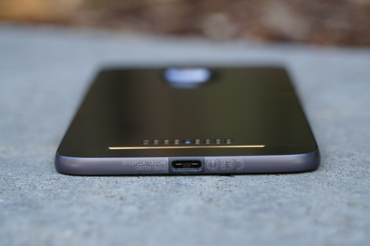
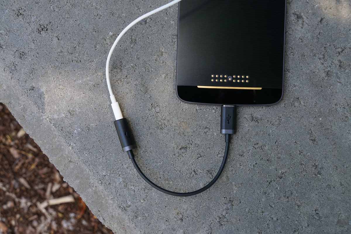
As our friend MKBHD put it, Motorola pulled an Apple before even Apple could pull an Apple. That’s in reference to the lack of a headphone jack here, a move that Apple is supposedly making on the new iPhone. Yes, you read that right – the Moto Z doesn’t have a headphone jack. So how does it work with headphones, you ask? Well, they included a dongle (pictured below). That dongle plugs into the USB Type-C port of the phone, which is the only port you’ll find, and allows you to attach your headphones.
I don’t have a strong take on this situation, other than that I feel bad for everyone who will need to now keep track of a dongle on the daily. You see, you get the same experience, at least in theory, by attaching your headphones to a dongle that is passing audio through. The problem is that you now have to carry a dongle with you, along with your phone and headphones and Moto Mods and charger and all that. That does kind of suck.
There are two potential fixes to make your life dongle-less. One would be to buy USB Type-C headphones that don’t exist yet. We know JBL is supposedly working on some. We aren’t sure if anyone else is, but you would hope so, since this seems to be the direction companies are interested in going. The other fix is to buy Bluetooth headphones that don’t require any wires. That, of course, means an investment in new headphones, something a whole bunch of people aren’t going to want to do.
So what are the benefits to this move? Honestly, I don’t really think there are any. Maybe, at some point, you’ll get headphones powered by USB Type-C and the audio will be super fantastic? Otherwise, Motorola probably did this to make the phone ultra slim (5.2MM!). Is there a benefit to that? Only if you need the world’s slimmest phone. Otherwise, no.
Specs
The overall specs package here is solid. Motorola didn’t cut any corners, but they also are missing a couple of features that companies like Samsung managed to include for a similar price.
Motorola packed in a Snapdragon 820 processor (the Snapdragon 821 just got announced, so they will launch a slight step behind the next wave of phones), 4GB RAM, 32GB/64GB storage, microSD support up to 2TB, 5.5-inch QHD AMOLED display, 2600mAh battery with Turbo charging, fingerprint reader, 13MP camera with OIS and laser autofocus, 5MP front camera with wide-angle lens, and a USB Type-C port.
My only issues here are that Motorola still won’t adopt full water resistance (this phone only has a water repellent coating), they skipped wireless charging, and didn’t include their Shattershield technology in the display. So unlike the Moto Z Force, you can’t drop this phone at will. If you do, it’ll shatter like all other smartphones.
So for the most part, Motorola is doing a lot of good stuff here, they just aren’t doing it all.
The Not-so-Good
Motorola’s history with software updates
Back in April, I told you that if you care about software updates or security, you shouldn’t even consider buying Motorola DROID phones on Verizon. Why? Because they are some of the last phones on the planet to receive not only major updates to Android, but they also almost never see timely security patches that are introduced monthly by Google. Motorola, probably because Lenovo laid off all of their support staff, can’t seem to push out anything when it should be. I don’t want to take the time to re-dive into all of that here, so if you want to know more, read this post.
I wish I could tell you to ignore that post as of today, but I haven’t seen anything from Motorola to suggest that things are going to change with the Moto Z and Moto Z Force. During their multiple unveilings of these two phones, no mention of future software updates was made. We are assuming that these phones will get Android Nougat at some point, but when is anyone’s guess. It could be six, seven, or ten months from when Google releases it for all we know. As for security patches, just expect to rarely see them.
I wish I had better things to say in this category, especially since Motorola was one of the best in the business at issuing software updates not all that long ago. Can they re-gain some of that swiftness? Sure, even slow Samsung is at least doing well with security patches these days. I guess it all depends on if Lenovo decides to care or if they are fine taking all of the blame for Motorola’s woes.
Availability
Motorola is a company that like HTC, hasn’t been able to regain previous success even after releasing numerous phones that reviewed well. Ever since Samsung took over the game a few years back, it’s been tough for anyone to keep up and turn a profit. Motorola, under Lenovo, was expected to return to the glory days of the original DROID, yet that hasn’t happened and Lenovo has recently had to admit that things haven’t exactly gone as they had hoped. So what does Motorola do? Release two phones that are arguably their most innovative to date and lock them onto Verizon as exclusives.
I cannot tell you how disappointing it is to see the Moto Z and Moto Z Force release exclusively to Verizon for the foreseeable future. Not only that, but the Moto Z Force is Verizon’s for good, at least in the US. That means if there are non-Verizon Motorola fans out there, the only choice for them will eventually be a GSM unlocked Moto Z. And we don’t even have a firm date on that happening.
After releasing the fully unlocked and universally accepted Moto X Pure Edition last year that worked on all major carriers and dropped in at a more-than-reasonable price point, this is beyond disappointing.
Other Notes
- Single front speaker: Yeah, so the Moto Z has a single front-facing speaker that also doubles as the earpiece. That means no stereo sound like we got on last year’s Moto X Pure Edition. I don’t know that I would categorize the speaker as being bad, but I do know that I prefer it to the bottom firing speakers that everyone else is using for one reason – you won’t cover it up when playing games or watching videos.
- Fingerprints: If you buy this charcoal and black version, good luck keeping fingerprints off of it. Some heavy breath and a shirt barely does the trick.
- Bloatware count: I counted a solid 12, 10 of which I disabled immediately. I don’t know why, but that seems low for a Verizon exclusive phone. Are times changing?
Video
Unboxing
[responsive_vid vid_url=”KHZTmQgp09o”]
Software tour
[responsive_vid vid_url=”JN5SqI2ZP_U”]
First 10 things to do
[responsive_vid vid_url=”Y13jUE_vYFg”]
Moto Mods tour
[responsive_vid vid_url=”M8pAOtTmwLA”]
Gallery
The Verdict
The Moto Z DROID has some good things going for it, but unfortunately for Verizon and Motorola, it has just as many in the average category. On one hand you get a phone that is beautiful to look at with top tier specs for the most part, a lovely software experience, and a stunning display. On the other, you get an average camera, average battery life, a phone that isn’t that much fun to hold, and availability that stops at Verizon.
Sure, you do get Moto Mods and a really cool modular concept that has been executed very well, we just aren’t sure the current crop of Mods are worth your time or money, outside of the speaker. So an area that should be the phone’s biggest selling point, isn’t quite ready to be that.
Priced at $624 full retail or $26 per month on a device payment plan, you are in Galaxy S7 territory. In my opinion, even with the Mods available for the Moto Z, I’d take the Galaxy S7 over it every time.










Collapse Show Comments86 Comments