Not surprisingly, Android news is pretty slow these days, as it always is in the lead-up to a new version of the OS. Google more than likely doesn’t want to out anything too fun at the moment, since we are only two months or so from stable Android N going public and new Nexus devices running it arriving alongside it. To fill the time, we are left entertaining rumors of minute changes that may or may not be on the horizon, like Google tweaking the navigation bar appearance and creating a live support app for Nexus users. Yep, that’s where we are at the moment.
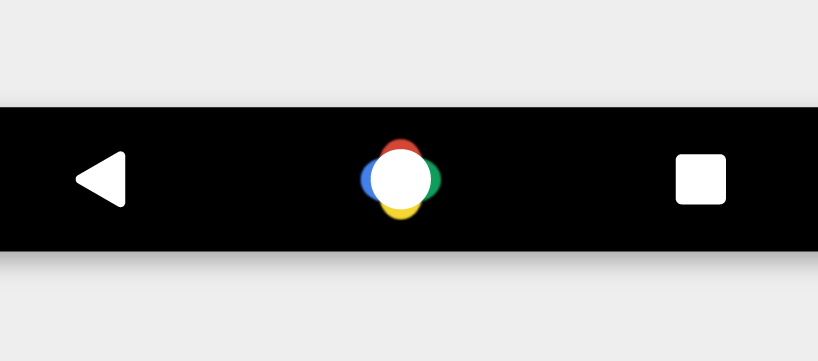
Both bits of information arrived through Android Police, this morning, but to break it up, let’s start first with the navigation bar. According to this report, a new navigation bar could see life on Android N or only on Nexus devices or on…we don’t know. But this is what it could look like! Emphasis on the “could” because Google is prone to switching things up on a regular basis.
Please, no. That home button is…yikes.
Today’s report suggests that this new navigation bar may arrive soon and that the home button has some sort of long-press animation along with it. That’s really all we know. What I know is that I’m hoping this is one of the “We’re just playing around, guys, and we’ll get rid of this multi-colored disaster at launch! Haaaaah…chill, bros!” types of things.
Look, I get that this could be some sort of Nexus exclusive type of change, where Google is highlighting that Nexus phones are Google phones and you should be happy and proud to own one and that those colors could animate into some hot Now on Tap action that all the fanboys will get sweaty over. But it also feels a hell of a lot like when Verizon branded the home button of the Galaxy Note 2 to let you know every single time you touched it, that Verizon owned your ass. We get it Google, your colors are fun and you infuse them into a lot of things, but this isn’t the way any of us want to see it. Just stick to the simple, clean, modern, minimal home button we all know and enjoy.
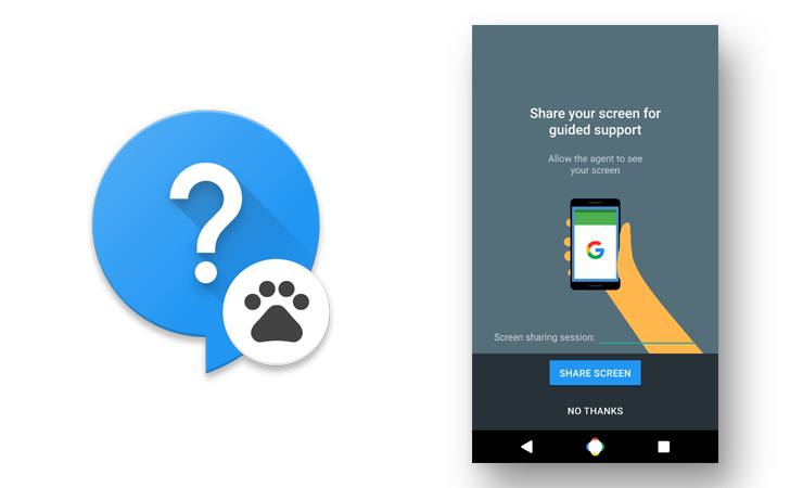
As for the second rumor today, word has it that we may see Nexus devices get a live support app. Here is a mock-up of the icon and opening screen for the app.
There isn’t much to figure out here. After all, a live support app is exactly that – a live support app. From the screen above, we can see that Google could get a view of your screen (that whole “share your screen for guided support” part) to help walk you through issues, diagnose problems, or help you accomplish your Android dreams. The app could come to other Android devices, but that would be a tough task for Google to take on, you know, trying to support phones that aren’t theirs.
Nexus owners, interested in getting live screen-shareable support from Google?
Android nerds, what are your thoughts on that new navigation bar?


Collapse Show Comments100 Comments