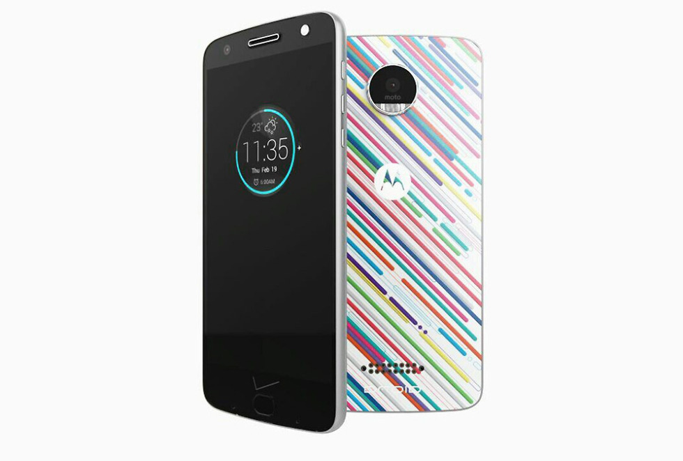
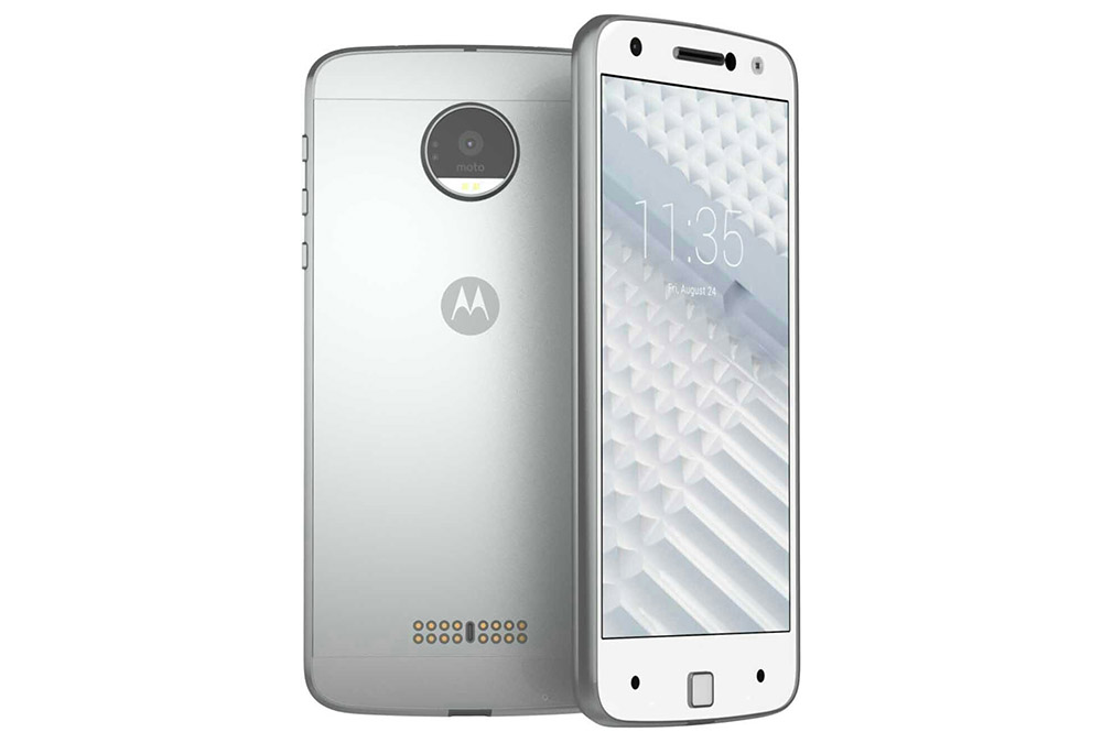
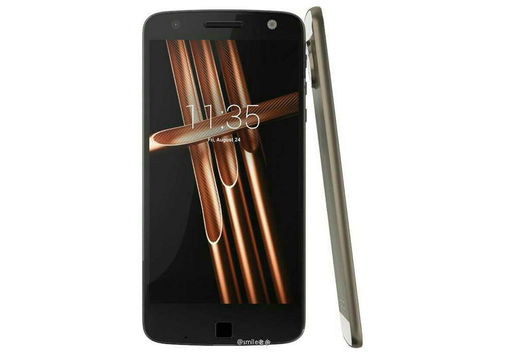
Alright, so remember back in December when a photo surfaced of a supposed Motorola phone we dubbed the Franken-iPhLumia360 (that’s pronounced eye-floom-ee-uh-360)? It was of a phone so distant in design from Motorola’s previous efforts that we stated something that didn’t seem all that outlandish at the time – that we were going to be beyond shocked if it was on any level real. Welp, it might be real! Check out all of these fabulous new renders that were posted by the folks at hellomotoHK over the weekend that look identical to that phone.
My, oh my.
So what are we looking at? Well, there is a lot to talk about here.
First, the phone up top has both DROID branding and Verizon’s new check mark, so we are just assuming that it is the next Turbo or some new DROID phone that you shouldn’t buy if you like software updates or security. The phones pictured below look almost identical, but lack the Verizon and DROID marks and could very well be the next Moto X (2016).
In terms of style, these phones look thin, really thin. They have fingerprint sensors situated on their bottom (HUGE) chins, lower IR sensors next to them to activate Moto Display, rear-facing speakers (EDIT: or are those contact pins?), and metal-ish looking exteriors. The fronts also have cameras with accompanying flashes and potentially more robust Moto Display capabilities, with options for wallpapers and/or colored widgets.
There are a variety of designs at play here, so it doesn’t seem like Moto Maker is going anywhere, even with the drastic changes from last year’s Moto X Pure Edition to what we are seeing in these new images. We have white or black fronts, along with white, gold accented, and multi-colored backs. I’m going to guess there will be even more, though I’m not sure if the leather or nylon backs can return with this design.
Each phone has a bulging disc camera setup that seems to be taking a playful approach to the Moto 360’s famous flat tire. I don’t even think we can call this a “hump” as it really does just look like a hockey puck slapped onto the back of a phone, ignoring any thought of a non-wobbly table presence. Obviously, the camera isn’t a dual setup like we have seen from Huawei and LG recently, but does appear to have a flash and a couple of other sensors, potentially a laser autofocus system.
As for other highlights, the bottom USB port seems to have some sort of cut-out on the backside. Is that something to keep an eye on or just an odd design choice? Tough to tell. Also, check out the terrible volume/power button situation. Ugh. Remember when HTC thought it was a good idea to put volume in two separate buttons and located them right up against the power button? Yeah, well, apparently Motorola didn’t get the memo on “How to Fail in Smartphone Button Setups” and is going that route here. Good luck ever figuring out which is which on the fly, in the most important of times.
See, there is a lot going on here. I’m still trying to take it all in on whether or not I like the new design or dislike it. There is a lot to like, but also plenty to raise an eyebrow or two at. Like, the lovable Moto dimple is gone and a fingerprint sensor has been placed on the front chin. For years and years and years, we have talked about the dimple being the perfect spot for a fingerprint reader and likely was going to be at some point, yet here it is gone and switched. I, obviously, hate that button setup and am not excited about a puck hump thingy on the backside. But the phone does look thin, appears to have an improved Moto Display experience, and Moto Maker will be back.
EDIT: As some have noted, that may not be a rear-speaker and could be contact pins. Does that mean a dock or other accessories? Will the new Moto X be modular? Brain now in overdrive. Also, the DROID phone does look to just have a speaker in place of the pins.
UPDATE: The new Moto phone will be shown off on June 9 at Lenovo Tech World. We’ll be there.
UPDATE 2: Potential specs and module details arrive.
Man. Thoughts?


Collapse Show Comments106 Comments