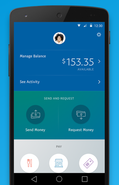
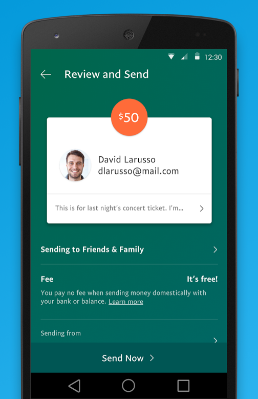
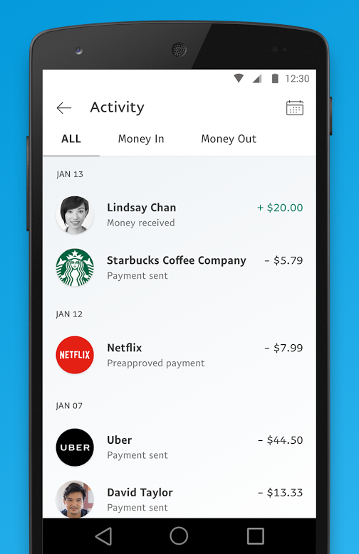
The PayPal app received a major redesign this morning that takes it from an outdated, often confusing mobile payment experience, to a slick, modern, and easy to use application. PayPal claims that the new experience is supposed to “make it simpler and more personal for you to move and manage your money.” After using it for a few minutes, I would tend to think they succeeded.
In the old app, in order to see something as basic as your balance, you had to swipe out a sidebar and jump into the activities or wallet sections of the app. In other words, it required a swipe, some taps, and a loading period in order to view your balance, a core piece to PayPal in general. With the new app, your balance is at the top of the front page, so you always know how much money you have available. How this hasn’t always been the case is beyond me, but hey, we’re there now!
The new app makes it incredibly easy to send or request money from the start page, see recent activity, and pay for items in stores. PayPal also fine-tuned fingerprint authentication in Android, shows separated account activity by pending and completed, and gives you access to the friends you send money to the most.
I don’t rave about app updates often, but this is one that was sorely needed. So far, it seems like PayPal did a great job at putting the right pieces in the right places.
[responsive_vid]


Collapse Show Comments16 Comments