Earlier today, a keyboard was dropped off in our inbox that has us pretty excited about a potential change away from the stock Google Keyboard. The keyboard is called Chrooma and it’s basically a form of the Google Keyboard we always wanted or at least kept hoping Google would build. In other words, it has a couple of features we wish Google would implement, along with a couple of really cool ideas that give your typing experience a boost of color.
If you are looking for flashy slideout menus and predictive emoji and themes and all of that jazz, similar to what you would find in Swiftkey, you won’t get that here. What you get with Chrooma is a very similar experience to the Google Keyboard. As someone who has found comfort in Google’s keyboard over all others, this is right up my alley.
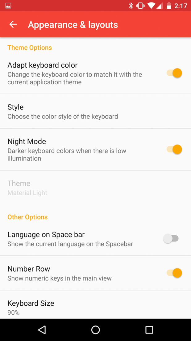
Chrooma stands out to me because not only do I get that Google Keyboard experience that I like so much, but I also get a couple of really important settings to play with. For one, I can add a number row! Because that takes up a massive amount of screen real estate, Chrooma also built a scale, where you can drop down the size of your keyboard in 10% increments.
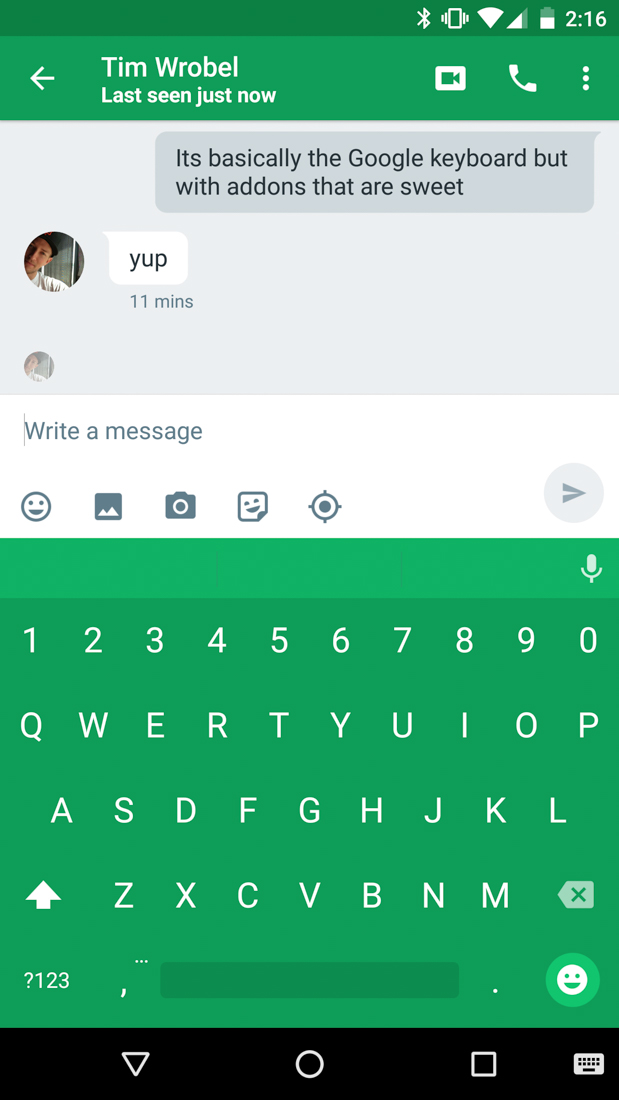
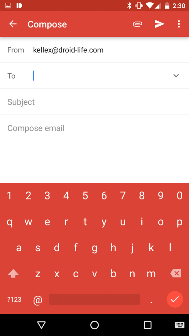
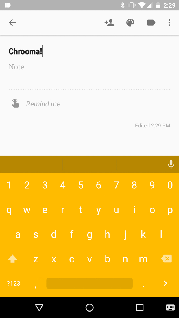
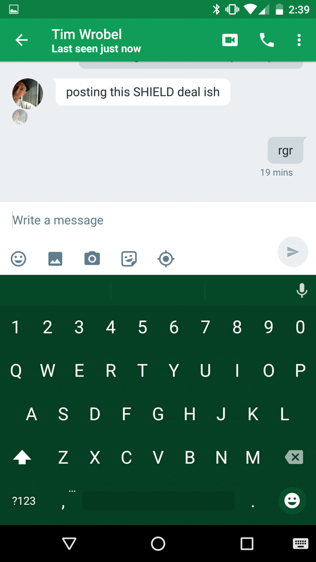
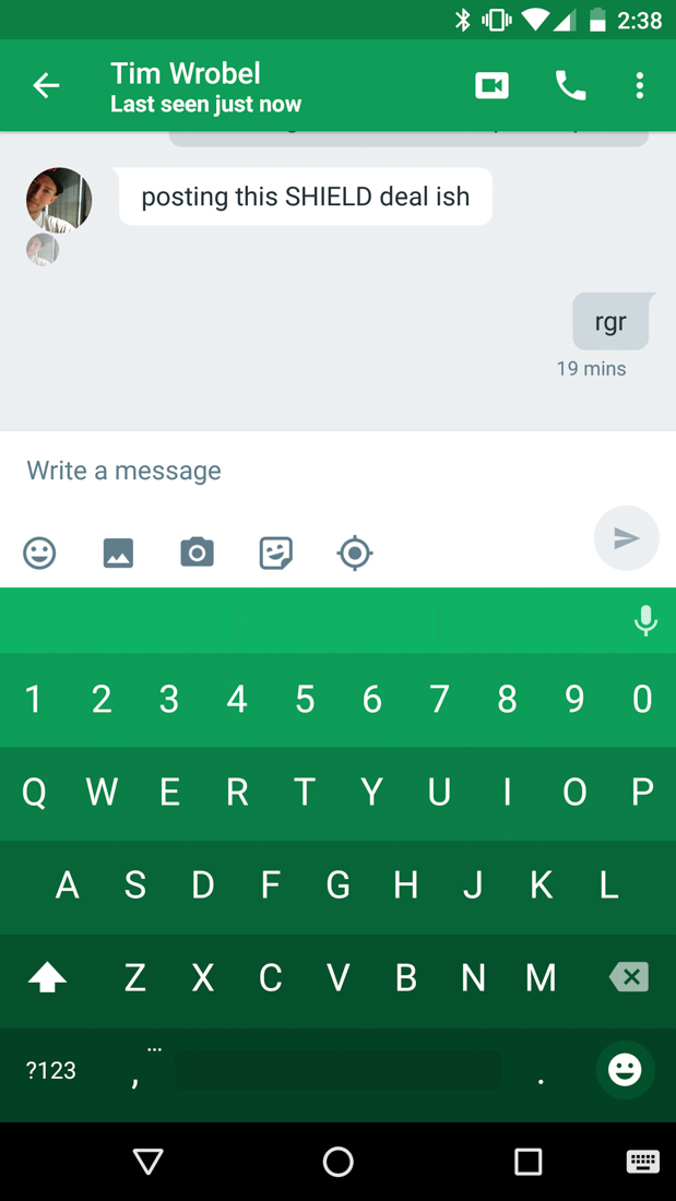
Where Chrooma really shines, though, is in its adaptive color management. Confused by that idea? Let me attempt to explain. Chrooma is using this smart color system, where it matches up the color of the keyboard to whatever app you are using. For example, in Hangouts, you get a green keyboard that matches up to the color of Hangouts. In Gmail, it’s shows up as red. In Keep, it’s yellow. Make sense? And it does this all automatically as you jump between each without a hiccup.
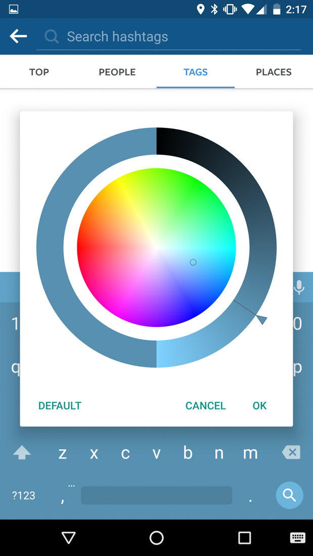
If you don’t like the adaptive color changing, that’s OK too. You can set a custom color for each app that you use or turn off the adaptive coloring altogether and go back to one of the standard Material Light or Dark themes.
Need another couple of reasons to try Chrooma? Night Mode and a palette style. In Night Mode, Chrooma recognizes “low illumination” and then adjusts the color of the keyboard to a darker shade so as to not blind you at night. With palette styling, Chrooma lays out a palette of colors on your keyboard, in case you need separation between lines and don’t want to look at so many solid colors all day. You can see both in action below.
How does it type, you are probably wondering? As I mentioned earlier, the whole experience reminds a lot of the Google keyboard, from the way it types out letters, gestures words, and looks. I’ve just begun testing it, but so far am pretty impressed.
Play Link ($1.49)


Collapse Show Comments58 Comments