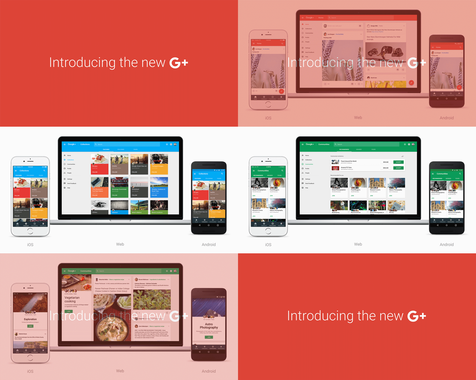
This afternoon, Google announced that it has been working on a new version of Google+ that is ready for prime time. Over the past couple of months, Google (with help from users of Google+) realized that a big part of the social platform’s growth was in Communities and Collections, and so that’s where the latest redesign takes its focus.
With Communities, you get a forum-like atmosphere within G+ that allows you to discuss topics with like-minded folks. With Collections, you have a way to bundle together the posts you like by topic, to help you stay organized and on top of your favorite things.
In this new G+, you’ll see in image above and GIF below, that just below the top “Home” tab, there are easy-to-reach shortcuts for Collections and Communities. From within those specific pages, you can quickly find new groups or topics to entertain, or just browse the ones you are already a part of.
Google also said that this new Google+ has been better optimized for mobile, should let you post, search, and connect easier, while keeping up with content.
To try out the new Google+ on the web, be on the lookout for a “Let’s go” button at the top that will let you make the switch. Google did say that not all of the old Google+ features will move over to the new version, so if you want to switch back to the classic, you can do that.
As for mobile apps, the Android and iOS Google+ apps are brand new and will arrive “in the coming days.”


Collapse Show Comments28 Comments