I’m fully on board with fingerprint scanners in phones. They make sense. Security is as important as ever, so if implemented correctly, they not only add a layer of protection, but they do so in a way that doesn’t really change much of the user experience. That’s how good tech works. It shouldn’t just be there for the sake of being there, it should be there to enhance an experience without getting in the way. Think the opposite approach of smartwatches.
Companies like Samsung and Apple certainly did it right out of the gate through home buttons that double as fingerprint readers. Since users of their phones often turn to home buttons to wake them, it makes perfect sense to included fingerprint scanners in those buttons, so that with one click of a button, you are waking your phone and also securely unlocking it. But what about some of the new placements we are seeing, like in power buttons (new Sony phones) or on the backs of phones (new Nexus, LG V10, etc.)? I think both have great potential and are actually better implementations than the home button solutions that have dominated early.
For the past week or so, I’ve been testing the LG V10, which happens to have a rear fingerprint scanner embedded in its rear power button. It’s a similar implementation to what Google has done with the Nexus 5X and 6P, if not a little less stellar. But still, the idea is the same and that’s what I’m basing this opinion on. I’ve also been using a Sony Xperia Z5 Compact for all of 3 hours and have already fallen in love with its power button fingerprint scanner.
Google said during its Nexus event that it thinks a rear placement, positioned up top of the phone’s center is a natural spot that you would place your index finger when your phone is picked up. I initially had some doubts about it, but I’m really coming around to the idea. On the V10, which is an abnormally large device, I do actually find my finger easily locating the fingerprint sensor for waking and unlocking. The V10’s fingerprint sensor seems to be garbage and often requires multiple reads, but it’s easy to get your finger in the right place, which is the point.
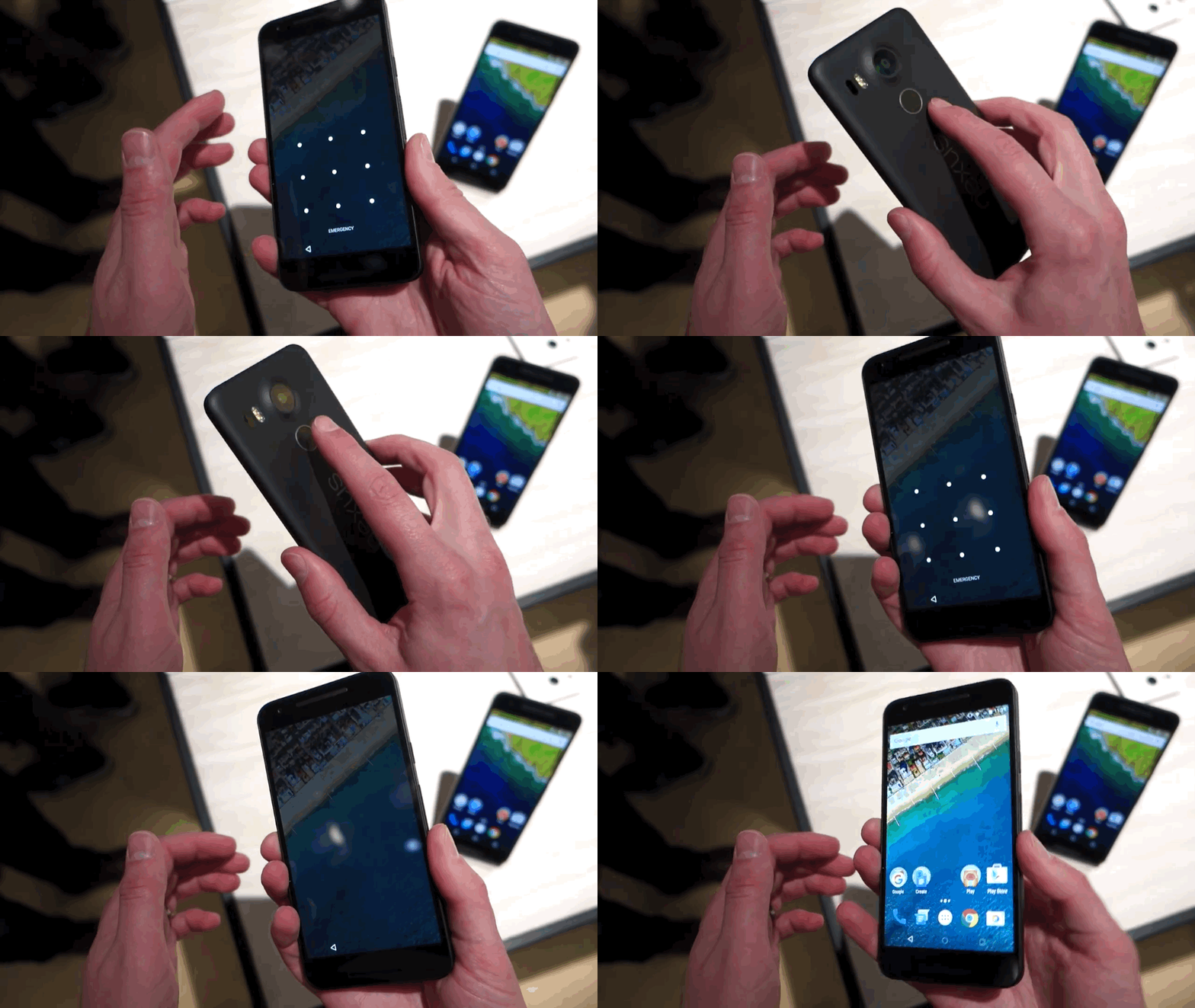
On the Nexus phones, even though I only spent 20 minutes or so with them, I came away impressed. Not only do they not ask for a button press of any sort since they are like a capacitive button or touchpad, they are instant. In our hands-on videos with the 5X and 6P, you can see the quickness in action, assuming that GIF above isn’t doing the action justice.
And that’s what I mean when I say that “that’s how good tech works.” With these rear placements, you pick up your phone and your index finger finds that upper central spot that it would normally track to anyway to balance the phone in your hand, but now there is a fingerprint scanner there, adding security while not really changing a thing about the way you use your phone.
With the new Xperia Z5 phones, we have a different fingerprint reader implementation that lies within the power button. This is similar to the Nexus experience in that when you pick up your phone, the fingerprint sensor is in a natural position and now a part of an action you would do every time anyway – unlocking or waking. Like the Nexus phones, I’ve found the Xperia Z5 Compact to be an instant read, so you can wake your phone like you normally would and also have it swiftly bypass your secure lock screen. I’ll have more of it on video in a first impressions video shortly, but you can see it in the GIF above.
Outside of the convenience of these, I think they are the better implementations because I think they allow for better overall phone design that doesn’t need the reader to be on the front of your phone, mucking up the appearance. I’ve never been a fan of physical home buttons, especially with Google trying its hardest to push Android manufacturers into using software navigation buttons, and these two fingerprint reader locations only solidify that idea in my mind.
The new Nexus and Xperia Z5 phones are (at least in my opinion) some of the best looking phones in recent memory because of their ultra-minimal appearances. Had you thrown a physical home button on the front of any of them, you ruin the entire aesthetic. Gone is the clean front glass that is then broken up by a gaudy button. Think OnePlus 2.
But besides the look, having no home button also allows for either a smaller overall footprint or the addition of something like a second stereo or front facing speaker. With the Xperia Z5 line, you have one of the smallest lower chins I have ever seen on a phone. With the Nexus line, you get stereo (6P) speakers or at least a front facing one (5X).
In short, the new fingerprint reader implementations on the backs of phones and in power buttons might be the best yet, in case you were worried about them. I know the instant reaction is to think that these semi-odd locations might be difficult to figure out and that Samsung and Apple’s home buttons are the optimal placements, but I’m actually thinking the opposite. These new fingerprint readers are not only fast, but they might be even easier to use while allowing for cleaner appearances and more flexible phone design.


Collapse Show Comments258 Comments