The original Moto 360 was the best smartwatch released in 2014. It had the looks of a modern yet traditional timepiece, along with the feature set of the current vision of a smartwatch, all at a price that wasn’t insulting to consumers understanding that it was a first gen product. Sure, it had its faults, but in the end, when you are talking about a fashion accessory that also has smarts, it’s all about aesthetics – and the Moto 360 was king by a mile.
With the release of the Moto 360 (2nd gen), Motorola had a lot to live up to, but they also had a chance to improve upon last year’s best watch. We all know that this year’s watch needed a major bump in processor to help in performance, so Moto took care of that. They also introduced size options, because not everyone wants to lug around a tank on their wrist. They even tweaked the design a bit, making it more classic looking than ever, while offering even more custom options through their Moto Maker software. Overall, the new 360 is upgraded in all of the right places.
So is it still king? Let’s find out in our Moto 360 (2nd gen) review.
Design
Last year, the Moto 360 was the best looking smartwatch month after month, even as new watches were introduced with round displays from other manufacturers. Other watch makers just couldn’t get it right. They all put together bulky, obnoxious round watches, that were supposedly premium and more watch-like than anything before them. The problem was, they didn’t realize that creating a case that is shaped like a traditional timepiece doesn’t make for a good looking timepiece if it’s enormous, cheap-looking, and unwearable.
This year, the new Moto 360 (2nd gen) actually has some design competition in the form of the Huawei Watch and Samsung Gear S2 line. These watches are slim, modern yet classic, round, and right around the same price point, while offering better specs and features in some areas. This year isn’t going to be a cake walk for Motorola.
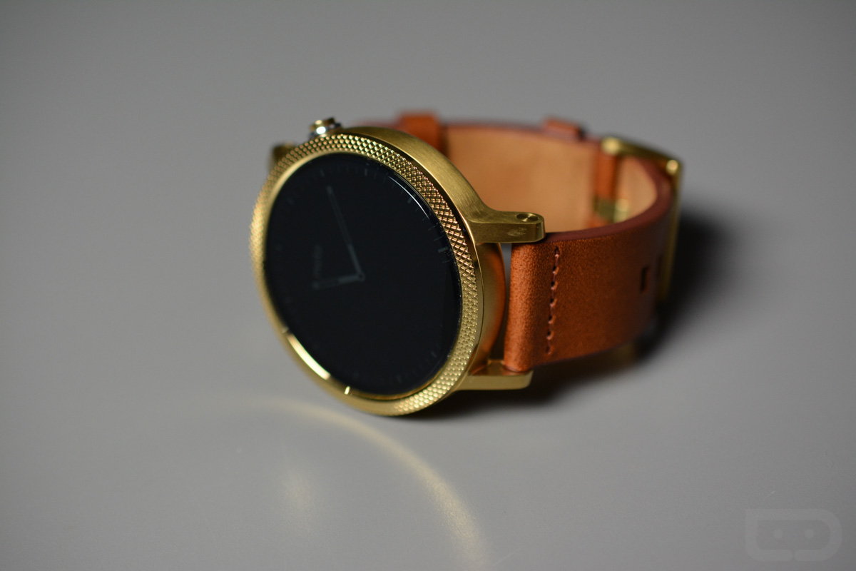
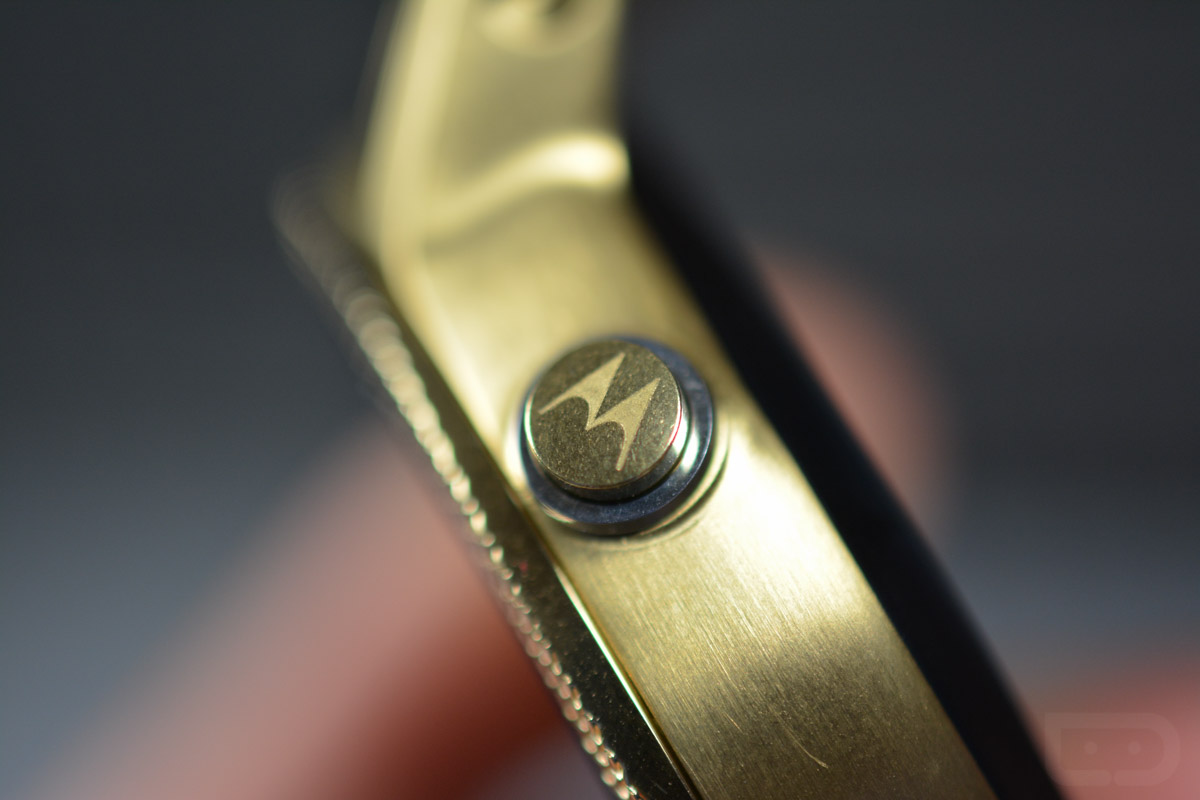
What improvements did they make, you ask? Motorola kept the same round shape with minimal bezel and stainless steel, but this time added traditional watch lugs, moved the crown position, and is offering two case options. You can now buy the 360 in 42mm or 46mm sizes, which is great news for those of us with smaller wrists. You can also easily swap watch bands, thanks to those lugs making band pins more accessible. And finally, the crown has been moved to 2-o’clock, to help out in the comfort department.
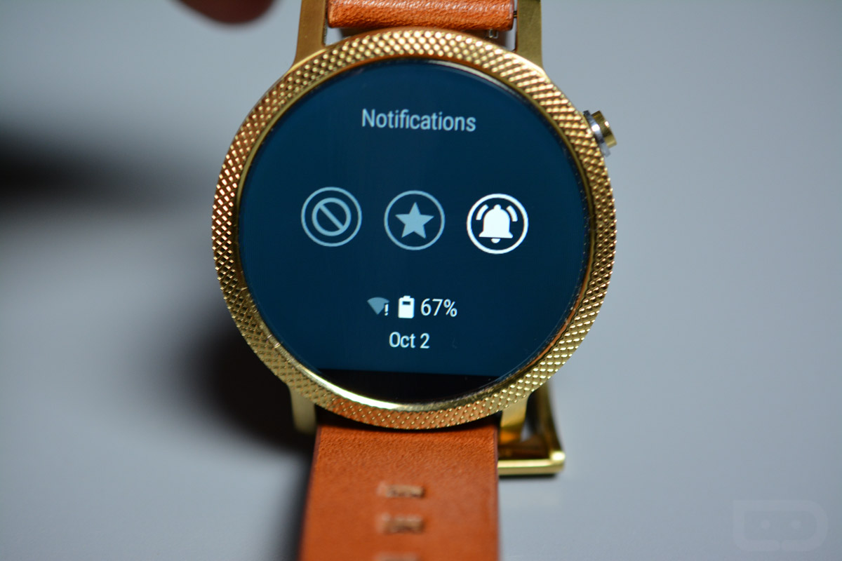
This watch lays nicely on your wrist, even at 46mm, partly because of the lugs gently wrapping. The body is fairly thin, has a decent amount of weight to it, letting you know that it isn’t just cheap plastic, and generally looks like a real watch, not a piece of technology. And that’s a big deal to me. I like watches as a fashion item, so the fact that this watch looks first like a classic watch, then doubles as a smart device, is very important.
Let’s also keep in mind that Motorola is offering up more customization choices through Moto Maker than I can keep track of, various colors, bezel textures, and watch bands. I’ll get deeper into that in a minute, but the fact that you can customize a watch is pretty damn cool.
In the end, the Moto 360 is still right there in terms of the best looking smartwatch. I’m still undecided between this and the Huawei Watch for the king of looks, but that’s good news for you. Should you choose either, you will end up with a beautiful timepiece that doubles as a smartwatch.
Customization
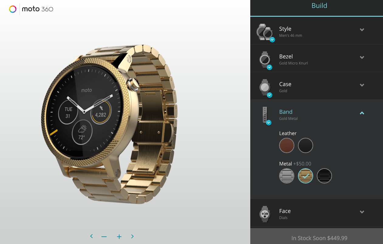
Motorola is bringing it all this year with Moto Maker and the new Moto 360. There are dozens of combinations when ordering one, which means there is a pretty good chance that you will have a watch that no one else you know has. There are two case sizes (42mm or 46mm), four bezel colors (silver, gold, black, and rose gold) with optional knurling or micro cut, four case colors, and eight band choices. Some of the options are specific to the watch case, but overall, we’re talking almost endless possibilities.
And keep in mind that Motorola is even offering a women’s 42mm model with specially made and designed options, like rose gold and various bands.
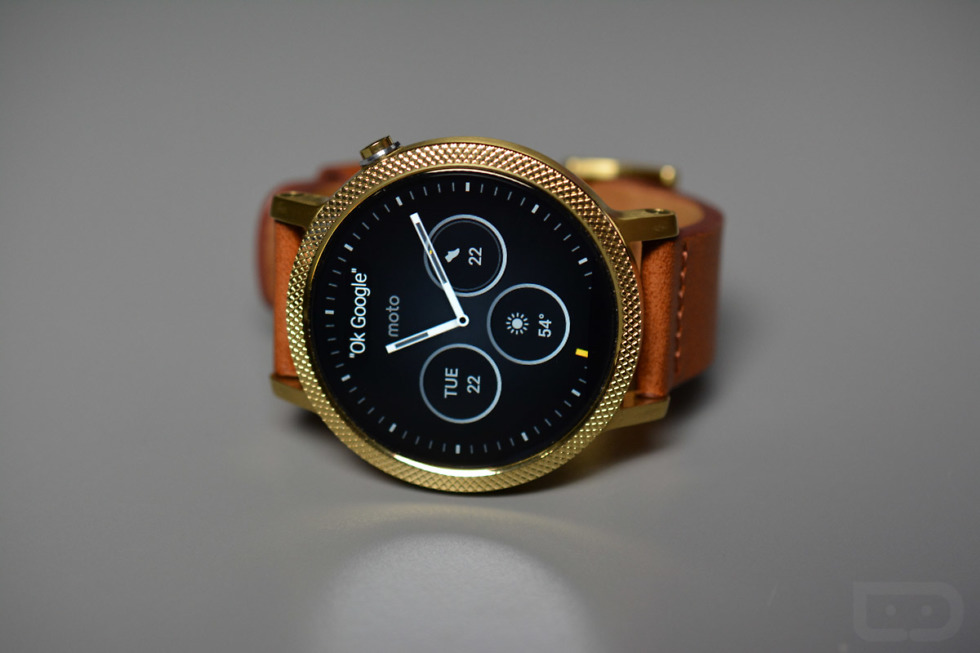
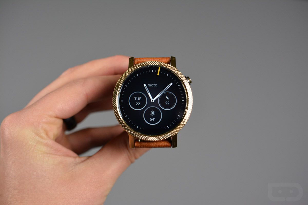
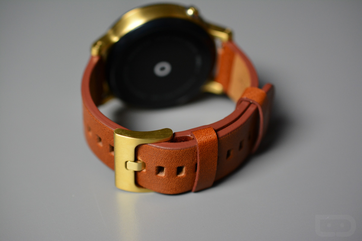
Our review unit is a 46mm with a gold bezel (knurling too), gold case, and a cognac Horween leather strap. It’s a sharp looking watch, if not a bit over the top. I’d personally choose the 42mm version if I were buying one, but that’s part of the beauty here – you get to choose what you want in a watch.
With the Huawei Watch or Gear S2, you get what Huawei and Samsung have decided you want to have. With the Moto 360, you get to choose the watch that fits your style on another level.
Battery Life
Enough on the looks, let’s talk battery life for a minute. As many of you know, the original Moto 360 was about the worst in terms of battery life. After some tweaks, Motorola was able to squeak out about a day’s worth of battery life, but it certainly never came close to being one of the best in this category. With the new Moto 360 (2nd gen), that has changed dramatically.
Thanks to the addition of lugs, Motorola was able to up the battery size in the 46mm case to 400mAh and almost match last year’s battery size (320mAh) in the smaller 42mm case at 300mAh. Not only that, but with the introduction of a proper and modern Snapdragon 400 processor, battery life is quite good.
In my first few days of testing, I was actively tracking battery life, but eventually stopped because it just wasn’t an issue. Initially, I was using “always-on” mode, since that’s the most aesthetically pleasing and preferred mode, as it lets your watch screen remain on to help it keep that traditional watch look. In the first three days with “always-on” mode on, I never once came close to killing the watch in a single day. Well, day 2 I did drop to 22% at 8PM, but that because I had to factory reset the watch mid-way through the day to connect to a new phone. If you have ever factory reset an Android Wear device, you know how much battery that can eat up, since the process takes up to 30 minutes to complete and sync to a phone. Otherwise, with “always-on” mode enabled, I saw numbers of 51% and 36% remaining in the early AM hours the following day.
After testing “always-on” mode, I then switched it off for a few to see how much longer the battery would last. In the first couple of days, I was going to bed at night with 70% still on the watch. That’s kind of nuts. Motorola says it should last up to two days and I actually believe that it will, depending on your usage level.
I think it’s safe to say that there aren’t battery concerns at all with the new Moto 360. In fact, it may be one of (if not) the best in the business now.
Performance
Along with poor battery life in last year’s Moto 360, there is no denying that it was also about the worst performing Android Wear watch. Motorola used an ancient TI OMAP processor in the watch which was evident from day 1. The watch often struggling with simple swipes as it aged, and never really provided that smooth experience we saw on other watches powered by Qualcomm’s chipsets. This year, Motorola gave in and is using the Snapdragon 400 found in most other Android Wear devices.
Because of that move, the watch flies around the operating system, responds quickly to touches, shows improved battery life, and overall, is a pleasant experience all-around. There aren’t hiccups or stutters or lag anymore, Moto 360 fans.
Specs
Because I haven’t mentioned them all yet, let’s do that now. The specs for the Moto 360 (2nd gen) are quite good. You are looking at 1.56-inch (46mm) and 1.37-inch (42mm) LCD displays, 400mAh (46mm) and 300mAh (42mm) batteries, 4GB storage, 512MB RAM, wireless charging (dock included), Bluetooth 4.0, IP67 dust and water resistance, heart rate monitor, dual mics, and a 1.2GHz Snapdragon 400 quad-core processor.
The specs here aren’t exactly brand new or pushing the envelope, but they are good enough to power a wearable on your wrist. You will see other smartwatch makers toss in things like LTE, more RAM, insane resolutions on displays, and giant batteries over the next year. I’m not sure anyone needs any of that, unless they don’t mind wearing tanks on their wrists.
Software
Android Wear as a wearable platform has really grown over the last year. At one time, it was a notification pusher and not much else. nNw, it can quickly load apps, direct you to your favorite contacts, let you interact with watch faces, is quicker with voice actions, has ambient modes in apps, can connect to WiFi (so you can leave your phone behind), has theater modes and more notification settings, and is a much better health tracker than ever before.
We have taken you on tours of the latest Android Wear updates a handful of times, so to catch up, be sure to watch this video.
I think the takeaway is that Android Wear has become a polished watch OS that is slowly evolving as Google figures out scenarios where it can do more. It’s not overwhelming like Apple’s watch OS, because Google wants it to be simple. A watch OS isn’t supposed to be distracting or confusing or dominate your time – it’s supposed to make your life simpler. I don’t know that Android Wear has fully figured that all out yet, but it’s getting there faster than everyone else.
As for specifics to the new 360, Motorola is really pushing their Moto Body experience, which is their take on a fitness platform. The Moto Body suite is like Google Fit or Jawbone’s platform or what you would get with Samsung’s S Health. It’s decent, but far from the best. Motorola seems committed to it, though, so expect it to get better over time.
Availability, Price, and Value
The Moto 360 (2nd gen) is available now should you decide you want to buy one. It’s available at Motorola’s site with Moto Maker customizations and at places like Best Buy. Customizing through Moto Maker will take a bit to finish, so you won’t have your watch for at least a couple of weeks if you go that route. If you decide you want one today, most Best Buy’s have them available.
If we look at price and value, the Moto 360 is probably the easiest and best choice. Competitors like the Huawei Watch have choices, like silver, black, or gold models, but as you choose anything but the base silver model, the price goes up dramatically and quickly. With Motorola, you can get an all-gold 46mm watch with a gold band for $450. If you went with the all-gold Huawei Watch (which isn’t even available yet), you are looking at an $800 price tag.
So the bottom line is that the new Moto 360 offers you customization that no one else can at a pretty reasonable price. It’s easily the best value.
Video
Unboxing
[responsive_vid vid_url=”aSdeGjNSNoU”]
vs. Moto 360 (1st gen)
[responsive_vid vid_url=”fFNwC7fJwa4″]
Original tour
[responsive_vid vid_url=”8c3azSwmn0k”]
Final Thoughts
I’m still trying to figure out if I need a smartwatch in my life, but there is no question that the new Moto 360 (2nd gen) would be in strong consideration as the watch for me. Not only can I customize it to my liking, but it looks fantastic. This smartwatch looks like a watch. Sure, it’s smart and does that whole Android Wear thing as well, which is great. But it looks fantastic first, and that’s important when you are talking about a fashion accessory.
Should you consider the Moto 360 (2nd gen)? If you are looking into buying a smartwatch, then absolutely. This and the Huawei Watch should both be put on your wrist before making that decision, though. Watches fit each person differently, but if this one fits nicely, go for it. You won’t be disappointed.
Collapse Show Comments128 Comments