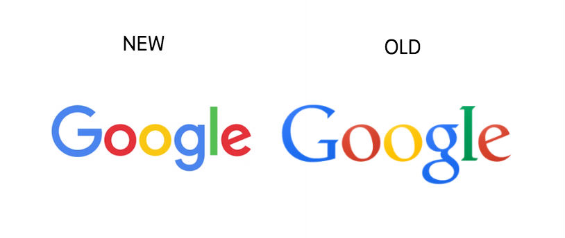
Here are a few of the words being thrown around to describe Google’s new logo, introduced this morning. There is colorful, playful, and evolved. Last month, Google announced a major reworking of its core structure, and now, it appears the company is looking to bring forth a new image.
To celebrate the change, Google released the below video, detailing the changes the company’s logo has gone through over the years. Personally, I enjoyed the flat look it had, but I suppose I could get used to this new font.
Share your thoughts below.
[responsive_vid]


Collapse Show Comments62 Comments