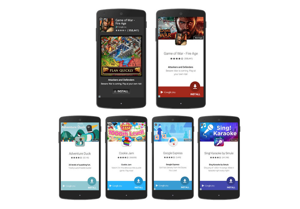
Every now and then, depending on what apps and games you use, you likely see fullscreen advertisements inside an application from time to time. Usually, they look really bad, and can sometimes be annoying. That’s just the nature of ads. However, thanks to Material Design, apps that use fullscreen ads from the AdMob Network (which is quite a few), should see a big makeover.
At the top of the header image above, the way fullscreen ads appear as they are today is shown on the left. With the update, ads will appear like the one shown on the right side. It features a floating action button which acts as an “Install” shortcut, and the overall layout is much cleaner and less intrusive.
In addition, the new ads will color match accordingly to an app’s icon and banner image, offering a pleasing aesthetic for viewers. Sure, ads are no fun, but at least Material Design can make them look a bit better for us mobile users.
Again, depending on which apps you use, prepare to see these new fullscreen ads rollout soon as developers work to implement them.
Via: DoubleClick Publishers

