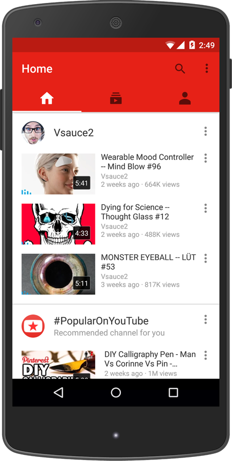
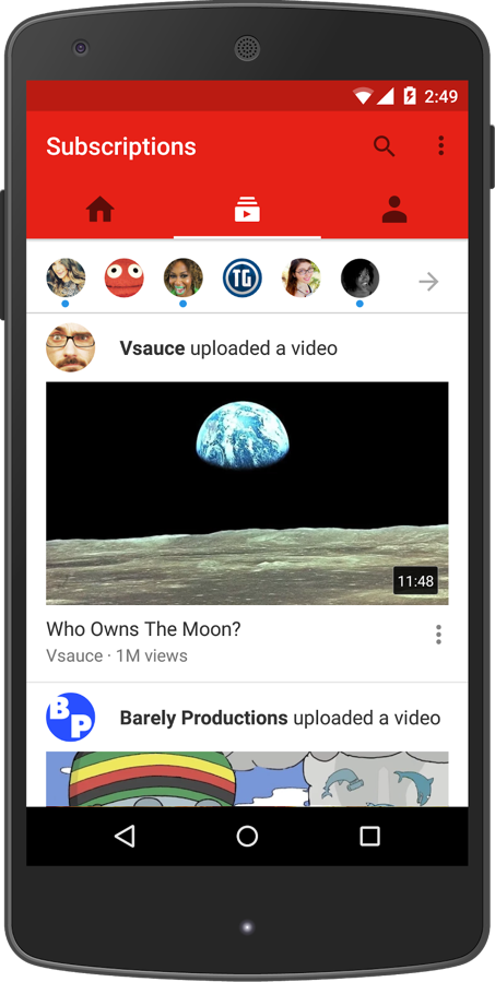
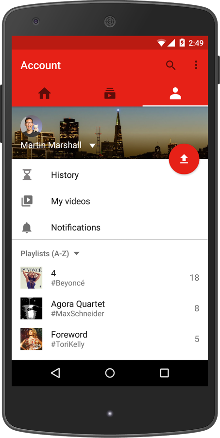
Notice anything different about your YouTube app this week? You should have received an update to YouTube within the last day that introduced a new 3-tabbed design to make it “easier than ever to find videos you love.”
The new app ditches the slideout navigation menu for three tabs or columns of Home, Subscriptions, and Account. Those names are pretty self explanatory, but the basics are you get to explore and discover videos with recommendations on your Home, find the latest from your subscriptions on the Subscriptions page, and check out your own account or upload new videos in the Account page.
Google also tossed in new creation tools for trimming footage, tinting images, adding music, etc.
The app is slick, fast, and easy to navigate, it’s just surprising to see Google continue to change up its design language. Is this the beginning of the end for the slideout drawer? Obviously, that all depends on the application.


Collapse Show Comments49 Comments